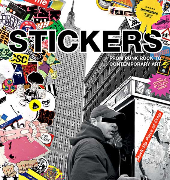
Source: http://coolmaterial.com/wp-content/uploads/2010/10/stickers-book.jpg
Happy Friday, inkheads!
I know you’re all gearing up for Go Skateboarding Day tomorrow—-don’t forget to enter yourself in the free sticker printing giveaway!
Since we’re on the subject of skating, I want to spread the stoke and share some of the best sticker designs in the industry.
Skateboarding brands invest a lot in sticker advertising because those semi-permanent printed pieces give fans a way to express loyalty as well as identify with the larger action sports community.
Let’s have a look at the sickest typographic designs!
Why typography is an essential sticker element
Before I show you the cream ‘o the CMYK crop, I think it’s important to address the greater purpose behind this post. While I want you to feel inspired by the design examples below, I’m hoping the artwork will convince you to spend more time carefully crafting your type.
Reason being, stickers tend be quite small. They’re often viewed from far away or in passing as someone walks by on the street.
You need to take these factors into consideration when you’re sketching out your design ideas (you will want to start your creative process on paper). I’m not one of those minimalist design freaks, but believe me when I say to let the KISS design principle guide your workflow. You must adapt your message to suit the medium and context, which means that people should be able to comprehend your concept within seconds. Unnecessary elements, illegible text, and complex layouts are your worst enemy.
9 gnarly skateboarding sticker designs
Feast your eyes on the most excellent examples of sticker typography in the skateboarding industry!
Lips 3.25″ x 5.5″ Print by Enjoi
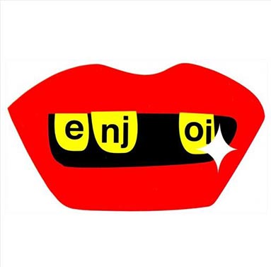
Source: http://pacwave.com/enjoi-lips-sticker-3-25-x-5-5-red
Always on the cutting edge of skater style, Enjoi kills with this creative and oh so flat sticker. The Enjoi brand identity doesn’t use a moniker or symbol, so they can get away with a type driven design. Most of the time, I’d say to avoid splitting up text this way, especially for the brand name. Still, there are exceptions to every rule. Since the company name is short, this unique layout grabs your attention.
Three P 2.5″ Circle by Powell Peralta
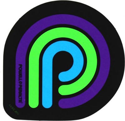
Source: http://www.warehouseskateboards.com/powell-peralta-three-p-small-skate-sticker-2.5′
The Powel Peralta brand blew our minds with their crazy cool custom skateboard shaped wooden business cards. This sticker’s not quite as insane, yet the artwork proves there’s strength in simplicity. The trademark letter P appears in bright complementary colors that create just enough contrast to keep your eyes entertained.
Future of Donut Die Cut Vinyl by Odd Future
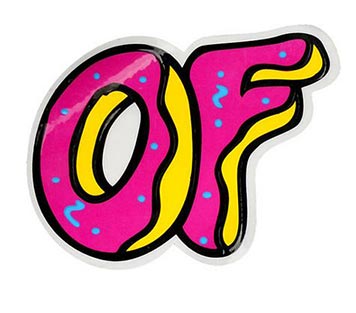
Source: http://www.zumiez.com/odd-future-of-donut-vinyl-sticker.html
It doesn’t get much sweeter than donut typefaces. This shiny sticker features the OF brand initials with distinctive, fun lettering. Gloss compliments the graphic well because fresh baked donuts often emit glare, at least from behind display counters. Not to mention the whole glaze thing. The custom die cut shape acts as icing on this funky tactile cake, or should I say frosting?
Caliber Trucks 7″ x 2.5″ Logo Die Cut
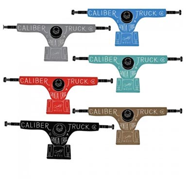
Source: http://socalskateshop.com/index.php?l=product_detail&p=41933
Caliber makes trucks aka axles, hence the interesting custom shaped die cut. The thin type may be tough to read towards the bottom, especially on the teal, gray, and light blue colored prints. Nevertheless, I’m willing to overlook these slight design faux pas because the rest of the execution saves the project.
Lakai Ballpark 2″ x 3″
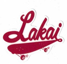
Source: http://www.nativeskatestore.co.uk/accessories-c3/skateboard-stickers-c15/lakai-ballpark-skateboard-sticker-p13565
You might not be familiar with Lakai unless you’re really into skateboarding. The footwear brand makes technical shoes that are flying under the mainstream radar. This sticker shows a clear connection between the brand name and the sport by connecting the type to the skateboard graphic. The perspective conveys a sense of motion and excitement, which leave a favorable impression about a lesser known manufacturer.
UV Blast 3.5″ x 6.1″ by Real Skateboards
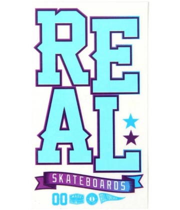
Source: http://www.skatehut.co.uk/skateboards/stickers/real_uv_blast_sticker_blue.htm
Props to the Real Skateboards team for this super clean decal with a clear background. The big bright letters will stand out on just about any surface. This print comes in 2 other color palettes that all give off the same summer vibe.
Creature Fiend 5″ Die Cut Decal
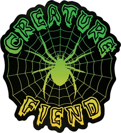
Source: http://www.blackholeboards.com/creature-fiend-decal-5in-127046
Creature appeals to the dark punk side of skateboard culture. Their brand imagery usually looks like something you’d see on a Misfits CD cover. Much like Misfits fans, Creature skaters are heavily drawn to gothic themes. In other words, Creature’s kind of a subculture within a subculture. Fans identify strongly with the brand’s values of rejecting commercialism, which is why devotees are called FIENDS. This sticker uses bold type inspired by classic horror films to enhance the sense of brand tribalism.
Orangatang Multi Logo
![]()
Source: http://www.daddiesboardshop.com/orangatang-logo-stickers
This one’s from the longboarding brand Orangatang, who concentrates on wheels mostly for downhill/racing. This sticker actually consists of 6 smaller logo decals arranged on a single piece of clear backing. Although I question the white/orange and white/blue color combinations given the material, the creative concept alone warrants a mention. A distinctive flat style gives a single letter the power to stand as an isolated symbol without being boring.
Santa Cruz Reverse Dot Circle
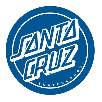
Source: http://www.nhsfunfactory.com/item/88281407/santacruz/reverse-dot-decal-3-in-pk25
This legendary NorCal surf/skate brand set the standard for unique branding. Most of the Santa Cruz merchandise looks loud with surreal illustrations. This toned down circle shaped decal lets the 3D type do the talking.
I can almost hear your brain lighting up with awesome design ideas. In case you’re reading this after the Go Skateboarding Day 2104 giveaway ends, you can still get stickers printed just not for free.