
Creative Data Sheet Design Samples
You've already invested in print marketing materials, such as brochures, presentation folders, and catalogs. Is there anything missing from your collection of professional offline advertising tools? While the above mentioned items are essential for your brand, there are lesser known printed items, including sales or product spec sheets, that bring big benefits you'll want to take advantage of.
What are Business Datasheets?
Don't be confused by the word "data" because these are nothing like the excel spreadsheets you might envision at first. Basically, these pieces of high quality paper contain important information about a specific product or service offering from your company. The details should be presented in a way that's both visually appealing and easy to understand. Think of these as a way to highlight the key features and benefits of whatever you're promoting. When you're creating your design, try to arrange the elements so that it's easy for prospects to scan the points and still understand your message.
Marketing Uses for Sales Sheets
As the name suggests, these are the perfect tools for your sales team. They're compact, portable, and best of all, permanent, unlike an email blast. Here are other popular ways to integrate these business datasheets into your marketing strategy:
- Trade show displays
- Product Launches
- Retail/Point of Purchase
- Upselling
- Drip campaigns
- Direct Mail
- Model for Web Landing Pages
Design Examples for Your Inspiration
Sales data sheets have a lot in common with brochures with respect to design. Remember, focus on scan ability, which means present a clear hierarchy with headings, bullet points, and small chunks of info. Still, there's a tendency to focus too much attention on stats, which may not be as persuasive as stories. Use personal anecdotes or testimonials to draw the reader in and incorporate data to support the statements. Here's an example that uses an intimate approach buyers can relate to:
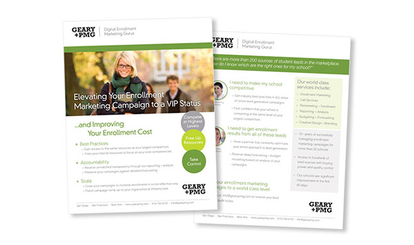
The company logo appears in two places, which establishes brand authority. You can easily gloss over the copy and get the gist of what the company offers. The copy appears in different colors that signify varying levels of importance and without deviating for a set palette. Everything is aligned on the left and right, which makes a bigger impact than centering the content. This design also utilizes space on the right side on both the front and back for supplemental details so as not to detract from the main points.
For more examples and templates, visit stocklayouts.com.