I’m always amazed at the lack of good resources for print design. While a handful of popular print products get a lot of tutorial and template love (business cards come to mind), other important items are ignored by most of the designer sites. Judging by the amount of people searching for brochure layout and typography tips, there’s clearly a need for educational information about these marketing tools. I covered the typography topic in a broad sense before in a post called Don’t be a font criminal, and today I want to dig deeper into typography’s role in creating a visual hierarchy.
Why your brochure design needs headings
Surely you’ve heard that web pages should be scannable because that’s how people absorb what they read online. You may not realize that the same principal applies to print! Well, at least the type of print we’re talking about. Novels are another story—but your brochure isn’t going to tell that kind of story. You don’t need space for plot or character development. Your readers don’t plan to curl up for the evening with your brochure by the fire. No, brochures usually promote a specific product/service or the brand in general.
In other words, think of brochures as sales tools. Just as you separate your Call to Action on a landing page with a heading tag, you’ll want to break up blocks of text with descriptive, bold headings. The goal is to make your copy easier to digest in chunks, which means your pamphlet points should be clear enough to absorb without a lot of effort. If you can’t widdle the details down to a few action oriented words, use subheadings to spell out the specs in a short sentence. And by short I mean tiny, no more than 5 or so words in length.
What’s in a typeface? Serif vs. Sans Serif
I hope it goes without saying that readability should be a primary concern with print marketing projects. By that I mean, avoid funky or decorative, no scripts, etc. Well, maybe there are a couple of script typefaces that might work for some brands. But in general, you want to stick to the standard serif or sans serif typefaces. This might present a problem for brands with specific typefaces as part of their identities. In this case, let your best judgment guide your creative decisions. A brochure that looks slightly out of synch will fare better than a branded appearance that’s totally illegible.
Serif typefaces appear more formal due to the accents. Serifs are the traditional choice for newspapers and magazines; however, that doesn’t automatically mean a serif would be the best fit for your brochure. Since you don’t have tons of text to work with and you’re likely dealing with numbers (statistics, charts, graphs), a sans serif may communicate your message without distracting the reader or creating confusion. Remember, not all typefaces that fit into each category are created equally. You always have the option of using a strong serif for your headings/subheadings and a plain sans for the rest of your text.
How many typefaces can I use in my design?
Please don’t get the wrong impression from the above combo suggestion. To keep your design looking professional, you’ll need to limit yourself to no more than 3 typefaces. Your best bet would be to stick to 1 or 2. But wait, doesn’t this rule put limits on your creativity? Well, yes.
Yet the limits actually enhance your storytelling abilities. As long as you choose a typeface with different weights and styles, you won’t feel as though you’re being constrained. For this reason, free fonts often present a problem for brochure printing. With a few exceptions, freebie downloads don’t come in light, italics, etc. They also lack glyphs at times. You’d be hard pressed to find a glyphless premium typeface in regular alone, though.
8 Good Fonts for Brochure Headings
And now for the moment you’ve all been waiting for…the font list! I’ve taken the liberty of finding both serifs and sans serifs for you. Inclusion in this article does not necessarily mean that said typefaces will complement each other. The lists below contain suggestions for your inspiration so you can start designing your own brochure today. Just click on the example images to download.
4 Serifs
Museo
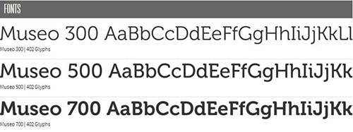
A free typeface that comes in 3 different weights as well as super thick slab version.
Vollkorn
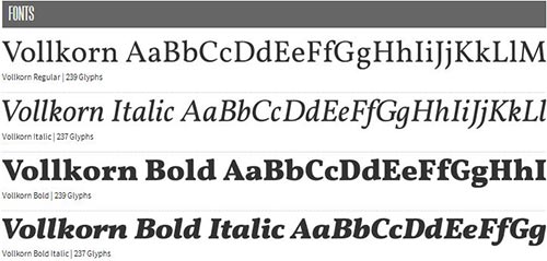
An elegant typeface with slight accents, too slight to combine with a sans in my opinion.
Garamond
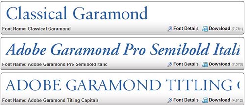
An easy pick because of its reputation for readability. Garamond often appears in children’s books.
Clarendon
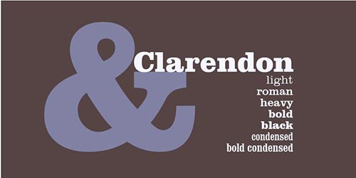
A thicker, meatier typeface that should be combined with a sans to soften to its blow.
4 Sans Serifs
Nevis
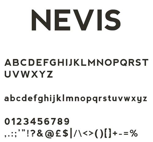
This freebie contains no extra weights; for a stronger headline look, use all caps.
League Gothic

Plenty o’ versatility here in this revival of classic in the public domain.
Futura
A premium modern choice for serious sales.
Gill Sans
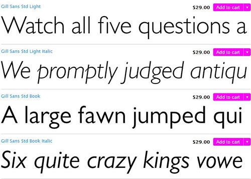
A fun choice with a youthful vibe.
You can use any of these typefaces with one of our free brochure templates! (Note: templates are for size 8.5″ x 11″ brochures)