Direct mail marketing is a very powerful tool that often brings much stronger ROI than online advertising. Mail order continues to thrive in the retail sector, especially when it comes to clothing, jewelry, sporting equipment, toys, and electronics. Postcards and flyers are often the medium of choice, but catalogs really give your products space to shine. Since catalog printing carries higher costs, you want to make sure you get the most out of your investment.
Catalog Cover Design From The Masters
To help you understand effective catalog design, I’m going to analyze one of my personal picks for direct mail marketer of the year, B & H Photo. I’ve ordered from them before, although I prefer to purchase photo equipment from my local camera store. I plan to order from them again in the near future, but I honestly hadn’t thought about their brand in a while. That is, until I received the Summer 2013 catalog in my mail box; there’s no way I would pitch this tantalizing teaser:
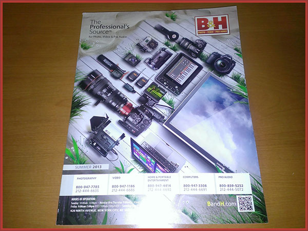
The catalog cover design sticks to the summer theme by placing popular products on the beach. Now even Bill Gates probably wouldn’t risk putting this kind of expensive gear in the sand, but this image isn’t about reality. The design successfully associates B & H’s inventory with a fantasy luxury lifestyle, which appeals to their professional target market. As an amateur photographer, I’m outside of their ideal demographic. But they’re grabbing my attention by showing me of glimpse of where I want to be, not where I really am.
Grade: A
Personalization in Print
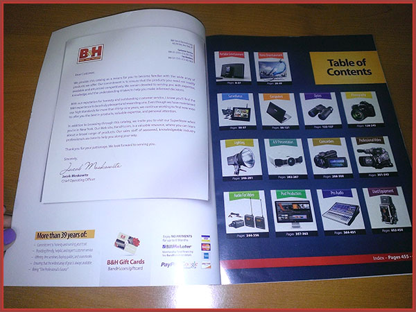
When I open the catalog, the first thing I see is a letter mockup alongside the table of contents. The letter is supposed to have the feel of a personal note from the B & H COO Jacob Moskowitz. The copy is ok, but there’s one fatal flaw in this design concept: it’s a form letter. B & H could’ve really nailed this with personalization through variable data printing. They probably chose not to go that route for price reasons. I’m sure their direct mailing list contains hundreds of thousands of clients, so personalizing the salutation would have cost tons of money. Still, this oversight serves as a lesson for small biz owners—never underestimate the importance of personalization. If you’re not going to take the time to tailor the content to the reader, then don’t pretend to address the consumer directly. You’ll come off as disingenuous, and that’s not the kind of impression you want to make when you’re soliciting sales.
Grade: B
Online and Offline Connection
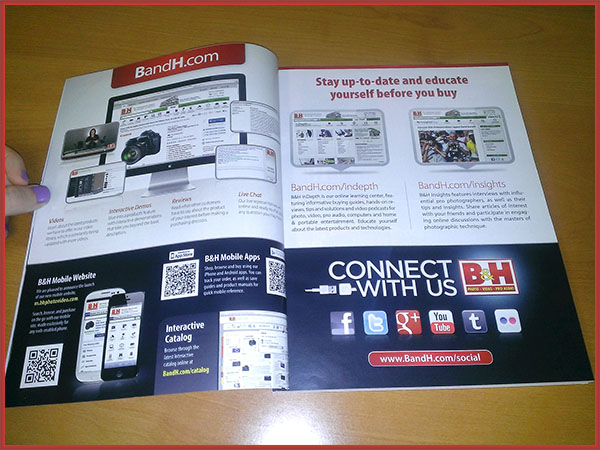
Most marketers miss the mark when it comes to bridging the gap between the virtual and physical worlds. B & H nails this by putting their online presence front and center in several places. The 4th and 5th pages are entirely devoted to promoting the B & H website, apps, and social media communities. There are a couple of reasons why this layout rocks. The upper left hand side of page 4 explains useful features on the B & H website, which actually adds value for users by showing them new ways to engage with the site. I personally love livechat for product support as well as inquires, so this really draws me in. Underneath this section, there are several QR codes that direct users to mobile friendly URLs. I can’t stress this enough: either link QR codes to mobile websites or don’t use them at all. There’s nothing more frustrating for consumers than scanning a QR code only to arrive on a desktop webpage.
Page 5 encourages readers to visit specific landing pages on the B & H site, which allows for comprehensive campaign tracking through Google Analytics. I am more likely to check these pages out because they promise content that will help guide my purchasing decisions. I’m always weary of buying photography gear online for good reason. This stuff is way too expensive for me to buy on a whim. B & H clearly gets my mindset or else they wouldn’t have highlighted these sections of their site. The bottom portion of page 5 invites shoppers to join several B & H social communities or visit another landing page. The design includes a clever custom USB cable with Facebook and Twitter icons on the end pieces. I wish this creativity extended to their social media landing page, but apparently they’re a bit better with print than web design.
Grade: A+
What grade do you think the B & H catalog design deserves? Tell us in the comments below!