Since April is National Card and Lettering Writing Month, let’s talk corporate letterhead design. After all, business letters and branded greeting cards show your clients you care on a personal level. You might not want to hand write professional correspondence unless you have near perfect penmanship, but you can sign letters in ink to maintain the human feel.
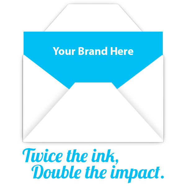
Twice the ink, double the artwork impact
Most of the time, our clients go for our 1 or 2 color letterhead printing service. Restricting the design to 1 or 2 Pantone spot colors will definitely save you some cash and give you a clean look. Still, I can’t help but think some brands miss out on the opportunity to really stand out with full color double sided artwork. Even a monochrome stationary design with artwork on the back makes a huge difference. As my graphic designer friend Matthew Price of Octopus Creative said:
“A lot of people forget letterhead design can be double sided. Always a good way to make an impact straight out of the envelope!”
I think the Octopus is really onto something, and I’ll show you what I mean in a minute. Before I get to the eye catching examples, do me a favor and close your eyes for a second (well, close them after you finish reading my thought experiment instructions). Picture yourself getting a piece of mail from a company you’re working with. You immediately recognize the company logo on the envelope, so you break the seal. You’re expecting to see a plain old boring white letter. Instead the first thing you see when you open the envelope is a burst of color that’s consistent with the brand’s identity. Do you think you’re going to remember this letter and the brand more than a competitor who sends a generic piece of paper?
I’ll go ahead and answer that question for you with an ABSO-FREAKIN-LUTELY!
Double sided letterhead design inspiration
Hopefully you understand why I’m making such a big deal about truly custom letterhead. I will warn you that designing two sided letterhead isn’t a job for rookies. Printing on the back side of the paper is especially tricky because of our process, hence why we only offer this option on our full color product. We print on uncoated (offset) 70 lb. paper. Uncoated means the fibers absorb a lot of ink, so dark colors that cover the back of the paper will show through. Coated paper, such as 100 lb. gloss paper, doesn’t have this problem because the ink actually sits on top of the surface coating instead of being absorbed by the fibers. For the sake of readability, we suggest using light colors on the back, preferably at about 7% transparency (opacity). The 7% rule applies to large background images on the front side as well because bold graphics will overpower the text of what you’re writing.
Ok, consider that your only warning—back to the fun stuff! Visuals always drive the point across, so let’s take a look at some brilliant two sided business stationary examples to fuel your artistic fire.
Solid color with inverted logo
Source: http://lahore.olx.com.pk/offset-printing-visiting-cards-brochures-letter-pad-printing-flex-printing-iid-549250188
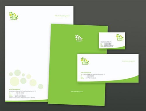
The fresh green splash on the back gives this design a carefree vibe. The logo works well in white and the paper can be folded so that the logo is the first thing the recipient sees when he or she opens the matching custom envelope.
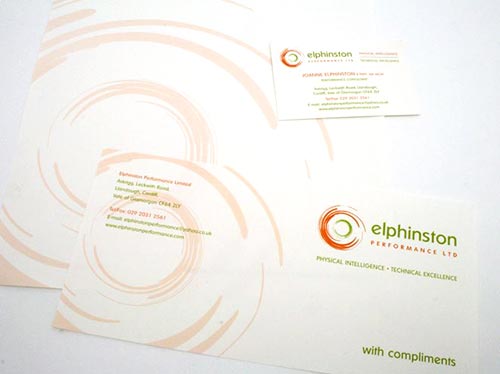
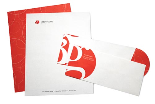
Simple vector pattern
See the branding project on Octopus-Creative.co.uk
See, I told you Mr. Octopus knew his stuff! He designed this beautiful logo and stationary for Elphinston Performance, a physiotherapy clinic that specializes in pediatric diseases. He used the already abstract brand moniker from the logo in a soft yet coordinated color to create an appealing pattern on the reverse side. Well done, Matthew!
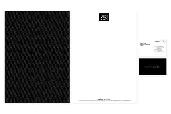
Spot AQ
Source: https://www.behance.net/gallery/Sophie-Cox-Shoes/5020917
Printed effects are rare in the world of corporate stationary. Spot AQ (partial aqueous coating) projects usually involve business cards, presentation folders, brochures, etc. If you have a basic pattern with a dark color design, spot AQ adds a unique shine as well as a tactile element to your marketing materials. Note: spot AQ requires thicker paper (80 lb. or heavier) due to the application process. Spot AQ can be used on lighter colors or white backgrounds, although it will not be as noticeable unless you move the paper near a light source.
Note: Spot AQ gives the same appearence as Spot UV; however, UV coating only works on card stock as opposed to paper.
Textured linen stationary
Source: http://teksoftprint.com.au/printing-product/colour-printing
I wish this image showed the paper up close! Oh well, you’ll just have to imagine how much the fine linen texture enhances this bright, modern pattern on the back of this otherwise minimalist design.