We get a lot of questions about banner design from the small biz community. Most of the time, we hear from business owners who get the concept, but aren’t sure what to put on these mini-billboards. This is one of the reasons why we recommend working with a professional designer on these types of projects. An experienced graphic artist will be able to create exactly what you need in a timely manner. Still, you should have ideas in mind before you commission your designer of choice. Creatives can’t read your mind, so you need to be able to articulate your campaign goals.
5 Vinyl Banner Design Tips
The list below contains 5 key components to effective banners in order of importance.
- Layout– Layout is the kind of word you may expect to hear from a web designer, but composition also plays a big role in print media. Your banner needs to be arranged in way that attracts attention and gets your point across. If you’re planning to use your banner outside to bring in foot traffic from the street, then you only have a few split seconds to impress. We recommend placing the strongest images towards the center of the piece to avoid distraction. When it comes to banners, clutter is your worst enemy. In fact, consider spitting your banner into two pieces to be displayed side by side as this gives you more space to work with.
- Banner Text– You’ve probably heard the phrase, “Keep it simple, stupid!” more times than you care to remember. At the risk of sounding repetitive, well, trim the fat till you’re down to nothing but bare bones copy. What does that mean in plain English? First off, don’t try to promote more than 1 thing in a single banner. The golden rule of banner advertising is 1 banner, 1 message. The message could be that you’re having a grand opening event, announcing a sale, or introducing a new product. It doesn’t really matter as long as you define a singular campaign objective. Ask yourself what you want people to do when they see your banner. Make this into a newspaper type headline, and then reduce the text into an ultra-compact, action oriented package. Don’t be afraid to spell things out for your audience. A banner that says, “Grand Opening, Say Hello!” will get more traction than a mere “Grand Opening!” announcement with no call to action.
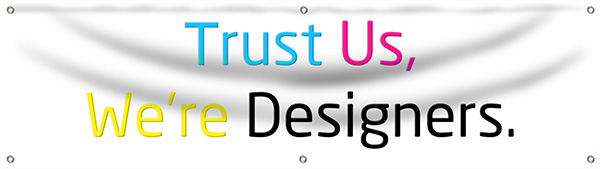
- Typography– If this word conjures up visions of pretentious art students sipping expensive lattes, resist the urge to tune me out. Reason being, typography will deliver the ROI you’re after. Choose your fonts wisely, and pay attention to the finer textual details. Earlier we mentioned composition, which applies to text spacing, size, and punctuation (or lack thereof). Recommended banner fonts include Helvetica, Veranda, Lead Gothic, Old Sans Black, and Trebuchet MS. We don’t want to stifle your creativity, but script fonts rarely translate well on vinyl banners.
- Identifies– This is a fancy way of referring to the stuff that pertains to your brand, such as the company name, logo, website, etc. It’s up to you how much contact information you put on a banner, but don’t try to cram everything in (see banner text section). A good rule of thumb is to ask yourself whether or not the identifier relates to your call to action. Are you trying to get people into your store? Your logo will serve this purpose more than your web address. Save your URL, phone number, and other contact info for a networking convention banner.
- Color Choice and Contrast– This might sound odd because color is probably the first thing that comes to mind when you think about design. It’s last on our list because color often gets in the way of other considerations in the design process. Colors are very easy to change in any graphics program, so don’t spend too much time stressing over shades until everything else is in place. Color selection should be your final turn on the road to the printing press. When you’re picking banner colors, go for bold contrast between the text, images, and background. Since we’re discussing small biz marketing, it may be best to stick to a 2 color banner. Red on white, black on white, or blue and white will make your message stronger and won’t cause eye strain.