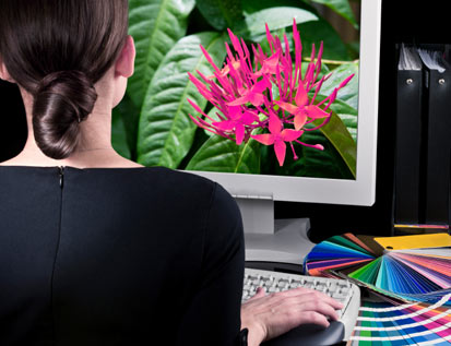
Our Canvas Photo Print Giveaway is in full swing, and we’re excited to connect with some truly talented photographers. All this photography talk got us thinking about the differences between print and digital media. This generation of photographers and designers may not be as familiar with photo editing for print projects. For the seasoned veterans among us, it never hurts to get a quick refresher on Photoshop print specs.
Commercial Printing Optimization Cheat Sheet
1. DPI vs PPI – You’ve probably heard that print pieces need to be set at 300 dpi instead of the normal 72 dpi for the web. DPI stands for “dots per inch,” which refers to the way printers reproduce an image. Pixels and dots are different measurements, and high DPI means large image size. Images that also contain text should be set at 400 dpi for the best quality.
2. CMYK Color vs RBG– Web images use RBG color (Red Blue Green) whereas print settings are in CMYK (Cyan, Magenta, Yellow, Black). CMYK lacks some of the RBG editing capabilities, but you can always edit in RBG mode and convert to CMYK when you’re done. In fact, editing in RBG may improve color brightness and vividness. If you want to check your work in CMYK mode during editing, view a proof in CMYK.
3. Contrast, Saturation, and Sharpening – There’s a tendency for photographers to overcorrect images. Minor adjustments to the white balance and exposure are ok, but avoid spending too much time trying to create a perfect picture. Contrast is an exception to this rule. Apply contrast to the entire image, and then go back to adjust specific areas. Increasing saturation to about 5- 15% compensates for the flatter colors offset printing may produce. Sharpening the photo gives it a crisp look when used in moderation.
4. Lightening – This deserves its own section because many photographers loathe overexposure. When preparing pictures for offset printing, you will want to lighten an image more than you normally would to counteract the dot grain effect.
5. Scale – Photos should be scaled to fit the size of the paper or other type of document. As in graphic design, always scale down. Stretching or otherwise up scaling the photo will cause distortion. That means you have to start with a big image to achieve optimum results.
Prepress Proofing
As a photographer, your reputation depends on the caliber of your work. For this reason, you need to be extra careful to proof your images before sending them off to the printing company. Try printing the picture from your home computer first to get an idea of how it looks on paper. Your monitor will display colors in ways that may not be true to the printed version of an image. Don’t send an image to print until you’re completely satisfied with its appearance. Be sure to request a proof from your printer, too. This may cost extra, but it can save you the hassle of having to reprint the project.
What are your favorite prepress tips and tricks? Share your knowledge with our design community! And don’t be afraid to mention mistakes you made and what you learned from them.