Hello inkheads and a very happy Friday to all of you! Anybody who follows us on Twitter knows about my penchant for alliterations, but that title probably raised an eyebrow regardless. No, I’m not trying to get into the Guinness Book of World Records for most uses of the word print in a single blog post—the repetitive diction serves a purpose.
Let me rephrase the title so you’ll see what I’m getting at:
Always print out your designs at home or the office before you send them to your commercial printer!
Note: hopefully when you see the words commercial printer, you think of PrintFirm, although this applies to every printing company.
This pro tip comes straight from our CEO, Nick. You see a lot of orders that end up in our claims department have file issues that could’ve been corrected beforehand with prior printing! I’m hoping you’ll hear Nick’s advice in this blog post instead of on the other end of an angry phone call because it could save you time, frustration, and money.
In fact, I’m personally grateful for Nick’s suggestion as it’s prevented me from making potentially costly rookie mistakes. Remember the print geek you see before you started out the same way you did—with no prior printing experience. Before I started working here, I’d only designed images for the web. Naturally, I shifted my gears towards CMYK projects after a couple of months. The first time I sat down to design a label for a client, Nick’s words rang in my ears as soon as I hit Ctrl + S in Illustrator. I stared at my screen and debated whether or not I needed to physically print a copy. And then I imagined the look of disappointment on Nick’s face along with my client’s rage as I tried to talk my way out of an inky disaster. Lo and behold, printing the label allowed me to correct artwork that would’ve been way off as far as the graphic placement in relation to the product.
6 Design elements to inspect with your home printer
With any luck my near death experience convinced you to try the paper method of prepress prep. Here’s what you need to watch out for when you’re giving your designs the final looksee before you send your files off to the presses.
Text size- I can’t count how many times I’ve heard people complain that they can’t read the contact information on their business card. Usually their text appears large enough on screen, especially since they’re looking at the artwork at 100% view in Photoshop, Illustrator, or InDesign. The trouble is that 100% on your monitor is way bigger than the actual product size. That’s why printing out your business card works wonders! You’ll be able to see a true to life 2″ x 3.5″ or whatever size card and gauge the readability of your text. Please keep in mind that we recommend at least 8pt text, yet you’re probably better off with 12 or 14 pt.
Image proportion/resolution- Nothing ruins an otherwise lovely brochure as quickly as pixelated photos. Image quality can be tough to gauge on your monitor alone; fortunately printing a copy will give you an accurate idea of the way your images will appear on the finished product. Proportion is another common image problem. You want your design to be balanced with a clear hierarchy of information in your layout. You may not notice small size discrepancies on your laptop, though. Trust me, these things will be crystal clear on paper.
Check for contrast- Color gets quite tricky here in CMYland. Lots of variables come into play, and your best bet would be to calibrate your monitor. Aside from color matching, contrast would be a widespread pain point. Without enough contrast, your artwork may blend together to the point where it’s no longer legible! Print out your own copy and inspect text or other prominent details to ensure easy comprehension. You might not find this as useful for plastic business cards due to the lack of white ink, so keep your material in mind.
Edit spelling and grammatical mistakes- Ok, you’d be surprised how often typos and other careless errors result in reprints. PROOFREAD YOUR WORK!!!! Seriously, never expect anyone else to fix your spelling because nobody can read your mind!
Orientation – This one’s a dilly of a pickle. Let’s start with what I mean by orientation otherwise known as format or layout. Basically, we’re talking about the way your design elements are arranged on the page. Without getting too technical, the issue I described earlier in my label story relates to orientation. The label served as product packaging for a candy bar, so the graphics needed to appear in the right place or else customers wouldn’t be able to read it in a retail display. To get the positioning down, I had to print the label out at home and physically wrap the paper around a sample chocolate bar.
Aside from testing your mockup, you also have to contend with the way our machines rotate your artwork during the printing process. It’s tough to explain this without being able to demonstrate; the diagram below makes more sense than my ramblings:
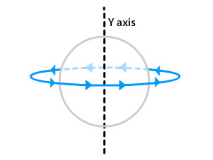
Hold your double sided artwork mockup up facing front, and then turn it to the right to reveal the back side. Is your artwork still correct? If not, you may want to crack open the Creative Cloud again.
Focus on folds- My label story also illustrates the trouble with folds, though not as directly as say, a trifold brochure design. My label didn’t have to be folded professionally; nevertheless, the way it wrapped around the candy affected the orientation of my artwork. It’s always wise to create separate guides to account for fold lines in your graphics program of choice, and print the mock up to double check your work.
Got questions about anything in the above list? Ask away in the comments below. Until next time, happy printing!