Before I get started with a fully fledged geek out, I’d like to thank my friend and printspiration Company Folders CEO Vladimir Gendelman for this gorgeous gift. Vladimir, being his thoughtful self, remembered a comment I made months ago about my burning desire for a copy of the printtastic Print Handbook. He kindly sent me a copy of this priceless piece of design mastery along with the handwritten note below:
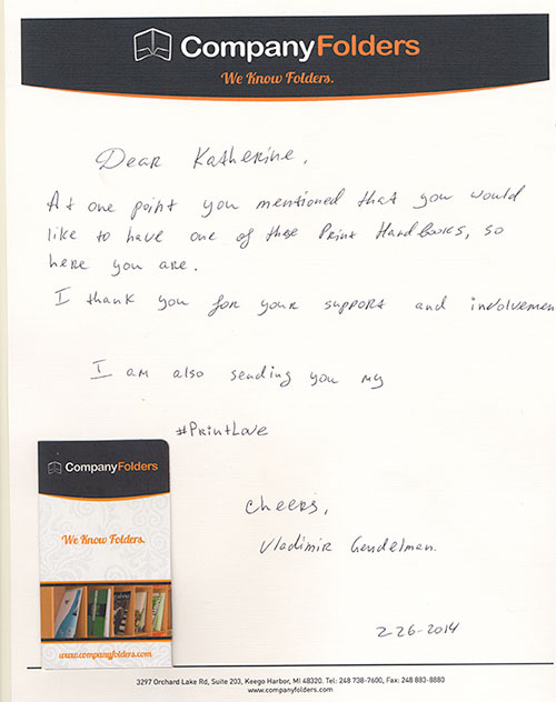
(On a side note, wow, talk about great branding! Everything from the mailing envelope to this linen letterhead sends the same message about the Company Folders mission. The folded business card even looks like a tiny presentation folder.)
THANK YOU Vladimir for the #PrintLove. I shall treasure this present forever. I think you should help me thank Vladimir for his generosity by following his brand on Twitter:
Why #Marketing With #Print Is Greener Than You Think via @MarketingProfs http://t.co/I1sL6EkbEn @MProfsWire @Veronica_Jarski
— Company Folders (@CompanyFolders) February 19, 2014
The Print Handbook Review: a printer provider’s perspective
Now let’s get to thefun stuff. I’m fairly certain Vladimir gifted me The Print Handbook because of my passion for ink & design. Indeed the book serves as a go to guide or cheat sheet for creative professionals. It should be required reading for web designers as far as I’m concerned. Those of us on the CMYK side will find the information useful and the design captivating. But I’ve found that many web designers don’t know the basics for print projects, and that often leads to costly mistakes for their clients. For this reason, I feel the print handbook should be incorporated into every college curriculum.
That said, I’m not as well versed in the technical side of things as other members of our staff. I didn’t want to go gaga over my gift without properly evaluating the guide’s utility. So I thought it would be fun to review the book from our company’s point of view.
I passed the orange magic around the office for feedback; as soon as my co-workers laid eyes on the Pantone perfection, I feared for its safe return. I sensed their jealously as they caressed the 300gsm Tangerine Keaykolour cover.
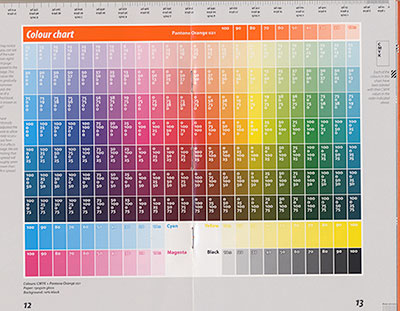
Rita, our prepress tech, fell victim to its beauty as she gushed over the whole book. A designer at heart, she found herself mesmerized by the color chart centerfold:
Luckily I managed to wrestle the book back out of her clutches without too much of a struggle.
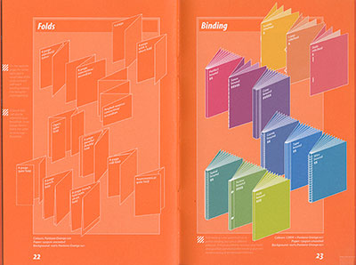
Our CEO Nick did his best to inspect the guide for accuracy. He found most of the details spot on, although he wondered whether or not some of the terminology reflected regional differences. I mentioned that The Media Collective (the publishers) are based in the UK, which explains why they kept misspelling the word color. Anyway, the section on folds refers to a 6 page brochure as a concertia/accordion. Nick said we call it a Z fold because of the shape. I did my own investigating and found that both terms are used interchangeability. That means they’re both correct, although the Z fold may be more common here in the US.
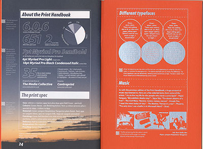
Our operations manager Alex offered aesthetic criticism. He felt that the text in foil was very difficult to read aside from the front cover. He blamed this on 2 things: the text size and the foil stamping process. He believes the foil effect put form over function considering the book’s small size. Personally I didn’t have a hard time reading the words, although I can see where others might get irritated. Older designers and those with vision problems will need to bust out the glasses to read the side notes.
Our Grade: A+!
Well, maybe I should say my grade. I don’t care what anyone else thinks—I freaking LOVE this book. Here’s a nice video review you can watch to justify understand my enthusiasm:
FPO: The Print Handbook from UnderConsideration on Vimeo.
What we would add to the book of print design knowledge
I reached out to The Print Handbook Facebook page immediately to sing the book’s praises. Since we’re a print shop, the admin asked if we thought they should add anything to the upcoming 3rd addition. We thought of a few software specific issues, such as flattening transparencies in Illustrator. But the book advocates for InDesign as the preferred print design tool. It would be helpful to explain offset vs. digital, particularly in the context of color matching. Speaking of color, monitor calibration would be another helpful tidbit for newbies. We often run into trouble when designers don’t realize that the colors on their screens aren’t the same as the final printed product. And just for good measure, it would be wise to cover the basics as far as color contrast and text size. This is a HUGE issue with business cards. Color contrast is your friend, and don’t even think about less than 8pt. text on a business card.