Are you still using dramatic drop shadows and garish gradients on your website? What about your print marketing materials? There’s no accounting for taste, but I welcome the return to simple graphics with minimal accents. The designers in the community are probably already sick of seeing this topic on the big creative hubs, although the concept may be new to other readers. The following is an overview of flat design and how you can incorporate this style to keep your brand feeling fresh.
What is Flat Design?
The word “flat” in this context refers to designs that are essentially made to look 2 dimensional i.e. free of unnecessary elements or effects, such as gloss, texture, and bevels. A completely flat piece will avoid the layer styles features in Photoshop entirely.
Flat Style Vs. Skeumorphism
Flat design gives off a completely different vibe from the Skeumorphic look of outdated Apple products. Maybe that’s why I love it so much. Skeumorphism aka realism attempts to make graphics on a screen or in print look similar to the way they appear in the real world with lots of shading and whatnot. Skeumorphism isn’t just about enhanced elements, though. Almost everyone uses an envelope of some kind to represent email because that’s a universally understood symbol for correspondence. Still, Skeumorphic design took a turn towards the ridiculous with overdone effects that bear little resemblance to objects on planet Earth. In this sense, flat design really represents a return to the minimalist aesthetic, something Steve Jobs always advocated despite his preference for cartoonish icons. Many credit Apple’s main rival Microsoft for the recent flat revival. When Microsoft released Windows 8 last year, the company debued a new logo with a look Apple ended up adopting for the iOS7 interface :

Yep, the brand that built a fortune off the creative industries took design cues from its supposedly bland competitor in the stiff suit. Oh, the irony.
Tips for Professional Printing with a Flat Look
Pure flat was all the rage in the beginning of 2013, but now we’re seeing designers strive for a balance or hybrid approach. It’s entirely possible to pull off a completely flat look for a wide variety of print pieces from business cards to brochures, posters, and trading cards. There are lots of great examples on the web for your inspiration, but here are a few of my favorites. Each one illustrates an important lesson about adapting your minimalist artwork for print projects.
Use Bold Colors and Soft Shading
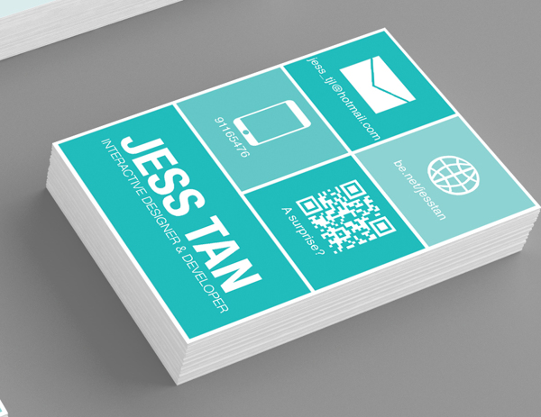
This business card is really only two colors, white and teal. But there are different shades of teal going on to create a nice gentle contrast. The results make the message easy to understand within seconds due to the lack of distractions.
Add Depth with Long Shadows
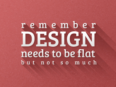
Long shadows are a way of mimicking Mother Nature and calling attention to the focal points of your images. They’re usually positioned at a 45 degree angle; to keep this effect in the confines of flat style, maintain sharp edges and ditch the fade or any other attempt at realism. These days designers are adding long shadows mostly to icons, but I see no reason why this trend should apply to such as limited range of work.
Typography Matters More than Ever
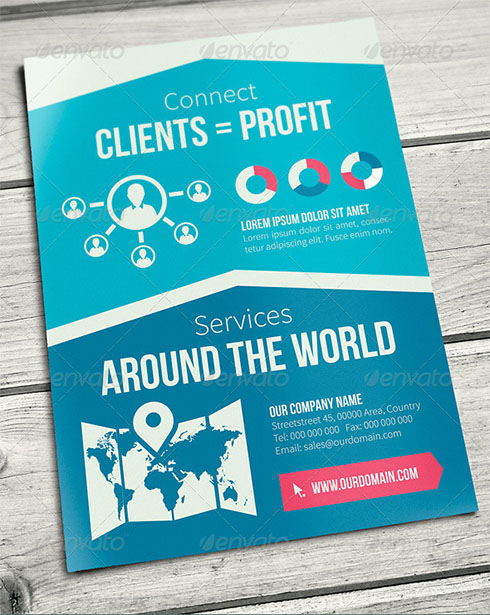
This flat brochure design would be perfect for an agency with a similar website for consistent branding. The template also shows an effective use of strong typography with clear headings and subheadings for emphasis as well as content separation.
Hopefully this brief introduction got your creative juices flowing. I know I’ve been inspired to bring the flatness to my personal business card design. Are you forsaking Skeumorphism for the flat side? Tell us what your brand’s doing with flat design in the comments below!