5 Tips to Help You Get the Logo of Your Dreams | PrintFirm.com

Guest Post by

Logo Design Communication
Image credit: Bazstyle | Photography on Flickr

At first glance, hiring someone to come up with a logo design for your business may seem like a piece of cake. All you need to do is find a graphic designer, tell them to do their magic, and you’re all set, right?

Not quite.

For logo design projects, you need to recognize that your graphic designer can’t do all the work. Sure, they can take care of the technical stuff, but as the client, you’ll have to come up with a clear vision and you need to find a way to effectively communicate that to your designer.

The fact is most of the work that you need to put into the project will happen BEFORE you even officially hire someone. Below are a few things that you need to take care of prior to getting on the phone with a graphic designer:

How to Communicate With Graphic Designers

  • Define your business – Be clear about how you want to come across. What is your business all about and what impression do you want to give customers? What sets you apart from the competition? Having a clear logo vision starts with these questions, so be sure you have this first step covered even before searching for a graphic designer.
  • Know what you want in a logo – Make a list of things that you want and don’t want in your logo. This could include colors as well as specific design elements (i.e. do you want your logo to be boxy, soft, etc). You should also start thinking about the type of logo that you’d like to have. Do you want your business name spelled out (think Google or Visa) or would you prefer an image or symbol in your logo instead? (Think Toyota or Apple.) Not sure about what you want? Check out your competition. Look at companies that offer similar products or services and determine what you like or dislike about their logos. Be sure to bookmark the ones that you like for easy access. Knowing these things beforehand will make communication with your designer immensely easier and will increase the chances of you getting the logo you want without too much back and forth and revisions.
  • Know your customers – It’s great that you know what YOU want, but before you move forward, make sure that your customers are on board with your vision as well. After all, they are the ones you’re trying to sell to. Do a survey with your customers (or with people that belong in your target demographic) and ask them what they think about your current logo. If you don’t have one yet, show them logos from similar businesses and gather their opinions.

Post-Production Communication

Once you hire someone…

Now that you already have a clear, customer-approved vision of what you want in your logo, it’s time to communicate it with your graphic designer. Here are a couple of tips to help make that process as smooth as possible:

  • Show, don’t tell – Remember those logos that you bookmarked? They will come in very handy in this part of the design process. Always be as visual as you can when communicating with your designer. You won’t really be able to put your entire vision into words, so you need to let other designs do the talking. Show them the other logos and specify the things about them that you like. Use them to show your designer the particular color shade that you’re looking for, the logo “feel” that you want to have, etc.
  • Provide detailed comments and feedback – Not 100% sold on the logos that your graphic designer came up with? Be sure to break it down for them. When providing feedback, specify the things that you’d like to keep and the aspects that you want to change. Again, use images to illustrate your point whenever possible.

Francesca StAna

Author Bio: Francesca StaAna is from LocalPages, a small business directory that helps consumers find and connect with local businesses. Connect with her on Google Plus.

Business Card Design Inspiration for Lawyers | PrintFirm.com

Law firms are notorious for abysmal marketing efforts. The legal profession tends to fear change, and that manifests as a struggle to keep pace with contemporary technology. Now I’m not simply perpetuating a baseless stereotype; I speak from personal experience. During an interview with a law firm, the topic of presentations came up. The interviewer asked about my PowerPoint skills, and I stated that I prefer Photoshop for creating marketing materials, but would use PowerPoint when pressed for time. His response says it all: “You can use Photoshop for presentations? Isn’t that for image editing?”

There just aren’t enough face palms for that question. Still, it explains why most attorneys’ business cards are about as imaginative as a “Got Milk” parody. The lack of creativity certainly reflects the conservative nature of the field, but that’s no excuse in my book. That’s what graphic designers are for, right? Perhaps lawyers are afraid to step outside the square because of a perceived compromise in terms of credibility. This is understandable on some level; attorneys worked very hard to earn that title, and need to be taken seriously by prospective clients as well as their stodgier peers. Point taken, but that doesn’t mean attorneys can’t find an appropriate balance between stuffy and edgy. The examples below are professional without being so boring.


Creative Lawyer Business Cards

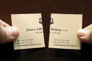
Divorce Lawyer Business Card

Image Source

While there’s nothing special about the overall design, the split in the center makes this card perfect for a divorce lawyer.

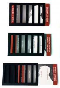
Criminal Defense Attorney Business Card

Image Source

No one wants to be behind bars, and this criminal defense attorney card captures that feeling visually.

milka-business-card

Image Source

Finally, a family law practicioner with some style!


The fact that we only found a handful of examples speaks volumes about this problem’s prevalence. Attorneys, we urge you to step outside of your comfort zones when it comes to your networking tools. Business cards are relatively inexpensive, so financial concerns really shouldn’t be an issue. Try printing a small batch of experimental cards to test the waters. We assure you that a unique design will get your phone ringing a lot faster than the same old blasé stuff you encounter at every Bar Association mixer.

Community Sound Off

Do we have any attorneys willing to take the plunge and explore the creative possibilities? Designers: do you have any suggestions for lawyers or stories about your attorney clients? Tell us in the comments below!

FAQs About Frosted Plastic Business Cards | PrintFirm.com

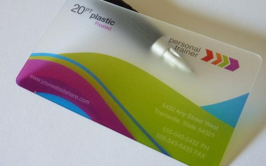
20PT-Frosted-Plastic-Business-Cards-520x325

Since we’re on the subject of business card design, we are getting lots of questions from our customers regarding our frosted business card product. We appreciate your inquiries, and wanted to respond in way that will reach everyone at once. If you don’t see your question on this list, feel free to let us know in the comments at the bottom of this page. Otherwise, our customer service department will be happy to assist you by phone or via email.

Frosted Business Card Design Questions


Q: Can You Print With White Ink?

A: No, we cannot use white ink on frosted plastic cards. Images, including logos, and text in white will print the same color as the background, which is a semi-transparent iced plastic. Please keep this in mind when you are planning your print project.

Q: How Do I Design My Artwork For Clear and Frosted Plastic?

A: You don’t need to completely change your design for a clear or frosted plastic card, unless you want to create a totally different look especially for your new networking tools. We recommend using darker colors, so those with lighter logos may want to use an alternative style card.

The most important aspect of your artwork in this case would be anything in white. As stated above, anything in white will come out the same color as the card background, which is semi-transparent plastic. That means you will be able to see through the white portion if you hold the card up to the light or hold it in your hand. This makes it difficult to read text or see images that contain white portions or accents. If you have a lot of white in your design, there are several ways to improve its visibility. First, you may want to pick a complementary color instead of using plain white. Black tends to stand out the most, but any darker shade will do. Another option would be to add a black stroke or a darker outer glow to make white text pop while still retaining its translucence.

Q: How Frosted is the Plastic?

A: There is no exact answer to this question, but it’s probably a good idea to think of the cards as slightly or lightly frosted plastic. This means that they are not absolutely clear, although they are semi-transparent.

Q: Is the Plastic as Thick as a Credit Card?

A: Not quite. While the cards are fairly thick, they are thinner than a typical credit card. Credit cards are roughly 30pt. in thickness whereas the business cards are 20pt. That means the business cards are more flexible, but they don’t have the raised lettering that often appears on credit cards. Instead, all of the graphics and lettering appear flat on the card’s surface. For size comparisons, the business cards are a bit wider than a standard credit card, and a little smaller in terms of height.

Q: What Kind of Material Do You Use?

A: The cards are printed on thick 20pt frosted plastic. They are more durable than a regular paper card, yet still lightweight.

Why Your Business Card Design Sucks | PrintFirm.com


As you all know, we’re currently running a custom business card design giveaway. We’re getting a great response from the community so far, and thought we’d run with a business card theme on the blog for a bit.

All this talk about networking tools got us thinking about what works and what fails miserably. Design is an art form, so it’s certainly subjective. But some business cards just plain suck. We’re not going to get into the finer points of design elements here; we’ll leave that to the ferocious art forums. Instead, we’re offering a brief rundown to help explain why your business card gets tossed in the trash.

Business Card Design Fails

  • Your Picture is Pixelated and/or Outdated– The point of putting your picture on a business card is to ensure facial recognition. No one is going to remember your face when you’re using a photo from your college days 20 years ago. Ditto for a low quality photo that’s too blurry to make out your mug. Use a current, clear picture, or don’t go there.
  • The Fonts are Too Small or Illegible – Business cards are supposed to present your contact information in an attractive way, not make your prospects wonder whether or not they need glasses. Tiny letters and funky fonts won’t win you any points when someone’s trying to actually reach out to you.
  • You Printed Without Proofreading – Nothing is more embarrassing than spelling or grammatical errors on printed marketing materials. If you don’t bother to edit your own business card, then you probably aren’t worth following up with. This may sound a bit harsh, but your card is an extension of you as a person and as a professional. That means a careless card indicates that you don’t care enough to do your best. If you don’t care, why should anyone else?
  • Your Card is Covered in Clutter – It’s always smart to include social networking profiles, phone numbers, email, etc. Still, don’t go overboard by listing every single social site, organization, or distinction under the sun. Focus on the platforms you update on a regular basis, and save the awards for your personal trophy room.
  • Your Job Title is Obnoxious – Social media marketers earned a reputation for inventing absurd job titles ranging from guru to wizard and alchemist. Other questionable professional titles lurk within the digital realm, including SEO. While the ridiculousness typically stems from tech professionals, I’ve seen plenty of nonsense from more traditional white collar workers. Suffice to say if your job title makes me want to gouge my eyes out, then I’ll happily send your card straight to the paper shredder.

Step Up Your Design Game

There may be other reasons why your business card sucks, especially if you decided to save a few bucks and skip the whole DESIGN part of the printing process. We’re a bit biased, but we firmly believe there’s no substitute for custom graphics. If you’re committing any of these offenses, we’re always willing to step in and clean up the mess.

What are your pet peeves when it comes to business card design? Graphic artists, what do you do when a client insists on making a sucky card? Tell us in the comments below!

Custom Shape Business Card Giveaway | PrintFirm.com

250-custom-shape-business-card-giveaway

Free Custom Shape Business Card Giveaway from PrintFirm.com


* Attorneys* Real Estate Agents* Entrepreneurs * Insurance Agents * Graphic Designers *

Here’s your chance to set yourself apart from the competition with FREE CUSTOM SHAPED BUSINESS CARDS complements of the best commercial printing company online. Our die cut business cards feature high definition full color printing for a professional edge. We use eco-friendly ink, so these are an excellent option for environmentally conscious organizations. We print on your choice of 14pt. glossy cardstock (UV front only), 14pt. glossy cardstock (UV front and back), or 16pt cardstock in a matte/satin finish. The winner will also select from the following size and shape options:


  • Leaf Shaped Card 2″ x 3.5″
  • Half Circle Shaped Card 2″ x 3.5″
  • Wink Shaped Card 2″ x 3.5″
  • Oval Shaped Card 2″ x 3.5
  • Circle Shaped Card 2″ Diameter
  • Circle Shaped Card 2.5″ Diameter


How To Enter

Get your cards ready and enter today! Here are the official contest details:

PrintFirm Custom Shape Business Card Giveaway


Giveaway Starts on Monday, March 11th, 2013 and Ends on Monday, March 25th, 2013


1 Lucky WINNER Will be Randomly Chosen by Random.org at 12pm on 3/25/2013


Prize Details


250 Free Custom Shape Business Cards


Shape and Size: Winner’s Choice


Business Card Finish: Glossy or Matte


10 Business Days Turnaround


Complementary Shipping


Up to $90 Value


Limit 1 Per Entry Per Person


Winner Must Provide Print Ready Artwork! If Artwork is not Available, PrintFirm Will Create a Custom Design for Only $50 (50% Regular Custom Design Price).


Please note: Winner Must Respond to Notification Email Within 48 Hours Or Another Winner Will Be Selected!


Best of luck and may the best networker win!

a Rafflecopter giveaway

As seen on Hypersweep.com!

Business Cards: How to Improve Your Bottom Line for Pennies a Day

Guest Post by

full color business cards

One of the most powerful – and least expensive – weapons in your advertising arsenal is your business card. Compared to the cost of a classified ad, a display ad, a billboard, or a television commercial, the economical business card packs a lot of punch.

Today, effective advertising is imperative. It can be the tipping point between success and failure, and the image that a company projects is an important element in sustaining ongoing success.
Business cards are an important tool for making a positive first impression, not only by the person handing out the cards, but also by highlighting the services that a company provides.

I learned about “first impressions” from my Dad. When I was a kid, during my summer vacations from school, my Dad always had me sweep the parking lot of his business before he ever opened the doors. On a hot summer day, that parking lot looked like a football field in the eyes of a ten year-old, but it was even bigger to my Dad.

One day I asked him why I had to sweep the parking lot and he said, “Our parking lot is the first thing that our customers see. They form an opinion of us and our business when they see the condition of our property. If our parking lot is dirty, or littered with trash, they may decide to go somewhere else. A clean parking is our advertisement that the inside of our business is also clean.”

Business cards are the “parking lot” that potential clients see, before ever stepping foot into the company’s building, or clicking on the link to their web site. These little cards make a statement in the business world, and as a result, their potential market value is high.

And be aware that the amount and type of information that can now be included on business cards has expanded, increasing the potential market value even higher.

Many people believe that it is important to put a picture on your business card. It could be your picture, a picture of your product, or a combination of both. Studies have shown that picture cards get attention, and that people are more likely to hold on to a business card with a photo on it.

The use of taglines, one-sentence benefit statements that can enhance business image and help sell business services, is a popular feature.

One of the things that I’ve always done with my business cards is include a hand written, special offer on the back. Be creative with this idea. One of my most effective offers is a 25% discount on the next purchase with the referral of a new client. People love to believe that they’re getting something for nothing.

The look of your business card is a critical part of your overall marketing scheme. You don’t take unnecessary risks with your bottom line, so why endanger it with a poorly designed business card? Enlist the help of a design professional to make sure that your first impression is sterling, and use your time doing what you do best – selling your product or service. A poorly designed business card is a sure sign to potential customers that your business is second-rate.

###

Thomas Sullivan Freelance writerAbout the Author: is a freelance copywriter and Internet Research Specialist. He has authored multiple landing pages for web sites, along with blog posts for several on-line and traditional businesses. Learn more about Tom on LinkedIn and Facebook.

Canvas Photo Print Contest Winner Announcement | PrintFirm.com

Today is March 7th, which means our Canvas Photo Print Giveaway ended at 12pm! We thank everyone who participated in this event, especially those who took the time to share their photos on our Facebook page. Before we announce the big winner, we’d like to give a special shout out to the following Facebook fans:

Photographer Tony Schock of GS Memorymaker Photography
Photographer Karimelly of Karimelly Makeup and Photography
Culinary Artist Michele Emeterio of Piece of Mine Catering
Photographer Velicia A Mackey of Ve MacKay Photography
And the owner at Deusprovidebit Hats

We enjoyed getting to know all of you, and hope you’ll continue to be a part of the PrintFirm community.

PrintFirm Online Giveaway Winner

Without further ado, here’s our lucky winner:

PrintFirm Canvas photo print winner

Congratulations Deanna Time! As you know, no one had to upload a photo in order to enter the contest. But Deanna was kind enough to share the following photo of the newest member of her family, Day-Z on our Facebook page! Deanna rescued Day-Z from a local animal shelter. After 4 adoptions, we’re happy to say Day-Z found her forever home with the Time family.

Day-Z PrintFirm Canvas Photo Contest Winner
Congrats to Day-Z and Her New Family!

We think Day-Z will look wonderful on a canvas, or anything else for that matter.

To everyone else, we’re going to kick off our next giveaway very soon. Stay tuned for more chances to win fun freebies from the best online printing company!

Top 5 Don’ts For Logo Design | PrintFirm.com

logo-design-wrong-06

Logo Design Mishaps


A while back we posted the top 5 logo design tips for small businesses. This time around, we’re tackling the biggest logo design mistakes as a warning to small business owners on the verge of disaster. Suffice to say that you should steer clear of these common faux pas unless you’re writing a book about rebranding failures.

  • Don’t Be Trendy – You want your logo to stand out, not follow the pack. Besides, trends come and go; your logo design needs to stay consistent for several years, even decades. Whatever’s in style now won’t be popular 5 years from now. For instance, the super glossy fad gave way to the flat design or minimalism craze. Now all those companies with ultraviolet logos are stuck scrambling for the opposite end of the spectrum. Avoid the trap of getting stuck with an outdated design cliché by going for a classic look.
  • Don’t Focus on Color – Yes, you read that correctly. Color is definitely key, but color selection should be one of the finishing touches. Focusing on color too much in the concept stages often delays the creative process. It’s best to start with plain black and white, and fill in the rest once you pick a winner. As soon as you have a concept you like, you’ll be able to sample it in different colors to your heart’s content.
  • Don’t Add A Tagline – Taglines are a fun, catchy way to sum up your mission, and it’s perfectly ok to put them alongside your logo. But taglines take up extra space and avert the eyes away from the actual logo. Taglines sometimes come off as a sales pitch, which may appear unprofessional at networking events. Plus, you might not always have room for the added text. Save your tagline as an afterthought, and make a separate set of logos with the tagline attached for marketing purposes.
  • Don’t Forget Your Customer Base – Your logo should speak to your target market. Make sure you understand your customers’ style preferences and what they want from your brand. For example, a tech company should probably go for a modern edge that appeals to a younger audience. Remember, style is a matter of taste, and you will never please everyone. Still, try to find middle ground with a design that won’t alienate the people you’re trying to attract.
  • Don’t Be Stingy – Too many small businesses focus on price, and try to save money by cutting corners. Unless you’re a graphic artist, don’t think you can get away with doing it yourself or hiring an amatuer for next to nothing. You don’t have to hire the most expensive designer on the market, but save the frugal attitude for unnecessary expenses. Your logo deserves a professional touch.

Did we leave out your logo design pet peeve? Do you have a logo horror story we can all learn from? Share your thoughts with our community in the comments beloW!

Free Vectors for St. Patrick’s Day Designs | PrintFirm.com

St. Patrick’s Day is a little over a week away, but there’s no need to panic if you don’t have all of your marketing materials ready to go. St. Paddy’s Day promotions can be very powerful in certain industries, such as restaurants and bars. This is a holiday for everyone, not just traditional Irish pubs. There are plenty of ways to weave your own wares into a festive flyer design or postcard. Own a Mexican restaurant? Throw a bright green sombrero on a Leprechaun. Got a Sushi bar? Put some chopsticks in his hands or add some shamrocks around a Bonsai tree.

Still stuck? These St. Patrick’s Day freebies will get your design gears turning!

St. Patrick’s Day Vectors Free Downloads


Glossy Shamrock

Free Shamrock Icon Vector

Click Here to Download

This shamrock icon uses subtle gloss and gradients that won’t overpower the rest of your message.

Leprechaun Hat

Leprechaun Hat Free Vector

Click Here to Download

Speaking of Leprechauns, this hat works well as a standalone symbol or as part of a larger illustration.

Beer Glass Illustrator Vector

Beer glass Illustrator Download

Click Here to Download

Break away from the usual bulky beer stein with this sleek, curvy glass for Adobe Illustrator.


PrintFirm Blog Update

On a side note, we wanted to let the community know that we’re in the process of redesigning our company blog. We’re excited to get a fresh look, and we already have a special logo for this section of our site. As a result of our digital facelift, you may experience some problems viewing this site in the near future. Please be patient as we try to improve your user experience.

Do you have any suggestions for us or free vectors to add to this collection? Let us know in the comments below.

Vocus and PrintFirm: A Twitter Tale

PrintFirm Thanks Vocus PRWeb

We interrupt your regularly scheduled informative blog post to share an awesome Twitter success story. Before I get into the details, let me give you the backstory. I’ve been involved in online marketing for a few years now, so I know a lot about promotional tools. Through trial and error, I’ve learned what tools work, and which ones are all hype. When I got my first copywriting job, I found myself writing press releases for the first time in my life. I studied Political Science in college, so I had no real journalism experience to speak of. I did a little research about the proper format, and hoped for the best. The company used Vocus aka PRWeb as a distribution service, which I’d never heard of. Submitting the release through their interface was easy enough, and the post-release analytics showed some pretty impressive results for a first timer.

By the time my second assignment rolled around, I felt pretty comfortable about the process. I wrote the release, and sent it off to my superiors for approval. Then an outside consulting firm the company hired ripped my release to shreds saying it lacked clear direction and purpose. The CEO explained their criticism, and I panicked. Fortunately, my supervisor at the time stuck up for me (thank you Peter Gregory—a true SEO artist), and we ended up publishing the original version of my release. I uploaded the copy to Vocus, and feared the worst. A few hours after the release dropped, my supervisor exclaimed, “We made the front page of Yahoo!” I was stunned. How did my little, supposedly horrible release make it all the way to such a major media outlet?

Vocus. That’s how.

I’ve been gushing over Vocus ever since, and always recommend them whenever the phrase “press release” comes up. I’ve bounced around to a few other businesses, but I never forget to follow Vocus whenever I land a gig. Of course, I’ve been with a few smaller companies who couldn’t afford to pay for PR. I didn’t care because Vocus always reminded me of one of the highlights of my young career. That release boosted my confidence, and taught me to trust my instincts when confronted with obstacles.

Naturally, following Vocus was one of the first things I did when I joined PrintFirm. I tweeted to express my appreciation for their services, and went about my business. A bit later Vocus replied to my tweet, and then followed PrintFirm. Score! That’s a big win for a social media manager, especially in the second week on the job. I quickly brushed it off, anticipating the inevitable unfollow.

Fast forward to this morning, which started out as a typical day at the office. I sat down to outline a solid 6 month marketing plan when my manager walked in, and handed me a book entitled Marketing in the Round: How to Develop an Integrated Marketing Campaign in the Digital Era. “Cool!” I said. “Do you want me read it, and give you a report?”

“Open it,” he said.

Puzzled, I flipped open the book to find a personal note from Vocus Social Media Manager Stacy Acevero thanking me for the Twitter love. Well Vocus, not only did you make my day, your response solidifies your place in our long term marketing strategy. So thank you Vocus…for everything. Now if you’ll excuse me, I have some reading to do.