Sticker Marketing Strategies | PrintFirm

Sticker Marketing StrategiesSource

As a consumer, I love stickers. Growing up around Southern California’s skateboard culture, I collected cool stickers to slap on the back of my deck. Skating stuck with me, and I never lost my affinity for these promotional items. Stickers to me express a kind of unwavering loyalty to a brand, and that’s exactly the kind of devotion you want to instill in your customers. For this reason, I think stickers work best when given as a free gift. Passing out stickers is a fun way to thank someone for placing an order or visiting a local business. Stickers are one of the least expensive forms of print advertising, but never lose site of your ROI.

Sticker Design Concepts


A successful sticker campaign requires thinking outside the box, which is why stickers are associated with guerrilla marketing tactics. There’s no need to go to advertising extremes, unless that’s your angle. But before you throw your logo on a bunch of boring bumper stickers, think about the campaign objectives. Are you building your brand identity, driving traffic to your website, or trying to boost in-store visits? The point is to let the purpose guide the design process. For a branding promotion, make sure to stay true to your color scheme. Feature your URL prominently or in an unusual way to increase direct web traffic. You may also want to consider creating a dedicated landing page with an incentive attached, such as a coupon code. Address information is important for foot traffic, although a phone number may be better in a confined space. Another option for brick and mortar businesses is to print a large version of the sticker to put on your front window. That way passersby might recognize the image they saw on a signpost down the street.

Fine Design Details


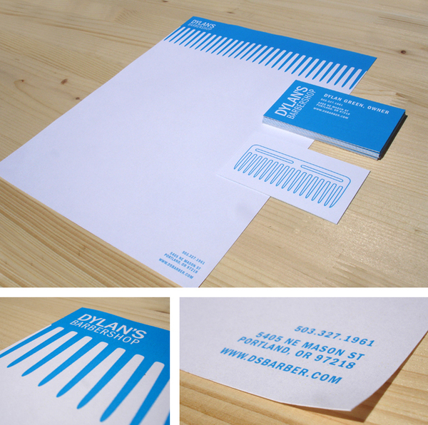
The less is more principle really applies to sticker design. Keep it simple, and consider the little details that will make the piece more effective. For example, choose a shape and size that compliments what you’re trying to accomplish. People are more likely to put a small circular sticker in a public place, which works well for branding campaigns. Adding textures or subtle vintage fading effects brings out your brand’s personality, and makes the item memorable. Just don’t go overboard; stickers should send a single message and be clutter free.

Social media integration


Custom stickers will fit nicely into your social media marketing strategy. The social sphere provides ample opportunities for connecting your digital advertising efforts to the physical world. Encourage your customers to take pictures of the stickers, and tag you in them on Instagram. You might want to use the stickers as part of a Facebook contest to see who can send in the most creative sticker photo. Another idea would be to let fans submit their own designs for a special limited edition sticker print.

Business owners: How do you use stickers in your online and offline marketing campaigns? Graphic designers: Do you have any sticker design tips to share? Tell us in the comments below!

Business Letterhead Printing and Design FAQs | PrintFirm

Custom Letterhead Design

Source

Custom stationary isn’t just for the big guys any more. Small to medium sized business owners are integrating this valuable tool into their marketing strategies for a very simple reason: professionalism. Every business wants to appear competent in the public eye, and using fancy letterhead looks a lot better than stuffing a plain piece of paper into an ordinary envelope. Are you undecided about hopping on the bandwagon? We made a list of frequently asked questions to help you make an informed decision on this investment.

Why Does My Business Need Stationary?


Although email and other forms of communication dominant client interaction, businesses should still consider company letterhead an important aspect of corporate branding. Whether you’re creating contracts, sending clients thank you notes, or addressing holiday greetings, custom stationary makes sure you never miss a branding opportunity. Smaller businesses get the added bonus of appearing larger than they really are. Branded letterhead signifies an established business presence.

What Should My Letterhead Include?


The actual letterhead design is something your in-house creative team or a graphic design firm will handle. If you don’t have anyone on hand or money for outsourcing, it’s possible to make your own materials for the time being. Your logo should definitely appear somewhere, although too many companies simply slap on a moniker and consider the project complete. The best stationary designs include logos and contact details, but present them in clever ways. Consider your target market, and ways to appeal to their preferences. As long as you stick with the principle of simplicity, your design will be distinct and effective.

How Much Does Stationary Printing Cost?


Stationary may be a bit of an indulgence, especially when you’re working under a tight budget. It’s hard to justify the expense when there are other things your business can’t live without. But letterhead printing prices aren’t as outrageous as you might think. For instance, our prices start at $75 for 1 & 2 color or $129.50 for full color letterhead. These packages will get you 250 pieces of high quality stationary. That will probably carry you pretty far, depending on how much you use snail mail. You can always save the fancy stuff for special occasions.

Do you have a question about this topic that we didn’t cover? Leave us a comment in the questions below or email marketing AT printfirm DOT com. We’d love to hear from you!

Photo Editing For Print: A Guide for Photographers | PrintFirm

prepress photo editing

Our Canvas Photo Print Giveaway is in full swing, and we’re excited to connect with some truly talented photographers. All this photography talk got us thinking about the differences between print and digital media. This generation of photographers and designers may not be as familiar with photo editing for print projects. For the seasoned veterans among us, it never hurts to get a quick refresher on Photoshop print specs.

Commercial Printing Optimization Cheat Sheet


1. DPI vs PPI – You’ve probably heard that print pieces need to be set at 300 dpi instead of the normal 72 dpi for the web. DPI stands for “dots per inch,” which refers to the way printers reproduce an image. Pixels and dots are different measurements, and high DPI means large image size. Images that also contain text should be set at 400 dpi for the best quality.

2. CMYK Color vs RBG– Web images use RBG color (Red Blue Green) whereas print settings are in CMYK (Cyan, Magenta, Yellow, Black). CMYK lacks some of the RBG editing capabilities, but you can always edit in RBG mode and convert to CMYK when you’re done. In fact, editing in RBG may improve color brightness and vividness. If you want to check your work in CMYK mode during editing, view a proof in CMYK.

3. Contrast, Saturation, and Sharpening – There’s a tendency for photographers to overcorrect images. Minor adjustments to the white balance and exposure are ok, but avoid spending too much time trying to create a perfect picture. Contrast is an exception to this rule. Apply contrast to the entire image, and then go back to adjust specific areas. Increasing saturation to about 5- 15% compensates for the flatter colors offset printing may produce. Sharpening the photo gives it a crisp look when used in moderation.

4. Lightening – This deserves its own section because many photographers loathe overexposure. When preparing pictures for offset printing, you will want to lighten an image more than you normally would to counteract the dot grain effect.

5. Scale – Photos should be scaled to fit the size of the paper or other type of document. As in graphic design, always scale down. Stretching or otherwise up scaling the photo will cause distortion. That means you have to start with a big image to achieve optimum results.

Prepress Proofing

As a photographer, your reputation depends on the caliber of your work. For this reason, you need to be extra careful to proof your images before sending them off to the printing company. Try printing the picture from your home computer first to get an idea of how it looks on paper. Your monitor will display colors in ways that may not be true to the printed version of an image. Don’t send an image to print until you’re completely satisfied with its appearance. Be sure to request a proof from your printer, too. This may cost extra, but it can save you the hassle of having to reprint the project.

What are your favorite prepress tips and tricks? Share your knowledge with our design community! And don’t be afraid to mention mistakes you made and what you learned from them.

Best Restaurant Menu Designs Los Angeles | PrintFirm

Brochure printing is a tried and true method of local consumer outreach. This strategy isn’t right for every business, but restaurants in particular usually see great results from this marketing tactic. There’s no better way to reach customers in the neighborhood than through professionally designed direct mail menus with enticing coupons to reel them in. Still, all menus are not created equal; keeping your menu engaging can be a challenge with so much stiff competition.

Our hometown of Los Angeles is well known for its fine dining options and funky mom & pop eateries. The city’s reputation attracts tons of tourists, which may boost short term business. Unfortunately, businesses can’t survive on one time visitors alone. A well designed brochure menu attracts the holy grail of customers, the people who will become your loyal base. For that reason, you really want your menu to “pop.” The brochure version of your menu should be a scaled down version of your actual layout, but try to keep the two in synch for branding purposes. We searched around to find the most creative restaurant menus to inspire your next direct mail campaign. Without further ado, here are the top pics:

Best Restaurant Menus in LA

[zooeffect AQJA3Erw_2hF]

We know there are tons of cool restaurant menus from spots across the country, and we would love for you to help us discover the cream of the crop. Restaurant owners: do you think your menu deserves recognition from our creative team? Email your suggestions to marketing AT Printfirm DOT com. Let us know what we’re missing!

Logo Design Tips for Small Business Marketing | PrintFirm

Do's of logo design

Image Source

In order to compete in the online arena, businesses have to create compelling images for their websites, social media profiles, and promotional materials. Unfortunately, small business owners usually don’t have an in-house design team to satisfy all of their graphic needs. While it’s ok to post less than stellar photos on the company Facebook page, your logo is another story. The impact of logos is up for debate, but we strongly believe in their branding power. Before you set out on a mission to design your first logo or update your image for a rebranding campaign, make sure you go in with a solid game plan. The tips below will give you plenty of food for thought and put your project on the path to success!

Top 5 Do’s For Logo Design


  • Do Use Vectors – Right now you may be thinking, “Great advice, but what the heck is a vector?” Without getting too technical, vectors are ideal for logos because they are scalable, meaning you can resize them without distorting the image. Most graphic designers use Adobe Illustrator for logos instead of Photoshop because Illustrator is vector based whereas Photoshop relies on pixels. Vectors also don’t have a built-in background, so it’s very easy to save an image with a transparent backdrop. Since logos are placed everywhere, being able to modify the size saves you the headache of trying to maintain the original image quality.
  • Do Keep It Simple – Apple CEO Steve Jobs said it best: “Simple can be harder than complex.” There’s a bad tendency in logo design to go overboard. But take a step back and think about the logos of well-known brands . Almost every big corporation represents itself with a pretty basic logo. The multi-nationals tend to shy away from multiple colors, cartoon characters, and unnecessary elements. Sure, an amazing abstract logo with tons of fancy swirls may look great on a webpage, but busy artwork may detract from your message. A smart, simple logo stays on point because there are no distractions to overwhelm the eye. Nevertheless, simple doesn’t mean bland; effective design finds a way to stay clean without being boring.
  • Do Separate Icons and Text – This sounds a little funny because lots of logos combine the two in a way that renders separation impossible. That’s fine so long as you’re working with a designer capable of pulling it off. Otherwise, put your symbols to the side, or above/below the text. There will come a time when you find yourself having to go with the text only version, so this technique helps you prepare for these situations in advance.
  • Do Think Versatile – Remember that your logo is something that may eventually end up on a button, sticker, magnet, or company uniform. You want a design for all seasons, so to speak. It’s also a good idea to sample the image in several different colors just in case you decide to change it up for a themed advertising campaign.
  • Do Consider Your Brand Image – Many of the most recognizable logos don’t really tell you anything about what the company actually does. Case in point: the infamous Nike “swoosh.” Nike sells sporting goods and apparel, but you wouldn’t be able to tell by their logo alone. Still, the curved check mark symbolizes the brand by conveying movement and achievement. Ask yourself what your brand really represents, what is your brand’s persona? If you’re having trouble with this, It may help to think of your brand as a person with an individual identity rather than as a company.

Canvas Photo Print Giveaway | Free Contest | PrintFirm.com

Free Photo Contest

Free Photography Contest from PrintFirm.com


* Photographers * iPhoneographers * Semi-pro Photographers * Hobbyists * Shutterbugs *

Here’s your chance to showcase your masterpiece with a FREE MOUNTED CANVAS PRINT complements of our professional online printing company. Our canvas printing process uses the offset method for high quality full color reproductions every time. We print on premium 17 mil. Artist Canvas paper for the best possible appearance. The winner will choose from the following six size options:

  • 12″ x 12″ Print
  • 12″ x 18″ Print
  • 12″ x 24″ Print
  • 18″ x 18″ Print
  • 18″ x 24″ Print
  • 24″ x 24″ Print


How To Enter

Pick your pic and enter today! Here are the official contest details:

PrintFirm Mounted Canvas Print Giveaway

Giveaway Starts on February 21st, 2013 and Ends on March 7th, 2013

1 Lucky WINNER Will be Randomly Chosen by Random.org at 12pm on 3/07/13

Prize Details

Free Mounted Canvas Print

Size: Winner’s Choice

17 mil. Artist Canvas With Professional 4 mil. Corrugated Plastic

7 Business Days Turnaround

Complementary Shipping

Up to $135 Value

Limit 1 Per Entry Per Person

Sorry, no image customizations beyond file resizing.

Best of luck and may the best photo win!

a Rafflecopter giveaway

This giveaway is listed at All Things Bloggy.

Guest Writers Wanted | PrintFirm.com

Gust Bloggers Wanted

PrintFirm.com is always on the lookout for awesome writers to guest post. Our site is blessed with 13 years’ worth of authority, and we won’t tarnish our outstanding reputation with poor quality copy. We’re only interested in true wordsmiths; writers and bloggers with enough talent and passion to make text jump off the page. Of course, we will return the favor by writing some content for your site as well. Do you have what it takes to meet our high standards? If you’re up for the challenge, we’d love to hear from you! First, please review the details below :

Guest Post Guidelines

  • Original Content Only – PrintFirm accepts 100% original text written by a real person, preferably someone who’s taken the time to establish Authorship (bonus points for authors with an active social presence). We will run all submissions through CopyScape and other resources, so don’t bother sending us stuff unless you’re positive it’s exclusive. Just so we’re clear, exclusive means articles written specifically for this blog, and for this blog alone. We will take the liberty of removing any content that appears elsewhere after publication on our site.
  • Links – We will be happy to link to your site in the post and promote the piece through our social media channels. But we have a strict zero spam policy; we allow 1 link per article. It’s up to you where you insert your link, but we suggest tossing it into an author bio instead of obvious anchor text.
  • Editing – Of course we will review your content prior to distribution. We won’t make any significant changes without your consent, so be sure to include all your contact information along with your submission. We understand typos and similar mistakes, but we will automatically reject anything with excessive errors, poor syntax, and bad grammar. You must have a firm grasp of the English language in order to qualify.
  • Topics – This blog covers all things printing with several notable exceptions. We also love graphic design and marketing. We’re open to nearly anything that falls under these categories, such as industry news, relevant contests, advertising tips, how-tos, design tutorials, even videos as long as they’ve been transcribed using unique text. Small business niches are encouraged to apply.

Submit Guest Blogging Proposals

Still think you can pass the test? Use the contact form below to get the ball rolling. Here’s to a long and mutually beneficial partnership. Happy blogging!

Your Name (required)

Your Email (required)

Website (required)

Your Message

St. Patrick’s Day Flyer Design Inspiration | PrintFirm.com

Cheap Flyer Printing

With Valentine’s Day out of the picture, it’s time to shift the design focus from red hearts to green shamrocks. St. Patrick’s Day may not be a major holiday, but many businesses hold themed events and promotions during the month of March. Naturally these celebrations require printing special marketing materials; flyers in particular are very popular this season. As graphic designers, it’s our job to put a fresh spin on this familiar motif. Stuck in an Irish rut? Here are some ideas to get your next project off the ground.

St. Patrick’s Day Symbols


While it’s ok to incorporate St. Paddy’s Day staples, try to use them alongside less common shapes or objects. Celtic crosses, harps, and horseshoes get the message across without appearing too cliché. Instead of using a standard leprechaun, put a green stove top pipe hat on top of an Irish Setter. Since the holiday falls in the spring time, feel free to play around with flowers, rabbits, fairies, and butterflies. The Irish flag is easy to recognize, and gives you an instant color palette to guide the layout.

Unconventional Colors

Speaking of color, green seems like the obvious choice. Still, that doesn’t mean you’re stuck with the same old emerald. Create eye-catching contrast by mixing softer pastels in with kelly green, forest, and jade. Bolder lime and pale greens add a cheerful touch; just be careful not to overdue the brighter shades as they can detract from the message. Teal is another versatile option that works well for accents or as a background color.

Fun Fonts

Font choice should never be taken lightly, especially when it comes to flyer design. Be careful with Celtic style fonts because the elegance may render the text unreadable. Choose subtler scripts to avoid this issue. Another option would be to use a flowery font for the heading followed by a simple, clean typeface for the event details. This Leprechaun Hats font strikes a good balance because it’s cute without being too elaborate.

How do you make your St. Patrick’s Day flyers stand out? What are some of your favorite design inspirations? Share your tips and tricks with our graphic design community!

Happy President’s Day From PrintFirm.com!

President's Day Printing Services

The PrintFirm.com team wishes everyone a wonderful holiday! We would like to take this opportunity to share what President’s Day means to us. This holiday marks the birthdays of Presidents Washington and Lincoln, two of the most iconic figures in U.S. history. These men continue to inspire us, and we found some interesting tidbits to share from their lesser known biographies.

George Washington Cartographer?


While Washington wasn’t a designer per say, the Revolutionary War General began his career as a surveyor and speculator. Washington sketched numerous landscapes, and his expertise certainly came in handy on the battlefield. His account of his adventures during the French and Indian War included a map showing the French presence in the Ohio territory. The publication entitled The Journal of Major George Washington is often cited as the beginning of Washington’s career as a national public figure.

Abraham Lincoln: Early Suffragist

Often glorified as a champion of civil rights, Lincoln reportedly supported women’s right to vote long before the concept became fashionable. In a letter to the editor dated June 13th, 1836, Lincoln wrote, “…I go for all sharing the privileges of the government, who assist in bearing its burthens. Consequently I go for admitting all whites to the right of suffrage, who pay taxes or bear arms, (by no means excluding females.)” (Source) Some historians doubt the validity of this document, but this statement fits within Lincoln’s belief in human equality. Although his statement applied to white women alone, his views certainly qualify as progressive for the era.

Honoring Washington and Lincoln

Marketers may honor these great men through special sales or themed promotions; such tactics appear patriotic so long as they are conducted in a tactful manner. Instead of offering rock bottom prices, we decided to express our appreciation by following their examples. Both Washington and Lincoln spent their lives pushing boundaries in relentless pursuit of success. We admire their persistence, which motivated us to renew our commitment to blogging and social media. We plan to update this blog on a daily basis, and broaden its content horizons. We hope you will join us in in this exciting venture!

How will you celebrate President’s Day? Did you print holiday flyers or give deep discounts? Tell us in the comments below!

Image credit: WordPressIntegration.com

Business Cards For Cult Classic Characters | Printfirm.com

Business cards signify professionalism, integrity, and reputation. Consequently, these iconic items have a unique place in American pop culture. Since the business card can be considered a staple of the white collar workforce, it’s not surprising that quirky creatives take up the task of designing cards for their favorite fictional characters. Naturally, most of the cards Continue reading “Business Cards For Cult Classic Characters | Printfirm.com”