Guest post by Christine Alexander
You’ve been slaving for hours to get that project design completed, and you’re just about ready to send it off to your printer. Just what is it that your print provider is looking for when they open up your files and prepare them for proofing and press?
Sizing
First and foremost, we’re checking out whether the specs you provided for quoting match that of the actual piece.
- Flat Size versus Final (folded/converted) Size
- Page Count:
If you change your page count, your price is destined to change (& possibly not in the way you hope). For example, if you have a perfect bound book you quoted at 100 pages, but reduce your page count by two – you’re going to be paying more because at a minimum you’re adding the need for an additional signature.
Remember we work most efficiently when page counts are divisible by four.
Fonts/Typefaces
I can’t stress this one enough. A lot of printers “turn-off” or clear out their fonts folders at the beginning of every job. Why? Because we don’t want to risk the chance of having a different version of your fonts used. This can cause text reflow, meaning all that time you spent making sure your document didn’t have any widowers is pointless if we try to fix it ourselves.
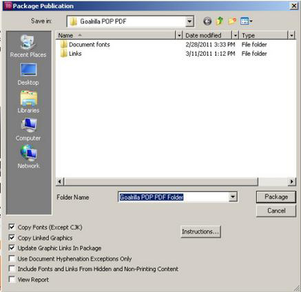
Packaging your fonts is relatively easy, too. Select “File” > “Package” in InDesign and follow the additional prompts to package all of your projects files (including images) together in one single folder.
Using the Creative Cloud fonts included in the Adobe Type Kit? Make sure you let your print provider know when submitting your files so they can turn their Type Kit on and eliminate any back and forth that might delay the processing of your print project.
Bleed
Bleed is incredibly important if you wish to have color going off the edge of your page. Improperly setting up for bleed can cause a small white border to be created when the project is cut down to final size.
Avoid risking this white margin, by making sure your bleed settings are set up to print 1/8″ and ensure all imagery/color boxes are extended to this bleed line.
Color Setup
We check to make sure that the project has been setup like the specs. If we quoted four color, but your file includes spot colors – most companies will double check with you to make sure you aren’t hoping to have that spot color printed instead of the four color process build (adding time to your project).
If you’re hoping to have specific PMS colors printed, make sure you spell this out at the time of quote and have your colors set up properly in your file.
Every print provider is different, but I also suggest setting up your special processes (dielines, embosses, foils, etc) as spot colors instead of layers. By setting it up as a spot color this allows us to simply turn the color off in our RIP without having any knock-out, and saves time by not requiring us to export multiple layers to create your special process files.
Images
In addition to checking to make sure that all linked images are actually provided, we check to make sure they are in the CMYK color mode. Just recently I had a client who did not convert images and was surprised when she saw the CMYK rendering on the proof.
Some print providers have a soft proof setting you can add to Photoshop so you can visibly see what the proof output will look like on screen. Check with your service provider to see if they can provide you with this setting. It will ultimately help you eliminate revision costs down the line when trying to hit that very specific hue of blue.
PC versus Mac Files
It is important for us to know what type of computer your project was created on because PC fonts don’t flow the same when (if they even can be) installed on a Mac. Most print shops I have been in have at least 4 Macs for every PC in their prepress department so they’re going to open your project on a Mac unless you specify otherwise. Help cut down their time and streamline your project by letting them know ahead of time.
Run-Across/Gutter Jump/Crossover
Run-across, gutter jump, crossover is the art of having a design element that prints on one pages and crosses over the gutter onto the facing page of the publication. Depending on the means of finishing, special steps need to be taken by the prepress department when laying out the imposition to ensure nothing gets lost in binding.
About the Author

Christine Alexander is the Chief Ink Geek for Dreaming in CMYK. Her experience comes from her time spent in the Metropolitan Printing Leadership Development Program where responsibilities have included prepress management, Web2Print and cross-channel campaign development, and her current role as a marketing consultant. Christine is passionate about what makes people tick and thrives on finding creative solutions that bring a brand’s story to life. Connect with Christine online on Twitter and LinkedIn.