Hello inkheads! We all know print design projects have several pain points, especially when it comes to color matching. For instance, have you ever held your freshly printed piece in your hands and wondered, “Why the heck does the black stuff look grey???”
After the initial shock dissipated, you probably questioned what the press operator was smoking while your file went into production. Or maybe you concluded that an incompetent prepress technician modified your file, and changed your artwork without your consent.
Yet, most of the time, color issues are the result of improper file formatting. Black is an easy example of this phenomenon, so let’s explore why you must adjust black color values for print and then I’ll show you how to get’er done in Photoshop, Illustrator, and InDesign.
What is plain black vs rich black?
We mentioned the difference between plain and rich black in our file requirements page, but we didn’t go into detail or explain how to manipulate color values with the popular Adobe software programs. The file specs page also discusses problems with the color blue, which I’ll save for another blog post because I don’t want to confuse you.
Rich Black only comes up in the context of print design because black always looks, well, black on your computer screen. Unfortunately, that’s not the case on paper; at least, not for backgrounds or filled objects/elements, such as a box for text, etc. In those instances, you want to go with the rich option to avoid an unsightly grey in ink. Rich black uses the following CMYK percentages:
C: 50%; M: 50%; Y: 10%; K: 100%
As opposed to plain black, which you should use for all black text:
C: 0%; M: 0%; Y: 0%; K: 100%
Reason being, you might run into trouble due to the mixture of colors contained in rich black. The extra Cyan,Magenta, and Yellow means unnecessary ink, which may result in blurry or fuzzy type. You want crisp, clear typography with no offsetting.
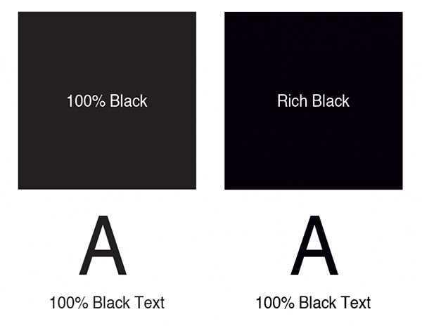
Here’s a handy graphic to illustrate the difference for you:
Other types of black
Believe it or not, we still haven’t exhausted the black possibilities. For those with super picky discriminating aesthetic tastes, you can get different tints by playing around with your color values a bit. The photographers among you will likely recognize the terms warming and cooling from photo editing/filters. Just as in image retouching, warm black adds a red tint whereas cool black creates a soft blue hue in your key. Use the CMYK values below for subtle hints of red or blue in your backgrounds. We don’t recommend anything other than plain black for your text.
Warm black
C: 0%; M: 40%; Y: 0%; K: 100%
Cool black
C: 40%; M: 0%; Y: 0%; K: 100%
The 2 types of black you should never use in print design
Now that we’ve covered the good, it’s time to delve into the ugly. And by ugly, I mean that either of these practices will get you a CMYK penalty, the printer’s equivalent of a party foul.
Default black in Photoshop
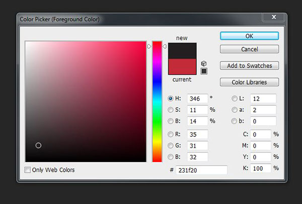
You won’t find black text issues in Illustrator or InDesign as both of these programs automatically use the plain black swatch (K 100%). AI and ID are definitely more print friendly than their pixely cousin Photoshop! To show you what I mean, I’ll need you to crack open PS for a second. Go ahead and open up a new PS document, and fill it with black. Grab your color picker, and you’ll see that Photoshop black is not exactly pure with respect to the CMYK values (75%, 68%, 67%, and 90%, respectively). As I said before, too many colors means lots of extraneous ink. Then there’s the possibility of editing an image in Photoshop to import into printed artwork with a black background in Illustrator or InDesign. The color inconsistency may force you to reprint your posters.
Solution: Always double check your black CMYK color values in Photoshop!
Registration black
Speaking of excessive color, sometimes newbies get carried away with the CMYK; they are under the mistaken impression that since black is a combination of colors, all of their CMYK values must be 100%. That would cause a serious ink overload unless our prepress department catches the mistake. Just so we’re clear, I can’t think of a single situation where you’d need to max out each color ink.
Solution: Just don’t.
How to select the right CMYK color values
By now you may feel as though you’ve got 99 ink problems, but at least black ain’t one! (Apologizes for the Jay-Z reference—I couldn’t resist!) Now let’s talk solutions to your Key woes.
Photoshop:
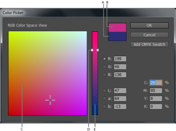
You likely figured out how to change CMYK color values from our previous default black exercise in Photoshop. Simply grab your color picker, and insert the correct values in the bottom right hand corner of the dialog box. Press ok, and you’re good to go.
Illustrator:
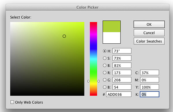
The AI procedure is almost identical to that of Photoshop. Pull up your eyedropper tool and input the proper CMYK values in the lower right hand corner of the color picker window.
InDesign:
ID isn’t quite as straight forward, yet it’s still a breeze. You have to double click on either the fill/stroke portion of the Toolbox or access the Color panel to get to the color picker. Once you get the color picker up on your screen, modify the CMYK values the same way you’d do in PS or AI.
Do you have any questions about using black in your print designs? Any funny stories from the creative trenches? Drop me a line in the comments below!
