Free Integrated Marketing Strategy Session

What are you doing tomorrow at 1pm PST?

I already know what I’m doing—joining my colleagues Richard Dannenberg and Spencer Powell for another awesome episode of the 21/20 Marketing series! Last month Richard and Spencer asked me to sit in on the all SEO broadcast. The 3 of us discussed inbound marketing for printing and mailing companies. If you missed the live broadcast, watch the video below to learn how search engine optimization and social media work together to help grow your business:

Where does print fit into your integrated marketing mix?

The March show went so well, Richard and Spencer invited yours truly to participate on the regular. I’m super stoked at the opportunity to share my online marketing knowledge with the printing community! Tomorrow’s topic will be “Where does print fit in?” Got a question about this subject? Submit your question on this form or tweet us your query with the hashtag #2120marketing!

We plan to tackle these tough topics and more:

Is print strictly an outbound communication channel or are there some inbound values?

What unique benefits does print deliver for new businesses and start-ups?

Does print complement content marketing and social media?

What strategies get the highest response rates and conversions/sales?
Where-does-print-fit-into-integrated-marketing

It might sound strange to talk about direct mail in a broadcast made for the CMYK crowd, but it seems many printing companies neglect to promote their own businesses with ink! That’s just craziness considering the tools at your disposal. After all, you have access to the pro press equipment, paper/cardstock, a customer database for mailing lists, and likely have an in house design team to produce your artwork. All these assets mean you’re able to spread the word at a much lower cost than your clients. You’re still dealing with overhead costs, yet the reduced markup means substantially higher ROI. Plus you’ll learn how to fine tune your own campaigns so you can offer better advice and consultations to your clients.

The key to inbound and direct marketing success

While we gear up for tomorrow, I want to touch on an important point from the SEO Hangout session. In the video, Spencer and I explained that inbound marketing is an ongoing process. You don’t just tweak a couple of elements on your website and call it a day, at least not if you’re serious about achieving long term goals. The same can be said for every other form of advertising.
consistency-is-key-in-all-types-of-marketing

Whether you’re using social media channels to maintain relationships or targeting hot prospects with postcards, you need to be consistent in your communications and brand messaging. Be forewarned that consistency requires a healthy dose of patience. Take this blog for example. I started posting on here in February of 2013. Since then I’ve written about 164 articles on top of the guest posts I’ve written on other sites, press releases, and countless social media updates. Point being that no one read or shared our first post. Seriously. And I didn’t expect them to, not until I’d been typing away for several months.

Your first direct mail campaign might be a lot like my first blog post in that you probably won’t get the kind of response you’re hoping for. Well, you may get at least a couple of solid leads off your initial round of mailers, which already puts you ahead of my pathetic post traffic. Anyway, don’t get discouraged because your next couple of campaigns will definitely pay off. Your customers need to get used to seeing your postcards in their mailboxes and come to expect discounts and personalized promotions weekly, monthly, etc. And with each campaign, you’ll get your hands on data to test variables and improve your results.

Repetition keeps your brand fresh in their minds, which explains why integrated strategies work best. In fact, search and direct marketing are the top 2 channels for lead generation, and direct beats search in terms of sales from the first point of contact.

How to attend the 21/20 Marketing Google Plus Hangout event

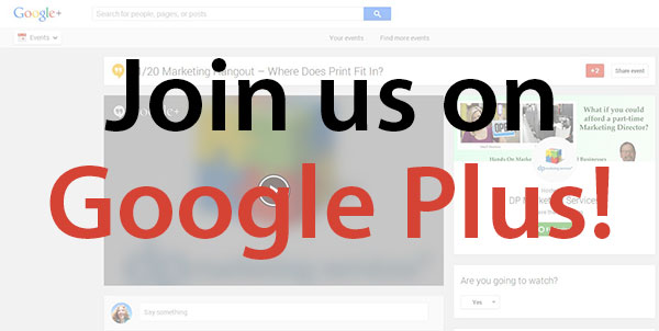
Last time several of you guys got confused about where to go and what to do to watch this live broadcast. We apologize for not having our wire crossed—your feedback always helps, and we think we’ve figured out a way to simplify things. For starters, we got rid of the sign up form. There’s still a form on the TMR Direct site, but it’s only for folks who want to submit an integrated marketing question beforehand. Everyone else, please click the link below to visit the official event page on Google Plus tomorrow at 1pm PST/4pm EST:
Integrated-marketing-hangout
https://plus.google.com/u/0/events/ccru5v2kuf3t1im1b9fjmgk6cr4

Note: for Google Plus newbies, here’s what you’ll need to do in order to participate in real time. If you’re unable to watch live, you can always catch the replay video!

#1) Google Plus account – yes, you need to have a Google + account to attend. Don’t have an account? Create a Gmail account or login to your existing Gmail account to get started.

#2) Download the Hangouts Plugin

#3) Webcam & microphone- You can tune in without this equipment, but Google highly recommends this equipment to improve your viewing experience.

See you tomorrow!!!
New Product Spotlight: Custom Shaped Hang Tags

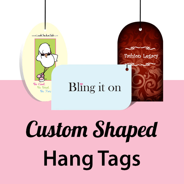
You’ve printed rectangular, diamond, square, and even folded hang tags for your merchandise. But many of you wanted to explore more creative packaging options without having to place a special project quote. We appreciate your feedback, and we’re proud to introduce the newest addition to our printing services: Custom Shaped Hang Tags!

die-cut-hang-tag-printing-new-at-printfirm

Click here to order full color tags: https://www.printfirm.com/Custom-shape-hang-tag-printing.html

How hang tags help your brand

Tags serve a variety of purposes for businesses. Clothing companies use tags to advertise their brand name whereas small stores print tags to promote their location and create branded gift wrap. Whether you’re looking for ways to make your apparel line memorable or to drive targeted traffic to your website, custom shapes are an affordable tool to help you reach your marketing goals. Here’s what die cut tags will do for you:

Put your logo front & center.

Unusual shapes draw attention to the tags, which means eyeballs on your marketing materials. Take advantage of the captive audience—make your logo central to the design because you want your customers to remember your brand.

Appeal to the sense of touch.

You’ve probably heard that buyers respond to tactile sensations as well as visuals, sounds, and smells. Different shapes give shoppers the urge to grab a hold of your packaging, which may influence their perception of the product’s value. A study in the Harvard Business Review reveals that consumers equate heavier packaging to higher pricing, so choose our thicker 16 pt cardstock option to increase your sales.

Display product info.

Here’s where printing on the front and back gives you a real advantage. Hang tags are the perfect place to put your product details, such as clothing size, color, material, and care instructions. Customers expect to see this info on tags, and may get a poor impression of your brand if they don’t see this stuff right away. That’s why we recommend a two sided design. You’ll have enough space to promote your business as well as the individual item.

Promote your website and social media.

Wait, did I just you can use a printed piece to boost your online presence? You got that right! Integrated marketing is all about creating a seamless experience. You know that customers who buy from you are already interested in your products. Put your URL on your tags and you’re reminding them where to follow up. Another idea would be to create a special landing page URL on the tags where shoppers go to sign up for exclusive email offers.

Advertise sale prices.

The combination of funky shaped cardstock featuring large, color contrast text advertising your rock bottom prices will be impossible to resist. Of course, this kind of campaign won’t last forever. You’ll need to print generic tags as well for when the big sale ends.

Add seasonal graphics.

Speaking of sales, spice up your inventory with images that fit your brand and send holiday greetings! Seasonal packaging gives you an opportunity to connect with consumers on a personal level by telling a story they relate to. Choose the main holidays in your business cycle and design tags to go along with the rest of your decorations and campaigns.

PrintFirm.com die cut hang tag shape options

If you like our custom shaped business cards, you’ll love the die cut hang tag selection. Please note that you must include space for your hole punch at the top of your artwork regardless of the shape! Choose from the following options:

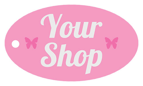
2″ x 3.5″ Oval

Oval-hang-tag-example

I’m partial to the ovals because my personal business card design is an oval eyeball. This example doesn’t do justice to the oval’s creative potential; although I do believe the curves are a natural fit for women’s apparel brands.

2″ x 3.5″ Half Circle

Half-circle-custom-shaped-hang-tag

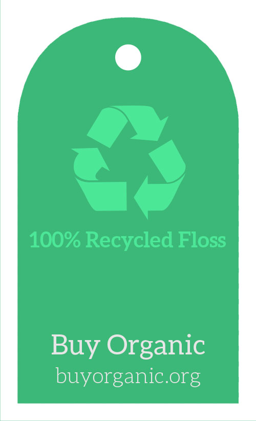
I see this shape on occasion at the mall, especially in the vertical orientation as seen above. Since the hole punch must be located at the top near the arc, you may get better results with a vertical design as opposed to horizontal.

2″ x 3.5″ Leaf

Leaf-shaped-hang-tag-sample

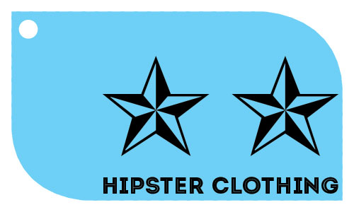
For some reason the leaf gives off an action-oriented vibe to me, hence the punk rock stars with a modern, bold typeface.

2″ x 3.5″ Wink

Wink-hang-tag-die-cut-sample

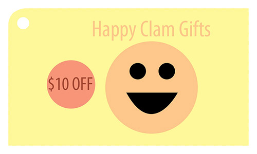
Our most conservative style, the wink contains one rounded corner to separate it from the regular rectangle. Brands with traditional type clientele will find the wink gives just enough sass to keep things interesting without straying too far from the norm.

Where’s the templates?

Rest assured, we’ll have print ready die cut templates up as soon as possible to make your design work easier. Until then, we suggest using our custom shape business cards as a guide.

Did we forget your favorite shape? Let me know in the comments below!

Why Do You Love to Create with Paper?

Hello inkheads! Earth Day will be here before you know it, and all this talk about trees reminded me of how much I love paper. I presume I’m not alone in this sentiment as most of my designer and artist friends also find paper inspiring. For some Friday fun, I made a list of reasons to inspire you to get into the pulpy groove!

Reasons-why-PrintFirm-loves-to-create-with-paper

8 Reasons to create with paper

#1) Paper is recyclable- We all want to do our part to save the environment; here in the U.S., paper’s recycling rate is about 65%. According to the EPA, roughly 33% of papermaking materials come from recycled paper. That pulp can be used to make over 5,000 other products, including masking tape, lamp shades, and coffee filters.

#2) Faster than software- This point speaks to the creatives out there in CMYKland. I start the design process with pencil or pen and paper most of the time. Simple sketches give you a chance to explore ideas without committing a lot of time to working in Photoshop, Illustrator, or InDesign. Of course, you’re able to scan any artwork into a digital design, too.

#3) No eye strain- My job consists of basically staring at a screen for 8 hours straight. If you’re inside the office working on a computer like I am, paper gives your eyes much needed rest.

#4) Break from typing- Painful conditions, such as carpal tunnel syndrome and ulnar nerve irritation are unfortunate side effects of nonstop typing. I suffer from these repetitive motion injuries, as do many copywriters and designers. Drawing on paper allows me to exercise my imagination without hurting my hands.

#5) Stimulates creative thinking- Research suggests that drawing plays an important role in cognitive development. I’m no neuroscientist, but I believe sketching produces better designs because you have more creative freedom.

#6) Embraces imperfections- Speaking of freedom, there’s a strong tendency to aim for perfection in the digital world. In a way, paper relieves artistic stress because of the human element. I feel as though I’ve failed when I notice even minor graphic errors in my digital work, yet I don’t impose the same demands on my psyche when I’m immersed in natural fibers. Once you get over the whole mistakes hang up, you’ll find yourself having tons of fun with nonjudgmental paper.

#7) No technical difficulties- Computer problems always seem to happen at the worst possible times. I’ve sat through Microsoft updates that took an hour to complete and forgotten to save photos to my hard drive before deleting them in Photoshop. The only technical issue I’ve experienced with paper would be ink bleeding through the page from permanent marker. I quickly figured out that you need to put something behind the sheet to protect the rest of your sketchbook when you’re drawing with Sharpies. Easy peasy fix compared to a blue screen of death.

#8) Collect pencils, pens, and markers – I stockpile typefaces as much as the next design geek, but amassing digital collections doesn’t feel quite as magical. I prefer finding beautiful colored pencils or new fine pointed pens I can hold in my hands to enhance my offline downtime.

Why do you love paper?

Unleash your inner print geek in the comments below!

Full Color Letterhead Creative Possibilities

Since April is National Card and Lettering Writing Month, let’s talk corporate letterhead design. After all, business letters and branded greeting cards show your clients you care on a personal level. You might not want to hand write professional correspondence unless you have near perfect penmanship, but you can sign letters in ink to maintain the human feel.

Custom-two-sided-letterhead-makes-twice-the-impact

Twice the ink, double the artwork impact

Most of the time, our clients go for our 1 or 2 color letterhead printing service. Restricting the design to 1 or 2 Pantone spot colors will definitely save you some cash and give you a clean look. Still, I can’t help but think some brands miss out on the opportunity to really stand out with full color double sided artwork. Even a monochrome stationary design with artwork on the back makes a huge difference. As my graphic designer friend Matthew Price of Octopus Creative said:

“A lot of people forget letterhead design can be double sided. Always a good way to make an impact straight out of the envelope!”

I think the Octopus is really onto something, and I’ll show you what I mean in a minute. Before I get to the eye catching examples, do me a favor and close your eyes for a second (well, close them after you finish reading my thought experiment instructions). Picture yourself getting a piece of mail from a company you’re working with. You immediately recognize the company logo on the envelope, so you break the seal. You’re expecting to see a plain old boring white letter. Instead the first thing you see when you open the envelope is a burst of color that’s consistent with the brand’s identity. Do you think you’re going to remember this letter and the brand more than a competitor who sends a generic piece of paper?

I’ll go ahead and answer that question for you with an ABSO-FREAKIN-LUTELY!

Double sided letterhead design inspiration

Hopefully you understand why I’m making such a big deal about truly custom letterhead. I will warn you that designing two sided letterhead isn’t a job for rookies. Printing on the back side of the paper is especially tricky because of our process, hence why we only offer this option on our full color product. We print on uncoated (offset) 70 lb. paper. Uncoated means the fibers absorb a lot of ink, so dark colors that cover the back of the paper will show through. Coated paper, such as 100 lb. gloss paper, doesn’t have this problem because the ink actually sits on top of the surface coating instead of being absorbed by the fibers. For the sake of readability, we suggest using light colors on the back, preferably at about 7% transparency (opacity). The 7% rule applies to large background images on the front side as well because bold graphics will overpower the text of what you’re writing.

Ok, consider that your only warning—back to the fun stuff! Visuals always drive the point across, so let’s take a look at some brilliant two sided business stationary examples to fuel your artistic fire.

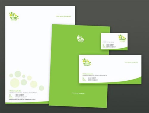
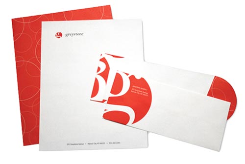
Solid color with inverted logo

two-sided-letterhead-with-solid-color-reverse-side

Source: http://lahore.olx.com.pk/offset-printing-visiting-cards-brochures-letter-pad-printing-flex-printing-iid-549250188

The fresh green splash on the back gives this design a carefree vibe. The logo works well in white and the paper can be folded so that the logo is the first thing the recipient sees when he or she opens the matching custom envelope.

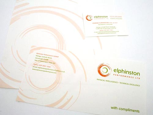
Simple vector pattern

stationery-design-elphinston-by-Octopus-Creative

See the branding project on Octopus-Creative.co.uk

See, I told you Mr. Octopus knew his stuff! He designed this beautiful logo and stationary for Elphinston Performance, a physiotherapy clinic that specializes in pediatric diseases. He used the already abstract brand moniker from the logo in a soft yet coordinated color to create an appealing pattern on the reverse side. Well done, Matthew!

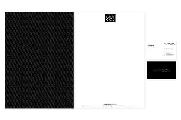
Spot AQ

Spot-AQ-two-sided-letterhead-example

Source: https://www.behance.net/gallery/Sophie-Cox-Shoes/5020917

Printed effects are rare in the world of corporate stationary. Spot AQ (partial aqueous coating) projects usually involve business cards, presentation folders, brochures, etc. If you have a basic pattern with a dark color design, spot AQ adds a unique shine as well as a tactile element to your marketing materials. Note: spot AQ requires thicker paper (80 lb. or heavier) due to the application process. Spot AQ can be used on lighter colors or white backgrounds, although it will not be as noticeable unless you move the paper near a light source.

Note: Spot AQ gives the same appearence as Spot UV; however, UV coating only works on card stock as opposed to paper.

Textured linen stationary

linen-paper-letterhead

Source: http://teksoftprint.com.au/printing-product/colour-printing

I wish this image showed the paper up close! Oh well, you’ll just have to imagine how much the fine linen texture enhances this bright, modern pattern on the back of this otherwise minimalist design.

Unique Hip Hop Trading Cards for Music Marketing

Merchandise plays a big role in music marketing. Record companies print posters, t-shirts, and stickers to promote artists’ albums and concert tours. Independent musicians usually don’t have the cash for elaborate promotional campaigns, so they need to be sure they pick the right advertising tools that will appeal to their fan base.

For my money, custom trading cards fit naturally within hip hop culture. Almost all of the popular rappers wear sports team jerseys and write about their favorite teams. For example, Wiz Khalifa’s hit song Black and Yellow (2011) celebrates his favorite football team, the Pittsburg Steelers. Since athletics are an urban staple, it’s a safe bet that tons of fans grew up collecting sports cards of their favorite players. Competition is another common theme in the rap scene. Trading cards are competitive in the sense that people brag about who has the best set or a rare limited edition print. You don’t really see this type of social behavior with posters or other items.

Custrom-trading-cards-for-music-marketing

Rapper trading card design ideas

CD cover art would be an easy choice for consistent branding on your trading card project. But if you’re not releasing a new album, you can explore other creative possibilities. Here are ideas for fresh graphics to keep your fans wanting more!

Graffiti hand lettering – Street art and hip hop go hand in hand. While graffiti inspired typography looks cool, there’s no substitute for real painting. Have an artist friend create hand lettering with your stage name or take photos of a local mural that fits your style.

Headshot with lyrics- Pair your dopest lyrics with a nice clear picture of your face so nobody doubts who wrote those words.

Live event/performance photos- You’ve just finished playing an awesome show, and now you’ve got amazing shots of you rocking the mic on stage. Share the pictures with fans on social media as a teaser, and then release special edition prints! Better yet, use Facebook, Twitter, SoundCloud, etc. to find fans with cool pictures from your performances and show them some love by printing their photos on a set of cards. Get their permission first, and be sure to use hi res images only.

Hometown city theme– Rappers always talk about representing their neighborhoods. If your city comes up in several songs, pay homage to the streets in your card designs.

Music video scenes- No still shots? As long as you’ve filmed an HD music video, you’ve got material to make your own trading cards. You’ll be working with a 2.5 x 3.5″ size space, which means you don’t necessarily need large images to get a pro look. Just be aware that still shots from video might not be as sharp as regular photos.

Baller MC promo card examples for inspiration

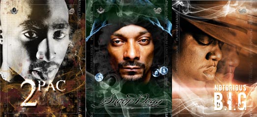
Truth be told, there aren’t a lot of hip hop heads doing the pocket sized CMYK thing. That means up and coming artists trying to stand out won’t face heavy competition from major labels. The only mainstream examples I can find come from the Platinum League Interactive Hip Hop Series, featuring classic artists, such as Biggie Smalls, Tu Pac, and Snoop:

hip-hop-trading-cards
Source http://hiphopmoneymagazine.com/wp-content/uploads/2012/03/hip-hop-trading-cards.png

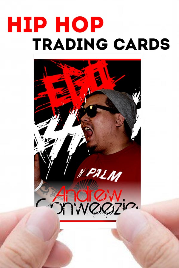
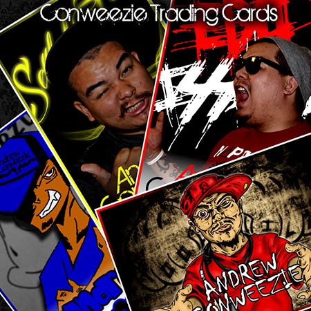
Our own underground artist Andrew Conweezie created cards for the unleased Ego Issues album. He sells the set of 4 cards individually or in a fan pack with loaded with stickers, a magnet, and a free song download. Rock on!

Andrew-Conweezie-hip-hop-trading-cards-printed-by-PrintFirm

Click here to see the cards on Conweezie’s site.

A Teaching Opportunity for the Printing Community

Hello out there in CMYKland! Today I want to ask you guys a favor. Well, maybe not a favor so much as I’d like to get your feedback on what I believe could be an exciting opportunity for the commercial printing industry.

It’s no secret that yours truly appointed herself print ambassador to the digital marketing set. I’m on a personal mission to bridge the gap between printers and online marketers. It’s a twofold mission in reality—I’ve taken it upon myself to help other printing companies learn about inbound marketing (SEO and social media/community management in particular) because our industry won’t thrive without incorporating online channels effectively. The second part of this quest involves educating the inbound crowd about print’s role in brand communications. Some folks in the digital space cling to the misguided belief that the internet trumps all other forms of advertising and outreach. That’s not just stinkin thinkin; their anti-ink attitude means tons of missed opportunities for their clients!

Hopefully you see where I’m going with this:

can't-print-and-digital-marketers-get-along
Source: http://www.rudebaguette.com/assets/Get_252520Along.jpg

The image above conveys my core message that we’re all playing for the same team. Marketing professionals of all stripes share the common goals of building relationships, raising brand awareness, and of course, growing business in the process. So far I’ve been proselytizing to a fairly limited audience, but I have a chance to educate the inbound marketers in their natural habitat—MozCon 2014!

Why printers should care about MozCon

By now you’re asking yourself what the heck is MozCon? Another social network I have to train my staff to manage? Nope, MozCon is one of the largest events of its kind wherein many of the brightest marketing minds gather in downtown Seattle to share knowledge and plan for the future. Printers with in-house SEOs may recall their employees begging for a ticket to this 3 day inbound extravaganza. Staff members groveling aside, printers should pay attention to what goes on at the big online marketing conventions, such as PubCon, SMX, Inbound Marketing Summit, and more (click here for a complete list) in order to stay on top of the trends.

Surely you follow the major printing conventions (DScoop, GraphEXPO, Print14, etc.) as well you should. And you pay attention to inkhead events to discover new technology, improve workflow, and explore growth avenues. You’ll find a few seminars about online marketing at printing conventions here and there, but nothing compared to the first hand exchange of ideas at an event like MozCon. Sure, a lot of the stuff will go over your head. Even I find myself confused when the true data geeks dig into the really wonky stuff. The point is that you don’t need to absorb every single detail to walk away a better marketer. You’ll hear plenty of actionable tips you can apply right away, and you’ll feel inspired to focus on your company’s progress.

Send a printer as a MozCon community speaker

Now that we’re on the same page, let’s talk printucation. We should do our best to send at least 1 representative to speak at the internet conventions. It’s our job to make sure that digitals see the value of print and its ability to generate online traffic as well as conversions. MozCon would be the perfect place to start because they have a program for community speakers already in place. They’re also quite print-friendly in that they’ve printed their adorable mascot Roger ( a robot I consider a close, personal friend) on lots of promotional products over the years. Guest speakers take the floor for 15 minutes, which gives us enough time to school the crowd on a few main points and leave them wanting more.

mozcon-2013

Long story short (too late) I’m going to apply as a speaker and I encourage you to do the same. I’ve got a couple of presentation topic ideas I’m kicking around in my head, which leads me back to the favor I mentioned at the beginning. The Moz team is looking for proposals that cover subjects not already on the as yet unpublished agenda. From the looks of the presenters, print won’t be on the menu. So I’m asking you this: what’s the biggest misconception digital marketers have about print media? Before you jump to the “PRINT IS NOT DEAD!” mantra, remember, we want to show them how they can use print to get results on the web.

Ready? GO!

Set the record straight in the comments below!

What National Card and Letter Writing Month Means to Me

When was the last time you wrote a letter to someone?

I don’t know about you, but this question got my gears turning.

I remember the last time I sent something in the mail a few months ago; I mailed several friends copies of my #onething poster print along with brief handwritten notes. The notes weren’t long enough to qualify as letters, though. For my money, a letter must be longer than a sentence or 2. I’ve also written business letters with my boss, which doesn’t count either because it’s part of my job description.

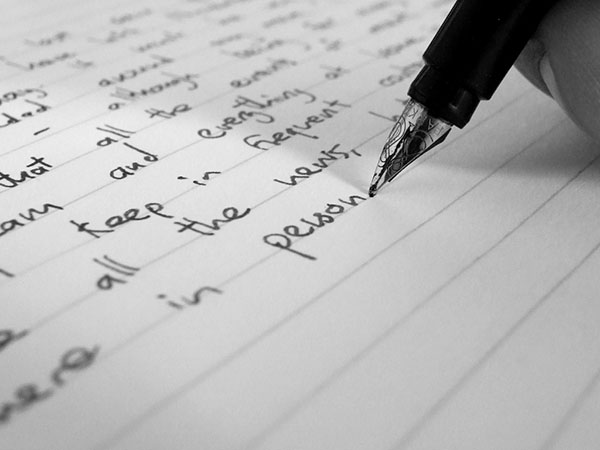
If memory serves me correctly, I haven’t written a personal letter in years. I presume I’m not alone in neglecting my penmanship. To test this theory, I posed the above query to my colleagues, who now think I’m insane. Here are their answers:

National-Card-and-letter-writing-month
Source: http://www.jonathangazeley.com/wp-content/uploads/2009/01/dscf3546d1.jpg

Alex (Operations Manager) – “The last letter I wrote was asking for permission to come to the United States from Iran. Everyone has to write to an ambassador for approval. My letter worked because here I am!”

Nellie (Secretary) – “I never liked writing letters. I felt bad because my friends and family would send me these big long things, and I would write back only a couple of lines. I guess it was 25 years ago, when we first came to this country. I wrote letters to my cousins and classmates from school. Then I stopped because of Facebook and texting.”

Thelma (Accounting) – “Maybe 20 years ago, around 1988, I wrote to my family when I got to this country. “

Rita (Prepress/ Designer) – “About 2 years ago I wrote to a friend I met on a trip. He was an older, grandfatherly figure who lived in Minnesota. We became pen pals and he would write the most beautiful letters!”

Austin (Designer) – “2 weeks ago I wrote a letter to my friend who lives in Europe. “

Nick (CEO) – “I don’t know, 25 years ago probably? I wrote to my family and friends when I came to the US.”

Ana (Customer Service) – “About 5 years ago, I wrote a letter to my grandfather. I still have it to remember him by because he passed away.”

Armando (Pressman) – “Long time ago. Back in high school, I wrote letters to my girlfriends.”

Dan (Shipping Clerk) – “It was 1986. I was in Italy visiting my relatives and I wrote letters to my wife while I was overseas.”

Katherine (Marketing Director) – “My husband and I wrote letters to my sister in law while she was in prison. Letters mean a lot to prisoners, she told us how much our messages meant to her after she got out.”

Ed (Delivery Driver) –

Why letter writing matters

The answers above reveal the reason why letters hold powerful meaning in the digital age. Handwriting is deeply personal. Each member of the PrintFirm team shared a story about his or her past as well as the story behind the story. As you can see in their answers, the backstories are often more interesting than the original anecdotes.

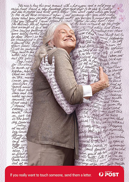
Simply stated, there will never be an electronic equivalent to ink and paper.

A-handwritten-letter-is-like-sending-a-hug
Source http://theinspirationroom.com/daily/print/2007/3/australia_post_mum_hug.jpg

Sure, you can type your innermost feelings on a screen, print them out, and seal an envelope without ever touching a pen. This type of communication makes for perfect sentence structure and legible diction. And that’s the problem—everything we do with machines comes out a little too perfect, with the human element removed from the process. Who remembers the details of what prompted their last email? Most people can’t recall email messages or specific social media posts as they’re fleeting in nature.

Yet Ana’s comment about hanging onto a letter to remember a loved one really cuts to the heart of the matter. Handwriting puts a piece of the person on paper. Along the lines of preservation, letters establish records of private insights from history’s greatest minds. They capture the passion of love affairs, comfort the lonely, and drive political action (think Amnesty International).

Take the National Card and Letter Writing Month challenge

Print Goddess Christine Alexander issued the following challenge on her blog:

“In the spirit of National Card and Letter Writing Month, I would like to challenge all of you, dear readers. Whether you send a letter a day, one a week, or just have the time to send out a single note, let’s celebrate the beautiful art of letter writing at least once a month.” ~ Dreaming in CMYK

I’m with Christine! I’ve been practicing my hand lettering and drawing a lot lately, so this seems like a logical step. I’m not sure who I’ll write to…I’m sure I’ll find a couple of cyber friends to exchange letters with once a month.

What about you—are you ready to pick up a pen once a month? Do you remember the last time you even wrote a letter? Tell us your stationary tales in the comments below!

Brochure Typography: Serifs vs Sans

I’m always amazed at the lack of good resources for print design. While a handful of popular print products get a lot of tutorial and template love (business cards come to mind), other important items are ignored by most of the designer sites. Judging by the amount of people searching for brochure layout and typography tips, there’s clearly a need for educational information about these marketing tools. I covered the typography topic in a broad sense before in a post called Don’t be a font criminal, and today I want to dig deeper into typography’s role in creating a visual hierarchy.

Brochure-typography-serifs-vs-sans-serifs

Why your brochure design needs headings

Surely you’ve heard that web pages should be scannable because that’s how people absorb what they read online. You may not realize that the same principal applies to print! Well, at least the type of print we’re talking about. Novels are another story—but your brochure isn’t going to tell that kind of story. You don’t need space for plot or character development. Your readers don’t plan to curl up for the evening with your brochure by the fire. No, brochures usually promote a specific product/service or the brand in general.

In other words, think of brochures as sales tools. Just as you separate your Call to Action on a landing page with a heading tag, you’ll want to break up blocks of text with descriptive, bold headings. The goal is to make your copy easier to digest in chunks, which means your pamphlet points should be clear enough to absorb without a lot of effort. If you can’t widdle the details down to a few action oriented words, use subheadings to spell out the specs in a short sentence. And by short I mean tiny, no more than 5 or so words in length.

What’s in a typeface? Serif vs. Sans Serif

I hope it goes without saying that readability should be a primary concern with print marketing projects. By that I mean, avoid funky or decorative, no scripts, etc. Well, maybe there are a couple of script typefaces that might work for some brands. But in general, you want to stick to the standard serif or sans serif typefaces. This might present a problem for brands with specific typefaces as part of their identities. In this case, let your best judgment guide your creative decisions. A brochure that looks slightly out of synch will fare better than a branded appearance that’s totally illegible.

Serif typefaces appear more formal due to the accents. Serifs are the traditional choice for newspapers and magazines; however, that doesn’t automatically mean a serif would be the best fit for your brochure. Since you don’t have tons of text to work with and you’re likely dealing with numbers (statistics, charts, graphs), a sans serif may communicate your message without distracting the reader or creating confusion. Remember, not all typefaces that fit into each category are created equally. You always have the option of using a strong serif for your headings/subheadings and a plain sans for the rest of your text.

How many typefaces can I use in my design?

Please don’t get the wrong impression from the above combo suggestion. To keep your design looking professional, you’ll need to limit yourself to no more than 3 typefaces. Your best bet would be to stick to 1 or 2. But wait, doesn’t this rule put limits on your creativity? Well, yes.

Yet the limits actually enhance your storytelling abilities. As long as you choose a typeface with different weights and styles, you won’t feel as though you’re being constrained. For this reason, free fonts often present a problem for brochure printing. With a few exceptions, freebie downloads don’t come in light, italics, etc. They also lack glyphs at times. You’d be hard pressed to find a glyphless premium typeface in regular alone, though.

8 Good Fonts for Brochure Headings

And now for the moment you’ve all been waiting for…the font list! I’ve taken the liberty of finding both serifs and sans serifs for you. Inclusion in this article does not necessarily mean that said typefaces will complement each other. The lists below contain suggestions for your inspiration so you can start designing your own brochure today. Just click on the example images to download.

4 Serifs

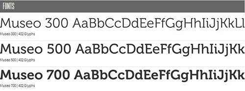
Museo

Museo free bold modern typeface.

A free typeface that comes in 3 different weights as well as super thick slab version.

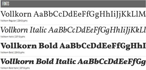
Vollkorn

Vollkorn-tyepface

An elegant typeface with slight accents, too slight to combine with a sans in my opinion.

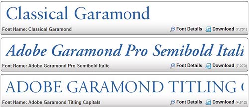
Garamond

Garamond-class-print-design-font

An easy pick because of its reputation for readability. Garamond often appears in children’s books.

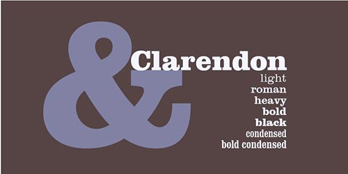
Clarendon

Clarendon-typeface

A thicker, meatier typeface that should be combined with a sans to soften to its blow.

4 Sans Serifs

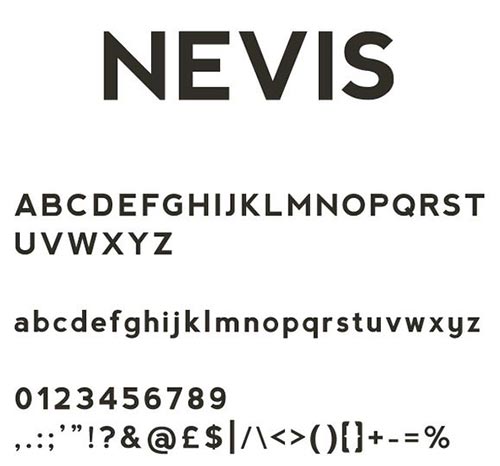
Nevis

Nevis-brochure-headling-font

This freebie contains no extra weights; for a stronger headline look, use all caps.

League Gothic

League-gothic

Plenty o’ versatility here in this revival of classic in the public domain.

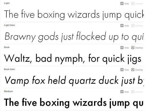
Futura

Futura-typeface

A premium modern choice for serious sales.

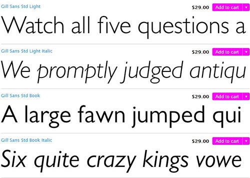
Gill Sans

Gill-Sans-typeface

A fun choice with a youthful vibe.

You can use any of these typefaces with one of our free brochure templates! (Note: templates are for size 8.5″ x 11″ brochures)

Evolve Marketing Contest from Vocus

As printers, we’re no strangers to industry evolution. While there’s a tendency for the commercial printing and mailing communities to feel as though we’re victims of technological changes— I say let’s embrace new growth opportunities instead of lamenting the past. Marketers of all stripes from small biz owners to inbound pros must adapt or get left behind. The old advertising paradigm of mass messaging and one way communication won’t win your brand the kind of long term relationships you need to develop.

Speaking of evolution, the fine folks at Vocus created a special contest to celebrate the spirit of progress: #EvolveMKTG! Share your best marketing prediction or your biggest challenge on Twitter or Instagram with the hashtag #EvolveMKTG. Your share automatically puts you into a raffle drawing—the grand prize is a MacBook Air and a 1 year subscription to the Vocus Marketing Suite! The contest ends on March 31st, so you have time to put your thinking cap on.

The PrintFirm #EvolveMKTG entry

Since we’re Vocus clients, I already have access to the suite. We purchased the small biz PR package, and they recently added the Suite as an upgrade. That means I probably can’t win the contest. But the Vocus team’s been in my corner since the early days of my career; I even wrote about my devotion to the best PR service in the business in our Twitter Tale. Senior Social Media Community Manager Stacey Miller in particular really goes the extra mile on customer care. Here’s her personal Twitter account so you can follow her adventures:


I’m happy to report that after a year with PR Web, we’ve increased our brand awareness tenfold. And PR Web is our #1 source of referral traffic. Our last release got picked up by 268 sites, which wouldn’t be possible without a quality distribution service. So I’m hoping one of you awesome people will read this and win! May you find similar success with the right tools at your fingertips (social media metrics, email campaigns, and more).

Now for my personal marketing prediction:

Katherine Tattersfield's marketing prediction

Ok, maybe I’m a little biased towards print communications. Nevertheless, print is an essential part of the marketing mix because of the emotional factor. My prediction already stands out more than the rest because it’s proudly written on premium recycled Neenah Paper (For the paper geeks, Environment Smooth Desert Storm 24 W).

Looking forward to seeing your entry in the #EvolveMKTG stream! If you happen to win, please send a tweet our way to let us know. Good luck!

Watch Our SEO Hangout to Increase Profits

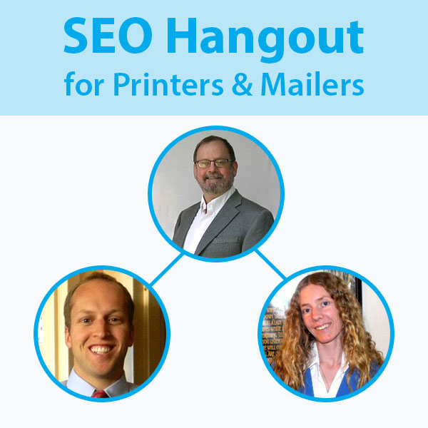
Hello out there in CMYKland! Today we have a special announcement for all of you printers and small biz owners. In case you missed our latest press release, you’re invited to an awesome FREE Google Plus Hangout on SEO for printing and mailing companies. I’ll be joining 2 well respected colleagues, Richard Dannenberg and Spencer Powell for this educational panel on inbound marketing for the print community.

Here are the important details:

SEO-Google-Plus-hangout-for-printing-and-mailing-companies

What: 21/20 Marketing Hangout Live Broadcast

When: Thursday, March 25th, 2014 1pm PST/4pm EST

Where: Google Plus

To register and/or submit a question, please click here.

Tweet your questions during the broadcast using the hashtag #marketing2120

Not able to attend? That’s ok, we’ll have a YouTube video for you to watch after the live broadcast!

SEO best practices for 2014

It’s no secret that yours truly comes from a digital marketing background. Today we’re going to cover search engine optimization basics, which means that people of all levels of experience should feel comfortable participating. Besides, SEO isn’t really about technical stuff and traffic. Sure, there are things you can do improve your site’s visibility in search, but that’s only part of the puzzle. Real SEO strives to provide an excellent user experience on your site as well as social media communities and enhance your brand’s reputation. As you can see, SEO fits in with the rest of your multi-channel marketing mix.

With all the changes from Google lately, it should be a lively session. I’m grateful for the opportunity to share what I’ve learned with my fellow printers, but I’m afraid we might not get to answer all of your questions. I’m also concerned that you’re not aware of some important new developments in the SEO world. So I figured I’d list a couple of key points to keep you on top of current best practice.

Beware of unnatural links!

Google’s been dishing out manual penalties to high profile sites lately to send a warning to business owners about their guidelines. Manual penalties can be quite confusing and vary in terms of severity. If you’re not familiar with the term, Google issues manual penalties as a kind of punishment for spammy websites or those who violate the big G’s quality guidelines. The key is that manual penalties aren’t algorithmic; rumor has it that Google staff members actually review websites to determine whether or not the site needs a good slap. You will see a warning in your Webmaster Tools account should your site ever get flagged, but you must be vigilant about monitoring your inbound links. This counts double for those of you who have hired an SEO agency in the past and quadruple if said “agency” resides overseas. The biggest indicator of linking manipulation would be exact match anchor text. For a printing company, links pointing to your website with optimized keywords i.e. business card printing, print trading cards, etc. spell disaster! You will need to either have the webmaster remove the bad link from his/her website or disavow the link in Webmaster Tools. Exact match anchor text is a common violation, but there are other ways to run afoul. Here’s a handy guide to potentially harmful backlinks for further reading.

Be super extra careful about guest blogging.

Contributing high quality content to other websites rocks as does allowing good writers to guest post on your business blog. Unfortunately, too many spammers nearly ruined guest blogging for the rest of us. You can still post, but you need to be extremely cautious about doing so. You must exercise the same level of scrutiny for anyone who writes for your site. The safest way to guest blog is to no follow any links in the content or author’s bio. Otherwise, you’re taking your chances. You don’t have to go to that extreme unless you want to. For example, I allow guest authors 1 link in their bio because, hey, I value their contribution to our site and they deserve recognition for their hard work. I don’t accept solicitations from people I’m not already familiar with, although we do have a page inviting authors to write for us. I’ve yet to grant a request from someone outside of my social circles.

Focus on link earning instead of link building.

Building links might come back to haunt you no matter how careful you think you’re being. The easiest way to avoid any problems down the road is to let other sites link to yours on their own. You can attract links by publishing useful articles, educational/resource pages, and making funny, entertaining videos. You’ll have to get creative, but at least you won’t have to live in fear of the webspam team.

I hope these tips give you a better idea of how to craft your SEO and content marketing strategies. See you at 1pm on the plus side!