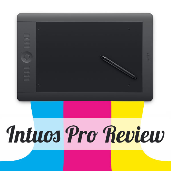
All right designers, we know you are more than the set of tools you use to solve problems for brands. At the risk of praising equipment over talent, I wanted to share an absolute must have item for creative professionals—the Wacom Intuos Pro Pen Tablet.
The Intuos Pro, a commercial printing company’s best friend
The fine folks at Company Folders introduced me to this life changing mouse replacement last summer during their Print Typography social media contest. They generously gave away an Intuos Pro to 1 lucky winner, which wasn’t me (although I’d like to note that CEO Vladimir made good on his purple unicorn promise). Intrigued by the event, I discovered that we have a Wacom of our own in the in house design department. Although I design about 90% of the brand images on this blog, I’m not technically part of the PrintFirm creative team.
Of course I didn’t let this minor detail prevent me from stealing commandeering the tablet for testing purposes. Before I forced the graphics person who shall remain nameless aside, I asked him whether or not the Intuos helped him do his job for custom design and print production.
“Oh yeah, I love this thing. It takes some getting used to, but once you get the hang of it, you work way faster,” he replied.
His comments made me think about other designers I’ve worked with in the past. Sure enough, I remember the good ones using what looked like a pen to me from a distance. Sadly, this insubordinate employee refused to let me take the tablet to my office for a few hours. He justified his monopolizing our Intuos with a bunch of excuses about clients, deadlines, and printing proofs.
Whatever.
I settled for holding the pen in my hand, and using it to adjust his paths in Illustrator. As soon as my palm felt the smooth surface of the sleek black active area, I decided to buy a Wacom of my very own.
My personal Intuos Pro photo editing experience
My loving husband helped me purchase an Intuos Pro for my birthday to indulge my passions outside of the office. I’ve only owned the tablet for a week, and I’m already in love. Most of my projects involve photography, design, and illustration. Since my job requires tons o’ typing, my poor wrists cry every time I try to tackle pictures at home. Saving myself from horrible carpel tunnel and/or ulnar nerve irritation is high on my list of reasons for dropping hard earned money on my Wacom. Repetitive motion pain plagues the design community (a universal #designerproblem in my book), and this tool seem to ease the strain on my delicate hands.
Sadly, I haven’t gotten the chance to explore a lot of the features outside of basic Photoshop. I’ve yet to program my shortcuts and hand gestures. Here’s a handy video that shows you how to do this stuff:
My laptop runs on Windows 7, and there’s a drive issue. I tried following the directions on this troubleshooting page, no dice. Every time I boot up, I get a pop up warning that the driver isn’t working. Or something or other.
Said warning isn’t preventing me from using the tablet, so I’m in no hurry to resolve the problem. Anyway, I’m in awe over the fluid motions for precision image editing. I’m not a fan of heavy processing; I generally loathe HDR photos. I believe good photographers take clean shots that require limited editing or else they lose their magic. Anyway, I’m able to adjust exposure exactly where I want it with a single swipe of the pen instead of accidentally clicking and losing my place with a mouse.
What do you think of your Wacom?
I’m sure we have plenty of Intuos fans in the community. Do you own an Intuos or other Wacom product? Do you have questions about how this awesome device can improve your work flow? Let me know in the comments below!
Due to the overwhelmingly positive feedback on our blogging tips for commercial printers post, I decided to extend this topic into an article series. Most of the responses I got came from folks in the printing industry who are pretty green when it comes to copywriting and content marketing in general. I applaud those of you with the courage to admit your inexperience. We all start somewhere, including yours truly.
I figured it would be helpful to break blogging down into parts and share some of my top trade secrets in the process. For my money there’s no better place to start than from the very top— your headlines, otherwise known as your post titles. Just like last time, I’m going to assume the role of you (the printer) and answer a series of questions I imagine you have about writing irresistible headlines.
Pro headline writing Q & A for printing bloggers
I’ll try to cover all your questions, but I’m sure I’ll miss something. I guess that’s what the comments are for at the bottom of the page. Here goes…
Why do blog headlines matter?
I’ll defer to the Father of Advertising on this one:
On the average, five times as many people read the headline as read the body copy. When you have written your headline, you have spent eighty cents out of your dollar. -David Ogilvy
According to Ogilvy and the rest of our marketing forefathers, headlines matter most of all. I’m inclined to agree; I’ve seen a huge difference in my writing since I started focusing on catchy titles instead of pure SEO stuff. I used to add a couple of keyword phrases I wanted to rank for, throw them between | (horizontal dash) marks, and hit publish.
That’s completely wrong.
I’m telling you this in the hopes that you’ll learn from my mistakes. Here are 4 reasons why you must obsess over tantalizing titles.
Headlines act as the first impression. Ok, this goes back to the point about SEO. Before I wanted to impress Google’s bots because hey, they’re the ones serving up my content to readers, right? Well, that’s a pretty small part of the traffic equation in this case. The most SEO friendly title tag in the world doesn’t generate traffic if no one clicks on your link. Try thinking of your headline as an invitation to an event. A good invite tells you everything you need to know about what you’ll be attending, and gets you pumped up in the process.
Most people only read the headline! Ogilvy’s quote rings true as ever in the digital world. Compare your Twitter shares to the bounce rate on one of your most popular blog posts and you’ll see exactly what I mean. Tons o’ tweeps RT, favorite, etc. based on your headline alone. Very few folks stick around to actually read the rest of your content.
Great headlines increase CTR & social sharing. Speaking of sharing, headlines make a HUGE difference in search and social. As I said before, users determine whether to share your post or pass by the headline. The headline also appears prominently in search engine results pages. Your headline directly entices readers to click thru to read (or at least skim) the rest of the story. Compelling headlines will naturally increase traffic to your website.
I’m sure you’ve heard the mantra, “write for people, not search engines.” There’s just one tiny problem with that: search engines are a barrier between you and readers. In other words, ignore them entirely at your own peril. This advice may not be as important to folks who blog purely for pleasure. But you’re blogging for your business. Huge difference.
Keyword phrases in title tags are a big ranking factor as are keywords in your URLs. Nevertheless, you want to strike a balance because keywords alone usually sound beyond boring. For example, which article would you rather read:
Business Card Printing | Print Business Cards Online or 15 Awesome Business Card Printing Projects?
I’m guessing you chose the latter. Notice how the 2nd title uses the keyword along with a number and an exciting adjective? That’s how you avoid overkill, by selecting a primary keyword phrase to nestle in between interesting language.
I’ve heard that bloggers write headlines first, is that true?
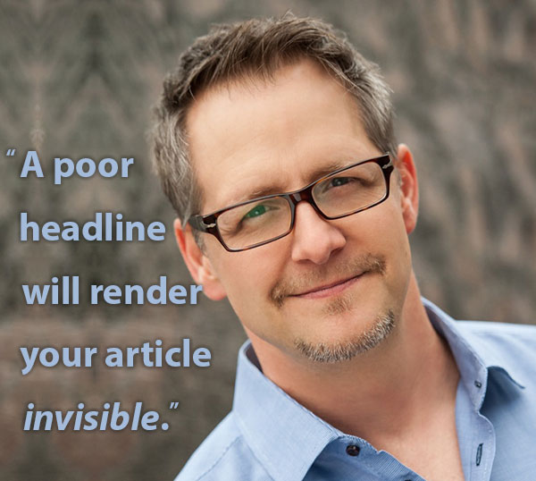
I can’t speak for everyone, but my blogging routine begins with the headline. Ditto my press release writing process. Now that I think about it, all my writer friends and the leading copywriting authorities, such as Copyblogger’s Brian Clark, recommend starting with the headline. Here’s a very convincing quote from the man himself:
Yikes! No wonder you can’t move forward until you’ve nailed your headline.
Personally, I feel this approach allows me to zero in on the main point, which organizes my thoughts for me in a way. I find that when I craft the headline before I move on, the rest of my project falls into place. Plus I have a good reference point in case I get stuck or veer off topic.
How much time do I need to spend crafting the perfect post title?
While I can’t give you an exact time frame, I will tell you that I devote at least 10 to 15 minutes to my headlines. I come up with a topic based on research or in the moment inspiration, and then I slave over the best way to convey the article’s main message in as few words as possible. The only exception to this rule would be a long tail keyword phrase I’ve unearthed discovered after weeding through a pile o’ data.
Do my headlines have to relate to my articles? Can I just write whatever will get the most clicks?
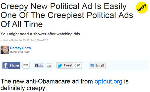
You can…and surely you’ve noticed that numerous high PageRank sites (Huffington Post, Mashable, BuzzFeed, etc.) are guilty of posting downright ridiculous lead ins daily. I strongly urge you not to follow their example. At least not to the letter. Readers consider this behavior irritating from major publishers, yet those sites seem to get a permanent pass. Your small brand won’t survive a potential public backlash because you don’t have exclusive access to news stories or other stuff that almost makes up with the big brand garbage.
Let me put it this way: your headline makes a promise to the reader. Don’t break the promise by using a highly clickable title that doesn’t reflect your actual content or provides zero value due to hyperbolic expectations. In online marketing, we call said shenanigans link bait, click bait, or even click bait trolling.
How do I improve my headline writing skills?
As with all things in life, you only improve with practice. Over time you’ll learn what works and doesn’t work for your readers/social media communities. Now I know there are lots of articles with supposedly foolproof copywriting formulas online. But every marketer worth his or her salt knows that producing great content means hard labor. And testing, lots and lots of testing.
4 Pro headline writing tips for printing industry bloggers
Set those silly sites aside and learn from the true writing masters. Here are 4 pro headline writing tips to put you on the path to blogging righteousness! Plus each tip contains a helpful link for further reading.
Be brief. Aim for 5 to 8 words (unless you’re answering a specific long tail query), and remember that search engines have a 70 character limit for title tags. Characters include spaces, so be mindful of this when you’re picking the right words. Note: although you’re allowed 70 characters, that number is a bit misleading because search engines tend to cut off after 68 characters. I stick to 65-68. UPDATE: the folks at Google changed the way titles tags appear in search results. There’s no longer a set number of characters for optimization. Early research shows title tags with 55 characters will not get cut off for 95% of queries, so that’s your best bet. (Thanks, Roger!)
Use the active voice.This point touches on 2 important things to me. Action verbs add an element of immediacy to your content as opposed to passive sentence structure. What do I mean by active vs passive? I’ll show you!
Here’s a headline from one of our recent press releases: New Valley Print Studio Fuels Los Angeles Artists
The verb fuels refers to something that’s taking place right now. Let’s rewrite the same sentence in the passive voice for comparison: New Valley Print Studio is fueling Los Angles Artists.
Doesn’t the helping verb “is” suck the life right out of the sentence? Without the helping verb, we’ve got implied power, forcefulness. We want to read more about VPS because we want creative fuel, too. The word “is” diminishes the fuel by creating a linguistic pause, a detour of sorts. We were on the expressway to creativity, and we ended up taking the scenic route. Makea sensea?
Ask curious questions. Readers dislike ambiguity, which makes questions trickier on your end. I’m a firm believer that questions work as title tags so long as they’re specific. Another way to posit a question would be to give readers a choice or present a kind of conflict. I used this tactic when I wrote about a Print Media Centr webinar with Sappi Fine Paper. The webinar title Print And juxtaposed with Print Or in the title made for more post clicks.
Go for emotional impact.Emotional language makes keywords seem natural. Don’t go overboard, but feel free to engage in a little sensationalism. Instead of saying, “10 design tips for better brochures” how about, “10 killer brochure design tips” or “10 brochure design tips from the experts”.
And now for the piece de resistance, that copywriting trade secret I promised you commercial printers…
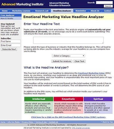
Introducing my secret sauce: the Emotional Marketing Value Headline Analyzer
Before I explain this most excellent tool, I must give a hat tip to my friend Robert Waddington aka Alpha Avant for turning me on to this free gift from the advertising gods at the Advanced Marketing Institute. You’ll find the link to this prized asset in his tweet below or simply click on the screen shot. I urge you to follow him for more morsels.
This easy to use web based analyzer gives you a rough estimate of how much emotion your words will invoke in readers. The AMI site says that pro copywriters typically score at about 30-40% whereas the gifted will hit 50- 75%. I average 50, although I reserve bragging rights for my 2 perfect scores. I play around with this for 15 minutes or so until I’m satisfied with the results. In other words, I rarely go with my original thought—I try several different combinations in one sitting.
The Headline analyzer tool case study
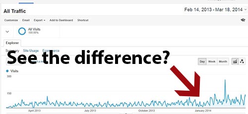
I don’t have much evidence beyond my own site’s experience and anecdotal reports from friends. Still, I think you’ll agree that this tool improved our blog traffic as well as social shares. I started using it at the end of January. Take a look at our Google Analytics traffic data since then:
This graph is good enough for me. I’ll be able to report back after a year with a more detailed presentation. Until then, happy blogging!
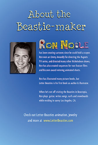
Today I’m super stoked to present a killer client project from PrintFirm loyalist Ron Noble! Ron’s a man of many talents; he’s an Emmy-Award winning animator, illustrator, artist, and director. You’ve probably seen Ron’s work on the beloved Nickelodeon shows Rugrats, All Grown Up, As Told by Ginger, and The Wild Thornberries. (On a side note God I miss the Rugrats).
As a cartoonist, Ron’s naturally been involved with children’s entertainment for most of his career. He also illustrated 8 children’s books over the years. His latest venture blends entertainment and education to help kids learn to read! Call it infotainment, if you will.
Letter Beasties Custom Booklet Printing Project
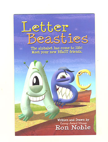
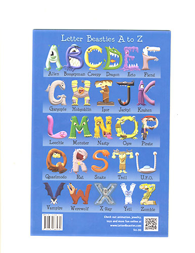
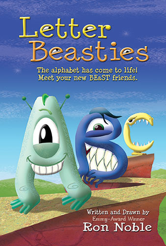
Letter Beasties marks a milestone for Ron as it’s his first time serving as both illustrator and author. Inspired by a Tim Burton exhibit, he set out to create an alphabet with unique, memorable monster characters as letters. Here’s the end result, fresh off our press:
As you can see, the colors are true to his original artwork design:
Ron’s custom booklets involved a set of precise tech specs to bring his artistic vision to life. The booklet features a thick 14 pt. cardstock cover with UV coating for extra gloss. He wanted the inside pages to more or less match the shiny cover effect, so we added aqueous coating to the standard 100 lb. glossy paper. Perfect binding completes the retail ready appearance.
Feedback and the Beasties Future
As soon as I laid eyes on the finished product, I knew Ron struck gold. Luckily, I got to meet him and his girlfriend when they stopped by to pick up their order. After I finished gushing over the awesome design, we talked about the feedback he’s gotten so far from kids and parents. He finds the kids relate to the concept of each letter as a character, which means they catch on quickly without having to make abstract associations. The accompanying animated series reinforces the message by using the same characters to form a word of the day.
There’s lots of merchandise in the works, such as trading cards, plush toys, posters, and even jewelry! Ron kindly brought me the Kraken Beastie letter K necklace. It happens to be my favorite color (purple); we agreed this coincidence meant the universe must be aligned in his favor. You can see all the rest of these adorable necklaces on his eBay and Etsy stores—be sure to follow him on Twitter so you don’t miss a minute of his remarkable story!
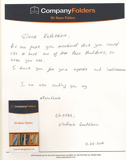
Before I get started with a fully fledged geek out, I’d like to thank my friend and printspiration Company Folders CEO Vladimir Gendelman for this gorgeous gift. Vladimir, being his thoughtful self, remembered a comment I made months ago about my burning desire for a copy of the printtastic Print Handbook. He kindly sent me a copy of this priceless piece of design mastery along with the handwritten note below:
(On a side note, wow, talk about great branding! Everything from the mailing envelope to this linen letterhead sends the same message about the Company Folders mission. The folded business card even looks like a tiny presentation folder.)
THANK YOU Vladimir for the #PrintLove. I shall treasure this present forever. I think you should help me thank Vladimir for his generosity by following his brand on Twitter:
The Print Handbook Review: a printer provider’s perspective
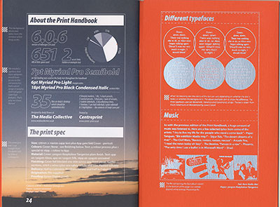
Now let’s get to thefun stuff. I’m fairly certain Vladimir gifted me The Print Handbook because of my passion for ink & design. Indeed the book serves as a go to guide or cheat sheet for creative professionals. It should be required reading for web designers as far as I’m concerned. Those of us on the CMYK side will find the information useful and the design captivating. But I’ve found that many web designers don’t know the basics for print projects, and that often leads to costly mistakes for their clients. For this reason, I feel the print handbook should be incorporated into every college curriculum.
That said, I’m not as well versed in the technical side of things as other members of our staff. I didn’t want to go gaga over my gift without properly evaluating the guide’s utility. So I thought it would be fun to review the book from our company’s point of view.
I passed the orange magic around the office for feedback; as soon as my co-workers laid eyes on the Pantone perfection, I feared for its safe return. I sensed their jealously as they caressed the 300gsm Tangerine Keaykolour cover.
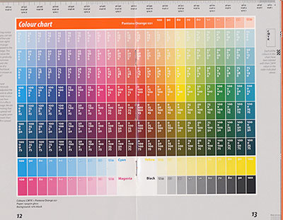
Rita, our prepress tech, fell victim to its beauty as she gushed over the whole book. A designer at heart, she found herself mesmerized by the color chart centerfold:
Luckily I managed to wrestle the book back out of her clutches without too much of a struggle.
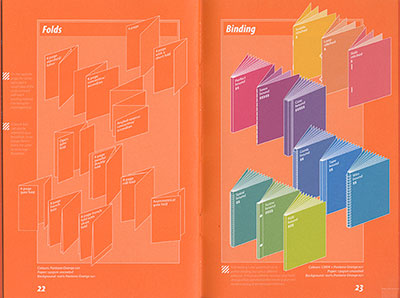
Our CEO Nick did his best to inspect the guide for accuracy. He found most of the details spot on, although he wondered whether or not some of the terminology reflected regional differences. I mentioned that The Media Collective (the publishers) are based in the UK, which explains why they kept misspelling the word color. Anyway, the section on folds refers to a 6 page brochure as a concertia/accordion. Nick said we call it a Z fold because of the shape. I did my own investigating and found that both terms are used interchangeability. That means they’re both correct, although the Z fold may be more common here in the US.
Our operations manager Alex offered aesthetic criticism. He felt that the text in foil was very difficult to read aside from the front cover. He blamed this on 2 things: the text size and the foil stamping process. He believes the foil effect put form over function considering the book’s small size. Personally I didn’t have a hard time reading the words, although I can see where others might get irritated. Older designers and those with vision problems will need to bust out the glasses to read the side notes.
Our Grade: A+!
Well, maybe I should say my grade. I don’t care what anyone else thinks—I freaking LOVE this book. Here’s a nice video review you can watch to justify understand my enthusiasm:
What we would add to the book of print design knowledge
I reached out to The Print Handbook Facebook page immediately to sing the book’s praises. Since we’re a print shop, the admin asked if we thought they should add anything to the upcoming 3rd addition. We thought of a few software specific issues, such as flattening transparencies in Illustrator. But the book advocates for InDesign as the preferred print design tool. It would be helpful to explain offset vs. digital, particularly in the context of color matching. Speaking of color, monitor calibration would be another helpful tidbit for newbies. We often run into trouble when designers don’t realize that the colors on their screens aren’t the same as the final printed product. And just for good measure, it would be wise to cover the basics as far as color contrast and text size. This is a HUGE issue with business cards. Color contrast is your friend, and don’t even think about less than 8pt. text on a business card.
St. Paddy’s Day celebrations are big business for bars, clubs, and restaurants. Since brands in those industries have almost a readymade promotional strategy for the month of March, I’m going to focus on brands in not-so-easy industries. Bars and restaurants are welcome to steal these ideas in the days leading up to March 17th, but the list below should be equally appealing to small biz retailors as well as service providers.
17 Ways to Make Your Customers Feel Lucky in March 2014
#1) Shamrock hang tags-Put a little green in your product displays, gift bags, and online orders. You don’t have to go all out for the die cut shamrock shaped hang tags, although that would be pretty awesome. As long as you have shamrocks in your design, you’re good to go. You don’t even have to use Illustrator. Try decorating your tags with shamrock stamps and stickers!
#2) Get in on the March Madness- College basketball inspires rabid fans across the nation. Your local biz can express support for the community with a show of team spirit for a nearby University. Don’t have a basketball team close by? Latch on to a regional favorite. Send an email campaign offering 20% purchases for fans who stop by in college basketball team apparel.
#3) Reward loyal ladies for Women’s History Month– Show your female clients special treatment to celebrate women’s achievements. Keep in mind that the spirit of the occasion is about respecting the female gender intellectually, so handing out pink roses probably sends the wrong message. You want to avoid anything that could be considered a negative stereotype; think brainy. A branded bookmark or a month long smart women’s discount will do the trick.
#4) Decorate for the 1st day of spring – This year’s record snowfall’s got everybody daydreaming about warmer weather. Well, everyone outside of Southern California. The season officially starts on March 20th, but shoppers will welcome cheerful colors, pretty flowers, etc. a bit earlier this year.
#5) Allow pets on puppy day- March 23rd is for our 4 legged friends. You can let dog owners bring their fur babies in your store, pass out puppy treats at the register, or have a local shelter set up an educational booth about pet adoption. This is a great way to express your inner animal lover and make a positive impact on the community.
#6) Spring fever postcard promo- Make space for the new summer inventory by getting rid of your winter merchandise. Since the items are out of season, slash prices to as low as you can. Use a postcard direct mail campaign to get the word out about your spring fever bargains.
#7) Honor Employee Appreciation Day- Your customers like knowing that their dollars go to support businesses who respect their employees. With all the bad press about big companies paying low wages and whatnot, let them know your small biz cares about your staff! Have a pizza party in the office, and post photos on your blog, Facebook, Twitter, etc.
#8) Spring theme Pinterest boards- Create a special Pinterest board to show signs of spring in the neighborhood! Take pictures of flowers, little leaguers, guests walking by your store in short sleeves, anything you find inspiring that reminds you of the fun times ahead.
#9) Spring break survival kits- Kids, teens, and college students usually have time off from school in March or early April. Collect fun items in your store and group them together in spring break survival packages. Don’t forget the parents; they’ll need stuff to relax while the kids run wild!
#10) Organize a “spring cleaning” trash pickup- As soon as the snow melts, you’ll start to notice trash that’s accumulated over the winter. Team up with a school or organization/charity and volunteer for a day to keep the neighborhood clean!
#11) Display new banners – Spruce up the place with outdoor signage. Print vinyl banners to advertise your sales, events, or just to wish everyone a happy St. Patrick’s Day outside your store.
#12) Salute Girl Scouts- March 12th marks the anniversary of the Girl Scout’s founding in 1912. This milestone easily ties in with Women’s History Month as the Scouts are all about empowering young girls to become independent leaders. Invite the troops to your store for goodies or sponsor an outing they’re raising money for this summer.
#13) Educate about Deaf History-National Deaf History month starts on March 13th and runs till April 15th. For many years, Deaf people have struggled with the perception that they’re disabled. Show your customers that you’re above the ignorance by sharing information about local events through the National Association of the Deaf (NAD) and other organizations.
#14) Dye potato chips for Tater Day- March 14th is about addictive snack foods. We say take it a step further by making your own potato chips with a green twist! Your customers will love munching on homemade taters.
#15) Tweet St. Paddy’s Day hashtags- Up the volume on your tweets by using the right hashtags for your marketing. Just make sure your shares apply to the tags—no one likes a hashtag hijacker! You’ll find a handy list of useful St. Paddy’s Day hashtags on Social Media Today.
#16) Time sensitive email offers- Urgency increases response rates, so send emails with marketing messages that customers must act on immediately. For example, watch the weather report and plan a 3 hour sunny afternoon special to blast to your customers a few hours ahead of time.
#17) St. Patrick’s Day scavenger hunt-This works best when you team up with other local businesses. Leave “clues” for your customers in your store, on your blog, etc. You can even print out clue cards to put in packages. Reward the winners with big deals, such as BOGO (Buy 1, Get 1 Free).
Hello inkheads! Many of you enjoyed our interview with Designer Paul Biedermann, so I thought you’d like to meet another creative friend of mine. Rick “Dr. Deadline” Clark makes waves wherever he goes, and he’s known for his ornery attitude about the Millennial generation. He doesn’t have anything against us per se; he takes issue with what he sees as the deevolution of the design profession. I asked Rick to share his advice for young designers, especially with respect to the role print will play in our careers. Enjoy!
Dr. Deadline on design, social media, and the future of print marketing
Q1 – Your experience overlaps agency and account management with various aspects of the creative process. How has this helped or hindered your career?
A1 – Interestingly enough, the pivot point came with the introduction of the first Mac. As an agency principle at the time, I was fortunate enough to at least recognize it’s potential impact as a creative tool. Of course it has far surpassed that limited vision today.
It was at this juncture that I immersed myself in the creative side of my business and turned administration over to others. Having a balanced view of my profession and understanding all aspects of what contributes to “doing the work” well, has always been a great advantage.
Q2 – What do you mean “doing the work?”
A1 – Identifying the right audience (demographic) and appropriate channels (media) to effectively and economically reach them; creating the right message (content), the copy, the images the tone and style (brand personality), to convince this audience to prefer my client’s product or service; this is “doing the work.”
Call it advertising, marketing, branding, design, whatever… it’s all the same. Each generation comes up with it’s own terminology in order to make the profession their own.
The good news is the business has a bright future ahead of it, the bad news is that, beginning in the late 80’s, the broad availability of graphics and production software and the suggestion that anyone can produce ads, collateral, etc., the desktop publishing revolution made it possible for millions of amateurs to produce a mountain of crap.
This profession has been reduced to a price driven commodity business peopled by greenhorns and further damaged by unscrupulous crowd sourcing and www-do-it-yourself for free charlatans.
Q3 – You’re well known for your strong opinions and sharp tongue, is this an asset or liability as a solo practitioner in a world that operates at Twitter speed?
A3 – I make a very good living, am working with clients who value what I bring to the table and are willing to pay a fair and reasonable price for my services. My receivables run net ten days. Apparently, it’s an asset.
Q4 – We would be remiss if we didn’t ask, does print still play a role in your business?
A4 – Always has, always will. I know many believe that social media has turned print into an anachronism, but it hasn’t. I’ve yet to work with a client who successfully abandoned traditional media and put all their eggs into the social media basket. Inevitably they all return to a more balanced strategy.
Just as I have grown to include social media channels in my clients’ marketing plans, those who grew up enjoying a lap full of technology should not be so quick to abandon what has proven to be successful for decades.
Mastery of the skills needed to put ink on paper remains an important part of every designer’s toolbox.
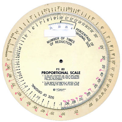
No longer do we have the smell of rubber cement or hot wax permeating the office or do we face the threat of getting gashed by an X-acto blade. We needn’t spend hours rewriting copy, altering layouts, specing type with a calculator, sizeing images with a proportion wheel, keylining with a Lucigraf, cutting rubies by hand, shooting and stripping negs, burning blankets, hovering over light-tables with a loop presschecking sheet after sheet into the wee hours of the morning.
Today’s technology allows us to accomplish all of this at the speed of thought. I’m able to do in a day what it took my “old school” staff weeks to do. But I’m not off the hook when it comes to producing the big idea.
What’s worse than a great idea poorly executed? A weak idea produced with great flare! Learn to think before you learn to do. But learn both and practice them every day.
About the Author
Rick Clark
For forty years, Rick has produced successful marketing campaigns for an enviable array of clients. His expertise spans both agency management and creative direction, legacy and digital media. He is as adept at developing solid strategy and turning an elegant phrase as he is designing and producing a memorable piece of advertising art. Visit Rick aka Dr. Deadline’s website and follow him on Twitter.
Never one to dodge the truth… I share this with enthusiasm. Branding ≠ Bullshit: Why Branding Should Matter… http://t.co/BymhKYAROy
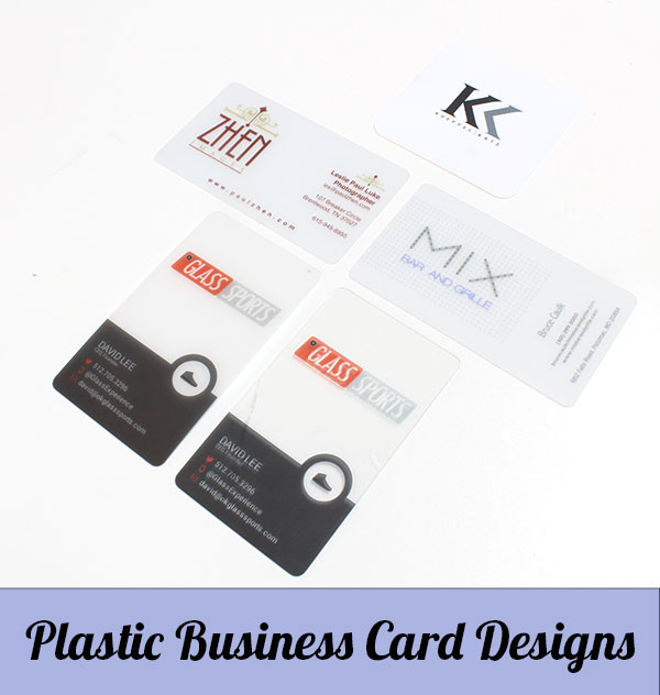
We’ve noticed an increased interest in our plastic business card printing service so far in 2014. I already discussed several technical questions about our frosted plastic cards in this FAQ. Today I want to showcase the creative side of this product. The projects below come from our real clients, and we’re proud to be able to share these successful print pieces for your inspiration!
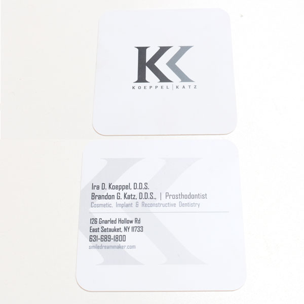
Square die cut white plastic card for dental marketing
This one’s my favorite of the bunch. For my money, the white plastic gives off the most professional vibe, plus the material makes the text easy to read. There are no issues with us not using white ink since the card itself is white. If your company logo or design elements use a lot of white, I highly recommend printing on this color. Otherwise your contact information may not be readable!
Anyway, this card is a custom job because you won’t find the square shape in our standard sizes. Most cards are 2″ x 3.5″ whereas this measures 2.25 inches all around. The round corners coupled with the bright white color remind me of a polished incisor.
Aside from the clean design, this card’s a winner because of the client’s industry. These two Drs, Ira Koeppel and Brandon Katz, practice Prosthodontics, a specialized field of cosmetic dentistry. Prosthodontic dentists work on complex reconstructions as well as the oral equivalent of plastic surgery. In other words, appearance is kind of a big deal for their practice. The plastic makes this card memorable as does the unique shape. Perfect combo. The thick, yet flexible 20 pt stock signifies trust, which would be an important message to communicate to new patients. Prosthodontic work tends to be much more expensive than a routine teeth cleaning, so patient perception should be a top priority. These cards look like a million bucks, and I’m sure patients would expect nothing less from an upscale practice.
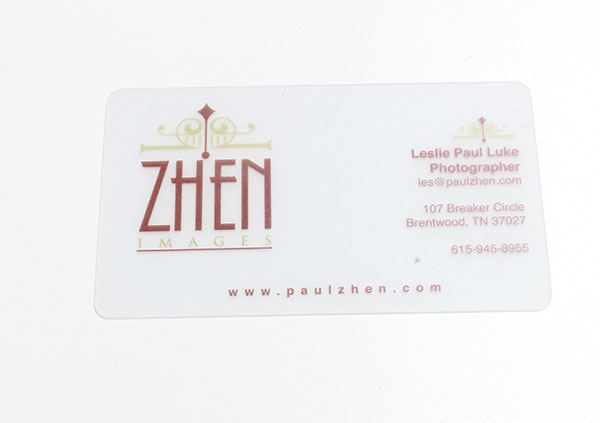
Translucent (Frosted) card for pro photography
Photographer business cards are always interesting. Well, not always. I’ve seen my share of blah, boring cards from creative professionals. At the same time, I’ve seen tons of awesome photographer card examples, especially on Pinterest. From die cuts in the shape of a lens to mini card portfolio collections, the competition seems quite stiff. And the prices for these custom projects are probably as high as a new imaging equipment.
Photographer Leslie Paul Luke of Zhen Images opted for translucent plastic, an affordable solution that subtlety attracts attention. The elegant design creates enough contrast with dark, reddish brown text in a classic typeface. Text color is key to making this particular product work for you, and this design proves it’s possible to remain readable without resorting to basic black. The light earth tone balances out the red, but it’s used sparingly so as not to interfere with the card’s functionality. I probably would’ve aligned the logo with the contact info; the phone number feels a bit disconnected to me on a line of its own. I think the extra space works in the URL since the site’s a fairly short domain name.
Grade these business card designs!
What other industries would you suggest for a plastic business card campaign? How would you rate the design examples above? Tell us in the comments below!
p.s. To get your own snazzy set o’ plastic cards from our website, please click here!
In case you can’t tell, I spend a big chunk of my work day blogging here at PrintFirm. I don’t do this for my health; in fact, incessant typing is quite taxing on my delicate wrists. Copywriting comes naturally to me, but my bosses want me blogging for a reason—my writing helps their bottom line.
They’re not the types to hoard trade secrets, so I’m free to share a bit of my online marketing knowledge with you. I’ve noticed a disturbing vacancy on many printers’ websites and I can’t resist the temptation to set the record straight on content marketing. I’ve also gotten a lot of annoyingly vague questions about blogging on LinkedIn in particular, which brings me to today’s Q & A. For the sake of discussion, I’m going to assume that you have very little experience writing for the web. I tried to put myself in your shoes and figure out what kind of answers you’re looking for when you ask me open ended stuff such as, “How can I promote my printing business online?” Let’s hope we both learn something through the dialogue below!
Do I really need a blog? I’m a freaking PRINTER!
HELL YES!
Now that I got that out of the way, I’ll level with you. I find this question expresses underlying animosity towards digital marketing in general. I can respect that. After all, many printers feel threatened by online channels to this day. You’re skeptical and maybe even resentful because you believe the web killed your sales. Fair enough. I’d be lying if I said that online advertising didn’t put a dent in your profit margin. Nevertheless, I urge you to view multi-channel marketing as an opportunity rather than a unwelcome intrusion. I bet you explain the benefits of cross media to your clients daily—heed your own advice!
Here are 3 reasons why your brand can’t live without fresh blog content:
You need to feed search engines- Think of Google as the insatiable Cookie Monster. You see, Google, Yahoo, Bing, etc. uses special software robots called spiders to “crawl” your website. These spiders feast on new material, and they won’t waste their time on your site unless you deliver tasty morsels for them to munch on. You can’t update the text on your banner printing product page every day, though, which presents a problem: How do you get the spiders to keep crawling your site and get a clearer picture of when to serve up your business in search results? And the answer is… blog, blog, blog!
Content gives you original material for social media sharing– Surely you share awesome stuff about print, design, typography, marketing, and other interesting topics with your social communities. That’s great, keep up the good work! But sharing other people’s content nonstop doesn’t benefit your business very much in the long run. Your community members connected with you because they want to hear what you have to say. A brand without a distinct voice will have a hard time standing out in a sea of noise. Your blog gives you a place to educate, entertain, and engage without relying on a 3rd party provider intent on burying you (*coughs* FACEBOOK *coughs*). Plus, every click from your social pages to the blog drives traffic to your site. Talk about a win, win! Eventually, your customers will see you as a fun, useful resource, and they might even look forward to your tweets.
Lead generation, baby- You probably consider sales a top priority. You’d do just about anything to boost those numbers, right? Well, blogging will help you accomplish this goal in several ways. First off, people will be able to find your posts through search and social although they might not be in the mood to purchase a product. At least not right away. These folks won’t land on your catalog printing page because they’re not looking for it yet. Maybe they’re doing research into promotional strategies or hoping to find awesome business card design examples for inspiration. Either way, you already know they’re interested in your products and services. Otherwise they wouldn’t click on your links in search results. In the online marketing world, we call this targeted traffic. The phrase refers to the kind of users you want, those who are most likely to buy something now or in the future. That doesn’t mean you try to hard sell them on your blog, but be sure to include a couple of internal links (in moderation) along with a call to action at the bottom of your article. Your CTA doesn’t have to go the sales route. For instance, your blog is the perfect place to capture emails for your promotional campaigns and company newsletter.
Does my blog need to be on my website or can I use a free platform?
Oh boy. Let me put it this way. Do you want to drive traffic to WordPress.com, Weebly, Blogger, Tumblr, etc. or to your own website?
You said your site, right? Ok, there’s your answer. Your blogging efforts should promote your own site, not an online blogging community. The only way to get the real benefits of blogging is by hosting the blog on your own domain.
If your website were a piece of real estate, then your blog would be the beautiful backyard patio where you invite guests to kick back. You wouldn’t put this kind of addition on a rental property, though, because you don’t actually own the home. Case via analogy closed.
What should I write on my printing company blog?
Personally, I believe printers have an advantage over other industries as far as content is concerned. Our niche blurs the lines between technology, design, marketing, and fine art. Plus we’re naturally associated with paper production/advocacy, environmental issues, education, and a rich history. Add your company’s adventures (client projects, announcements, events) and you should be able to blog from now until the end of time.
Does everything have to be original? Can’t I just curate great content?
Personally, I err on the side of originality. I strongly encourage you to get in the habit of creating more than you curate. I’m referring only to your blog here because social media communities are another story. I follow the 80/20 rule on social, which means that only 20% of my social shares overall come from our brand.
Back to blogging. Curating content can help your blog gain traffic so long as you include an explanation of why you decided to post the infographic, article link, etc for your readers. Throw in your own 2 cents on the subject to add extra value, and you’re good to go.
Before we move on, I want to extend 2 cautionary notes.
#1) DO NOT REPOST ARTICLES IN ENTIRITY WITHOUT PERMISSION. I don’t mean to shout at you, but I want you to know that this is an important point. It’s bad netiquette (internet etiquette) to straight scrape (copy) content from another site and repost it even if you link back to the source.
#2) Google’s not a big fan of curators. As Google’s algorithm evolves, they’re getting much better at making lazy bloggers disappear. So be careful about curating too much or you may see your blog traffic decline quickly in the near future.
How often should I blog for my business?
My gut instincts say you should blog as much as humanly possible. But I realize that’s not exactly realistic unless you have an in-house inbound pro like me on your team. And even I don’t blog every day because I have too many other distractions responsibilities that get in the way. You’ll have to decide the best way to utilize your available resources.
Most inbound marketers recommend posting at least once per week. Still, there’s a lot of evidence to suggest that daily blogs generate fantastic results; however, I want to extend a friendly warning about this model. It’s been my experience that small businesses simply can’t keep up with this demanding schedule, at least, not without sacrificing quality. I’m sure you’ve seen some snake oil salesmen trying to convince you that you can produce great content in just 15 minutes per day. That’s absolute nonsense, especially considering how many brands are publishing on the web (a phenomenon known as content shock). I’m a professional writer and I spend at least 2 or 3 hours on a typical blog post. Longer ones like this eat up an entire work day or 2. The mythical easy blog post template won’t cut the mustard in 2014 and beyond. Simply stated, inbound marketing is hard work. You have to slave away to get the results you want just like the rest of us.
How long should my articles be?
It depends. Don’t bother posting less than 350 words unless you’re curating. Longer posts (600-2,000 words) with references and uncommon language send good signals that you’re posting higher brow articles. I say mix it up. Let’s say you’re going to blog 3 times per week. 2 of those posts can be 500 words with 1 extra meaty article. At the very least, aim for 1 epic post per month.
Should I link to other websites in my articles?
Ab-so-freaking-lutely! Linking to authoritative edu sites or high PR domains passes a tiny bit of juice along to your post. Still, you want to be strategic about outbound linking, too. By that I mean you shouldn’t always go for the major publishers who will likely ignore you. Seasoned bloggers understand the importance of backlinks, and smaller sites might return the favor or at least give you a pingback.
Does my blog need images to go along with the copy?
Yes. You’re telling stories and visuals help convey your message. Just compress the pictures before you upload them so they don’t slow down your load speed. You should also name them properly for image searches and include keyword friendly titles, captions, and descriptions.
Where can I go for blogging printspiration?
My main sources for blogging material are as follows: Google analytics, Webmaster Tools, our customers, my co-workers, and the top printing industry blogs. I suggest you dig into your web analytics to develop a content strategy, sign up for Google alerts related to your services, and ask your social media communities for topic suggestions. You can never go wrong including your clients in the process.
Who should I follow for better blogging tips?
You mean besides me?
Seriously though, I’m afraid I can’t think of a very good source of this type of information in the CMYK space. There are a lot of industry publications, yet I find that their online marketing tips merely scratch the surface. For better blogging advice and online marketing training in general, I recommend you follow these Twitter accounts:
Of course these sites maintain active blogs you can subscribe to for free.
Got blogging questions?
Hopefully you’re pumped to produce some bodacious blog posts for your printing company! I think I covered most of the critical stuff, but maybe I missed your biggest burning question. Ask me anything about blogging in the comments below!
Hello and welcome to the 5th article in our series 7 things NOT to say to your printer. Today’s printucational article will be a little different than the previous posts because the topic comes directly from our CEO, Nick Artounian. Nick asked me to write about one his personal pet peeves—multi-page documents.
Nick’s got nothing against catalogs, booklets, and other types of print marketing materials. His main beef comes from custom quote requests that don’t really make a lot of sense from a technical standpoint. For example, he’s not sure what to say when someone asks whether or not we can print a 9 page business booklet for them because there’s no uniform standard for counting pages!
No, that’s not a typo—we really don’t know what you mean when you ask for a 9 pager. Let’s use this project scenario as an example to explain an especially tricky aspect of commercial printing.
What is a page?
In our example, you’ve called or emailed us about a 9 page catalog project. The trouble is that the word “page” is subjective in the sense that people use the same term to refer to different things. These are the 3 most common definitions of “page” we hear from clients:
#1) A full sheet of paper (front and back) – Flip through a magazine and you only need to turn a single sheet of paper to see more content. As a result, some people call a sheet of paper a “page” even though there’s artwork on both sides.
#2) 1 side of a sheet of paper (front only, back only)- This is more in line with our thinking process. A book, magazine, catalog, etc. usually presents pages as one side of a piece of paper. Notice that when you read a novel, each side of a piece of paper contains a page number in sequential order.
#3) 1 double sided spread- We’ll define spread shortly. For now, let’s say that we tend to hear designers with prior printing experience refer to an individual spread sheet as a page.
Just writing this made me confused! *sighs* For our purposes, definition #2 would be your best bet—a page is the equivalent of 1 side of a piece of paper.
Do covers count as pages?
Yes indeed! Here’s the funky part—as I said above, we count 1 side of a piece of paper as a page. Since you have a 2 double sided parts to your cover (front and back), your cover counts as 4 pages! The front side of the cover is 1 page, the backside of the front cover is 1 page, etc.
How do I count the number of pages in my catalog?
The answer depends on your binding option, which we’ll discuss in a bit. For now, I’m going to assume that your fictitious catalog will be bound with staples (aka saddle stitched) because that’s the most popular method among our clients.
If you check the catalog or booklet product pages on our site, you’ll notice that the page number minimum starts at 8 pages, 4 for the cover and 4 inside. Click on the drop down menu and the page number options increase by multiples of 4 (12, 16, 20, 24, etc.) because of the way the pages are physically laid out on paper.
Pages vs. Spreads
For stapled booklets or catalogs, you’re actually dealing with spreads in your layout as opposed to regular pieces of paper i.e. the kind you see in a spiral notebook. Adobe defines a spread as:
A set of pages viewed together, such as the 2 pages visible whenever you open a book or magazine.
Basically, a spread is a sheet of paper that will ultimately contain 4 pages after folding. This concept is hard to wrap your head around, so let’s hope this diagram does a better job explaining things than I can:
If you’re still having trouble, go get a magazine. Open it anywhere and you’ll see two pages on either side of the fold in the center. Each page is part of a single spread it shares with 3 other pages!
While we’re on this subject, I want to make a quick note about reader’s spread vs printer’s spread (I know, I’m only kidding myself on the quick part). You see pages in a newspaper, paperback, etc. in numerical order, otherwise known as reader’s spread. But that’s not an accurate reflection of the printing process. We arrange your pages on the spread sheets as part of the prepress procedure; however, here’s the kicker— we have to print the pages out of order on said spread sheets so they appear in the proper sequence after they’re folded. The crazy way we go about putting the ink on the paper so you don’t end up reading gibberish is called printer’s spread or imposition.
Before you panic, no, we don’t expect you to submit your files in a printer’s spread. I just wanted you to get a better understanding of the way everything works in CMYK world. And maybe make you feel sorry for us a little bit.
I think that’s enough printer’s self-pity for one article—back to page counting.
Why can’t you print a saddle stitched “stapled” catalog with an odd number of pages?
This question goes back to the previous answer about pages coming in multiples of 4. So an odd number of pages (9, 11) or an even number of pages that’s not a multiple of 4 (6, 10) presents a problem. We can print a 9 page catalog (that’s 9 pages of content excluding the 4 cover pages) with side staples, but you’ll end up with 3 blank pages. Why? In order to fit that last page in, you’d have to order a 16 page product to get 12 internal pages (remember the cover takes up 4 of those pages)!
There are a couple of things you can do in this case:
You can remove the last page and go with an 8 page catalog (12 total with cover)
You can live with a blank page at the end and order a 16 page catalog with 12 inside pages.
Add more artwork to complete a 16 pager (12 inside pages)
I’d go with option #3 because there’s no extra charge for the 3 additional pages. You’re already paying for the paper and printing; why not include more in your design? Besides, you probably designed that 9th page for a reason. Scraping it doesn’t make sense unless you’re on a super tight budget.
Are you still with me? You might want to take a little break before we move forward. Your brain deserves a rest.
How binding options effect page numbers
Ok, binding brings a whole new level of complicated into the mix. Our standard options for business catalogs and booklets don’t include wire binding, although we offer this type of binding on short run catalogs along with short run booklets.
The main difference is that we don’t have to work in multiples of 4 with wire-o binding. The spreads have to be cut in half and bound with wiring, which means we work in multiples of 2 instead of 4. The information on our website shows the page counts in 4s, yet we can make you a catalog with 10 inside pages without leaving anything blank (the total number would be 14 pages with the cover though).
We don’t separate wire binding numbering on our website to keep things uniform. If you don’t see the number of pages you need in our standard options, feel free to place a custom quote request here.
Does page size affect my page count?
For once, I can give you a simple answer: NO!
A 5.5″ x 8.5″ page and an 8.5″ x 11″ page are essentially the same as far as the folding and raw materials are concerned.
What information do you need in order to give me an accurate price quote?
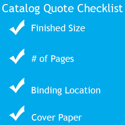
We’d be happy to give you a project estimate! Here’s a little quote checklist:
Finished size- Not to be confused with the flat size. The finished size means the dimensions after we’re done folding your catalog. Some people give us the flat sized (pre-folding) measurements, which causes confusion on our end. We don’t want you to worry about the flat size, stick with finished!
Number of pages- remember, each piece of paper counts as 2 pages because it’s double sided. Count the number of ½ sheets of paper and add 4 more for your cover.
Staple binding location- Tell us whether your saddle stitching will be on the long side or short side. Most projects call for left side stapling, yet we’re usually able to accommodate other requests (top, bottom, etc.).
Cover paper- Your cover material changes the price. We offer self-covers, which are made with the same 100 lb. glossy paper as the rest of your catalog, or thicker 10 pt. cardstock.
What’s the best software for multi-page documents?
We highly recommend InDesign for creating catalogs, booklets, and other print products. ID is a layout program, which means it’s set up with shortcuts to make your life easier. You can use Photoshop or Illustrator for the task, but we believe InDesign will be your best bet for multi-page designs.
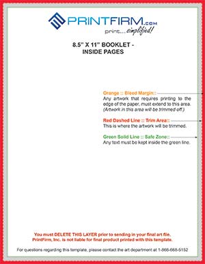
Does my artwork need a bleed?
From now on, please assume that every printed file can’t leave the safety of your computer without a bleed. That way you’ll never have to ask this question again.
How should I save my multi page file?
Please save your file as individual pages in the correct numerical order w/ equal bleed all around. Page numbers in the artwork certainly help us figure out the right sequence.
A note about InDesign: stick to the reader’s spread in ID— let us do the printing setup work for you! Don’t worry about the imposition, we’ll handle that part.
Questions
If you’re not asleep yet, surely you have questions about printing multi-page catalogs and booklets. Ask your burning questions in the comments below!
Happy Valentine’s Day, everyone! In case you’re wondering, yes, we have a winner in the custom canvas giveaway. Congratulations Matthew Shuey!
Matthew is a talented web designer/inbound marketer from our Google Plus page, and he certainly deserves to win this prize for his wife. Matthew already shared the photo he wants to print for his sweetheart—I know she’s going to be thrilled.
I’m happy to say that most of you who entered this giveaway are already a part of the community. It’s great to meet new people, but I’d rather give a prize to one of you CMYK loyalists. This time around, I decided not to promote the contest on giveaway sites because that decreases your chances of winning. I think we’ll stick with this strategy from now on.
#PrintLove Anniversary Announcement
Speaking of love and community, February 14th happens to be my 1 year anniversary of working here at PrintFirm. As many of you know, I come from a digital marketing background. When I first joined the team, I thought of my position as just another ecommerce job. Little did I realize, I didn’t get another online marketing job—I found a virtual family.
I love all my colleagues, but they couldn’t really help me navigate the social sphere. When I got here, the company didn’t have any presence to speak of on Facebook, Twitter, etc. So I reconnected with a few cool people I knew from previous SMM positions, and hoped for the best.
Shortly thereafter I stumbled on #PrintChat. Through PMC, I met many awesome people I consider friends. The printing and design community embraced me with open arms, as did several special customers. So today is a milestone for me personally that wouldn’t exist without YOUR support.
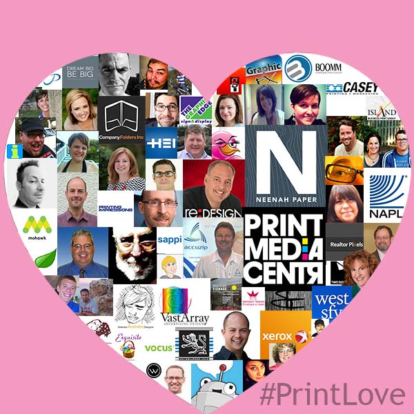
I couldn’t think of a better way to represent my gratitude than with this graphic:
I tried to fit all of you beautiful people and brands into this image; if you don’t see yourself pictured, you have my apologies. Thank you everyone for making this an amazing year!






 Hello and welcome to the 5th article in our series 7 things NOT to say to your printer. Today’s printucational article will be a little different than the previous posts because the topic comes directly from our CEO, Nick Artounian. Nick asked me to write about one his personal pet peeves—multi-page documents.