Share Creative Print Pieces on Social Media

Happy Monday inkheads! Anyone who follows my personal social media accounts knows I started the #onething personal creative challenge with my friend Drew Myler in the re:Design Google Plus community. Over the past 5 months or so, numerous artists have joined in the fun of creating for personal fulfillment i.e. making art for art’s sake. We’ve gotten several inky submissions from pen drawings to my promotional poster print, yet no one’s chosen to zero in on CMYK alone.

Enter Christine Alexander.

Anyway, Christine is a certified Print Goddess who’s appeared on this blog before. She instituted a letter writing challenge for National Card and Lettering Writing Month. Although I accepted the terms, I failed to mail a single letter for the month of April! Christine assured me there’s plenty of time to redeem myself, and I’m happy to report that I started working on a special letter for her last night. It’s not just a letter, though. I’m working on a handmade postcard of sorts.

A total print geek and design enthusiast, my new pen pal decided to put her own unique spin on the #onething movement, which is exactly what the movement is about—expression and fulfillment.

Introducing #DreamIn4C
#DreamIn4C printing industry hashtag

The print social communities already use industry hashtags to communicate with each other as well as the professional design crowd. Popular examples include #PrintWins, #PrintLove, and #PrintChat. Christine added her own new tag to the mix—#DreamIn4C, which comes from her blog title and the fact that apparently 88% of the sighted population dreams in full color. The idea is similar to the #PrintSpotters hashtag from the People of Print in that Christine intends to share photos of awesome print sightings in the real world to share through digital channels. She suggests snapping pictures of anything inky that catches your eye from brilliant movie posters to sweet sticker typography and lovely UV coating. Although you’re not creating the piece itself, your photo of the printspirational work counts as an original contribution, so the images can be part of the #onething stream.

My #DreamIn4C submission

I welcome Christine’s innovation, and I see her tag as a way of opening up one thing to the wider world of artistic enthusiasts. I tried to broader the one thing project’s scope with #MyHoodPics because I thought this would be an easy way for new people to get involved. While the notion of snapping pictures of interesting things in your immediate environment sounded simple to me, in hindsight I see why this would prove difficult for someone who’s not already artistically inclined. In truth, most people ignore their surroundings or at least rarely stop to examine the small details that make for a great photo. Christine’s concept seems more appealing to the average person because we’re all surrounded by print media in the offline world. Surely you’ll be able to find 1 item worth photographing without even straying from your daily routine. For instance, you probably pass by lots of billboards on your commute to work. Those are a form of print advertising, so take a pic and you’re good to go.

Enough talking, let’s start sharing! Here’s my first #DreamIn4C post, a photo of the custom canvas print I gave my mom for Mother’s Day. I took a long exposure landscape photo of the San Fernando Valley way up on the top of Canoga Ave above the 118 freeway in Chatsworth. My mom and I always drive by the area on our way home from her house in Simi Valley. We often admire the view together, so I figured the canvas would remind her of the time we spend together on the weekends.
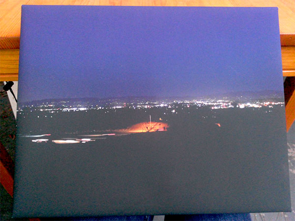
Custom Canvas Photo Print

Did you see an irresistible example of print today? Will you be sharing with the either of these hashtags in the future? Tell me your story in the comments below!
When to Use Plain vs Rich Black

Hello inkheads! We all know print design projects have several pain points, especially when it comes to color matching. For instance, have you ever held your freshly printed piece in your hands and wondered, “Why the heck does the black stuff look grey???”

After the initial shock dissipated, you probably questioned what the press operator was smoking while your file went into production. Or maybe you concluded that an incompetent prepress technician modified your file, and changed your artwork without your consent.

Yet, most of the time, color issues are the result of improper file formatting. Black is an easy example of this phenomenon, so let’s explore why you must adjust black color values for print and then I’ll show you how to get’er done in Photoshop, Illustrator, and InDesign.

All about using the color black in print design.

What is plain black vs rich black?

We mentioned the difference between plain and rich black in our file requirements page, but we didn’t go into detail or explain how to manipulate color values with the popular Adobe software programs. The file specs page also discusses problems with the color blue, which I’ll save for another blog post because I don’t want to confuse you.

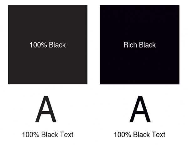
Rich Black only comes up in the context of print design because black always looks, well, black on your computer screen. Unfortunately, that’s not the case on paper; at least, not for backgrounds or filled objects/elements, such as a box for text, etc. In those instances, you want to go with the rich option to avoid an unsightly grey in ink. Rich black uses the following CMYK percentages:

C: 50%; M: 50%; Y: 10%; K: 100%

As opposed to plain black, which you should use for all black text:

C: 0%; M: 0%; Y: 0%; K: 100%

Reason being, you might run into trouble due to the mixture of colors contained in rich black. The extra Cyan,Magenta, and Yellow means unnecessary ink, which may result in blurry or fuzzy type. You want crisp, clear typography with no offsetting.

Here’s a handy graphic to illustrate the difference for you:

Plain black vs rich black in commercial printing

Other types of black

Believe it or not, we still haven’t exhausted the black possibilities. For those with super picky discriminating aesthetic tastes, you can get different tints by playing around with your color values a bit. The photographers among you will likely recognize the terms warming and cooling from photo editing/filters. Just as in image retouching, warm black adds a red tint whereas cool black creates a soft blue hue in your key. Use the CMYK values below for subtle hints of red or blue in your backgrounds. We don’t recommend anything other than plain black for your text.

Warm black

C: 0%; M: 40%; Y: 0%; K: 100%

Cool black

C: 40%; M: 0%; Y: 0%; K: 100%

The 2 types of black you should never use in print design

Now that we’ve covered the good, it’s time to delve into the ugly. And by ugly, I mean that either of these practices will get you a CMYK penalty, the printer’s equivalent of a party foul.

Default black in Photoshop

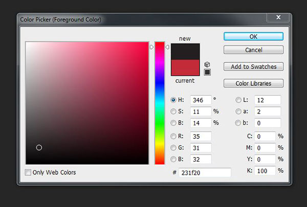
You won’t find black text issues in Illustrator or InDesign as both of these programs automatically use the plain black swatch (K 100%). AI and ID are definitely more print friendly than their pixely cousin Photoshop! To show you what I mean, I’ll need you to crack open PS for a second. Go ahead and open up a new PS document, and fill it with black. Grab your color picker, and you’ll see that Photoshop black is not exactly pure with respect to the CMYK values (75%, 68%, 67%, and 90%, respectively). As I said before, too many colors means lots of extraneous ink. Then there’s the possibility of editing an image in Photoshop to import into printed artwork with a black background in Illustrator or InDesign. The color inconsistency may force you to reprint your posters.

Solution: Always double check your black CMYK color values in Photoshop!

Registration black

Speaking of excessive color, sometimes newbies get carried away with the CMYK; they are under the mistaken impression that since black is a combination of colors, all of their CMYK values must be 100%. That would cause a serious ink overload unless our prepress department catches the mistake. Just so we’re clear, I can’t think of a single situation where you’d need to max out each color ink.

Solution: Just don’t.

How to select the right CMYK color values

By now you may feel as though you’ve got 99 ink problems, but at least black ain’t one! (Apologizes for the Jay-Z reference—I couldn’t resist!) Now let’s talk solutions to your Key woes.

Photoshop:

How to change CMYK values in Photoshop

You likely figured out how to change CMYK color values from our previous default black exercise in Photoshop. Simply grab your color picker, and insert the correct values in the bottom right hand corner of the dialog box. Press ok, and you’re good to go.

Illustrator:

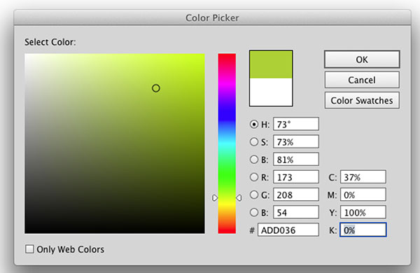
How to change CMYK color values in Illustrator

The AI procedure is almost identical to that of Photoshop. Pull up your eyedropper tool and input the proper CMYK values in the lower right hand corner of the color picker window.


InDesign:

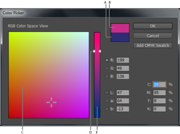
How to change CMYK color values in Adobe InDesign

ID isn’t quite as straight forward, yet it’s still a breeze. You have to double click on either the fill/stroke portion of the Toolbox or access the Color panel to get to the color picker. Once you get the color picker up on your screen, modify the CMYK values the same way you’d do in PS or AI.

Do you have any questions about using black in your print designs? Any funny stories from the creative trenches? Drop me a line in the comments below!
Exclusive Demand 14 Marketing Conference Discount

Happy Monday inkheads! Unlike most Mondays, today I genuinely feel blessed because we’re kicking off the week with a very special offer from the fine folks at Vocus. You might remember my begging encouraging the printing community to mingle with our digital counterparts at the exciting online marketing conferences coming up this summer.

When I introduced the idea, I made a note that we as printers need to educate ourselves on the internet side of the marketing equation in order to remain relevant. Search engine optimization, social media marketing, and community management all help grow your brand, but you must stay on top of current best practices to harness these channels.

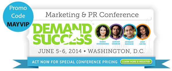
Demand Success Promo Code

I think you’ll agree that Demand Success 2014 PR and Marketing conference from Vocus is a must attend for serious professionals. The speaker’s list contains tons of prominent figures, including keynote speakers Randi Zuckerberg (yes, as in Facebook Zuckerberg) and Google Digital Marketing Evangelist Avinash Kaushik as well as copywriting rock star Chris Brogan, MarketingProfs CCO Ann Handley, and Twitter Editorial Director Karen Wichre. The speakers will host intimate sessions on everything from visual storytelling to content marketing, customer data, and crisis communications.

So here’s the deal—I’ll give you an exclusive discount coupon code that will save you $300 off the ticket price. And if you redeem this discount I’ll be able to thank you in person at #Demand14 because Vocus will comp my ticket as a thank you for the referral.

Save $300 on Demand Success conference tickets from Vocus and PrintFirm.com!

Register at http://www.vocus.com/conference/register/

Promo Code: MAYVIP

There’s only 1 catch…the offer sends 5/16/14 at 11:59 pm EST!

Did you take advantage of this deal? Be sure to let me know in the comments below—-lunch is on me!

6 Reasons to Print Projects Before Printing

Hello inkheads and a very happy Friday to all of you! Anybody who follows us on Twitter knows about my penchant for alliterations, but that title probably raised an eyebrow regardless. No, I’m not trying to get into the Guinness Book of World Records for most uses of the word print in a single blog post—the repetitive diction serves a purpose.

Let me rephrase the title so you’ll see what I’m getting at:

Print your designs

Always print out your designs at home or the office before you send them to your commercial printer!

Note: hopefully when you see the words commercial printer, you think of PrintFirm, although this applies to every printing company.

This pro tip comes straight from our CEO, Nick. You see a lot of orders that end up in our claims department have file issues that could’ve been corrected beforehand with prior printing! I’m hoping you’ll hear Nick’s advice in this blog post instead of on the other end of an angry phone call because it could save you time, frustration, and money.

In fact, I’m personally grateful for Nick’s suggestion as it’s prevented me from making potentially costly rookie mistakes. Remember the print geek you see before you started out the same way you did—with no prior printing experience. Before I started working here, I’d only designed images for the web. Naturally, I shifted my gears towards CMYK projects after a couple of months. The first time I sat down to design a label for a client, Nick’s words rang in my ears as soon as I hit Ctrl + S in Illustrator. I stared at my screen and debated whether or not I needed to physically print a copy. And then I imagined the look of disappointment on Nick’s face along with my client’s rage as I tried to talk my way out of an inky disaster. Lo and behold, printing the label allowed me to correct artwork that would’ve been way off as far as the graphic placement in relation to the product.

6 Design elements to inspect with your home printer

With any luck my near death experience convinced you to try the paper method of prepress prep. Here’s what you need to watch out for when you’re giving your designs the final looksee before you send your files off to the presses.

Text size- I can’t count how many times I’ve heard people complain that they can’t read the contact information on their business card. Usually their text appears large enough on screen, especially since they’re looking at the artwork at 100% view in Photoshop, Illustrator, or InDesign. The trouble is that 100% on your monitor is way bigger than the actual product size. That’s why printing out your business card works wonders! You’ll be able to see a true to life 2″ x 3.5″ or whatever size card and gauge the readability of your text. Please keep in mind that we recommend at least 8pt text, yet you’re probably better off with 12 or 14 pt.

Image proportion/resolution- Nothing ruins an otherwise lovely brochure as quickly as pixelated photos. Image quality can be tough to gauge on your monitor alone; fortunately printing a copy will give you an accurate idea of the way your images will appear on the finished product. Proportion is another common image problem. You want your design to be balanced with a clear hierarchy of information in your layout. You may not notice small size discrepancies on your laptop, though. Trust me, these things will be crystal clear on paper.

Check for contrast- Color gets quite tricky here in CMYland. Lots of variables come into play, and your best bet would be to calibrate your monitor. Aside from color matching, contrast would be a widespread pain point. Without enough contrast, your artwork may blend together to the point where it’s no longer legible! Print out your own copy and inspect text or other prominent details to ensure easy comprehension. You might not find this as useful for plastic business cards due to the lack of white ink, so keep your material in mind.

Edit spelling and grammatical mistakes- Ok, you’d be surprised how often typos and other careless errors result in reprints. PROOFREAD YOUR WORK!!!! Seriously, never expect anyone else to fix your spelling because nobody can read your mind!

Orientation – This one’s a dilly of a pickle. Let’s start with what I mean by orientation otherwise known as format or layout. Basically, we’re talking about the way your design elements are arranged on the page. Without getting too technical, the issue I described earlier in my label story relates to orientation. The label served as product packaging for a candy bar, so the graphics needed to appear in the right place or else customers wouldn’t be able to read it in a retail display. To get the positioning down, I had to print the label out at home and physically wrap the paper around a sample chocolate bar.

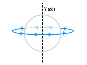
Aside from testing your mockup, you also have to contend with the way our machines rotate your artwork during the printing process. It’s tough to explain this without being able to demonstrate; the diagram below makes more sense than my ramblings:

Y axis rotation

Hold your double sided artwork mockup up facing front, and then turn it to the right to reveal the back side. Is your artwork still correct? If not, you may want to crack open the Creative Cloud again.

Focus on folds- My label story also illustrates the trouble with folds, though not as directly as say, a trifold brochure design. My label didn’t have to be folded professionally; nevertheless, the way it wrapped around the candy affected the orientation of my artwork. It’s always wise to create separate guides to account for fold lines in your graphics program of choice, and print the mock up to double check your work.

Got questions about anything in the above list? Ask away in the comments below. Until next time, happy printing!

Paper Fun Truck Spreads the Joy of Paper in Los Angeles!

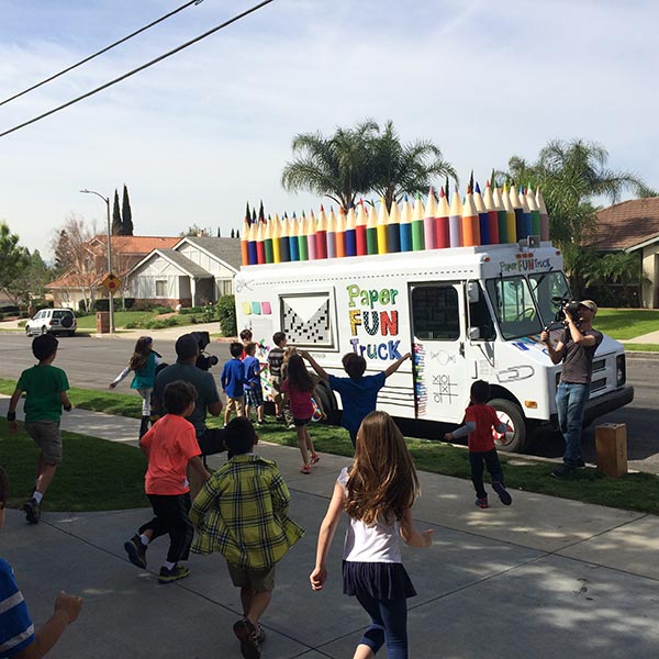
Hello inkheads! Today my friend Dana, the marketer behind the bodacious bison at Dakota Press, brought my attention to one of the coolest things I’ve ever seen—the Paper Fun Truck from Domtar Paper company!

The Paper Fun Truck by Domtar Paper

Well, actually Dana discovered the pulpy vehicle about a month ago on Twitter. The fine folks at Domtar Paper Company created the truck as part of the award winning Paper Because campaign that promotes print media and sustainability. Paper Because also shares the Two Sides US mission of dispelling myths about the environmental impact of paper production and usage.

The Paper Fun Truck project put a unique twist on the dialogue by emphasizing the sheer joy of the tactile experience. The colorful truck rolled around Los Angeles making stops at schools, retirement centers, and other public places to pass out tons of print goodies. Passersby received a variety of generous gifts, including markers, notebooks, books, and more. Yours truly is pretty bummed about missing out on this fiberous action—I’ve already started lobbying for a repeat visit to the Canoga Park area here in the San Fernando Valley so I can take photos for you guys. Feel free to assist me by tweeting requests with the hashtag #paperfuntruck.

After you watch this teaser video, be sure to let us know why you love to create with paper. Enjoy!

Paper Fun Truck video

Why We Need Letters For Our Memories

We’re wrapping up National Card and Letter Writing Month, and I must confess, I’ve not sent a single handwritten letter since taking the challenge! I’ve been a bad print geek, but I have 2 days left to redeem myself.

Part of me merely wants to save face. Nobody wants to be seen as a hypocrite, certainly not I. At the same time, there’s more than my reputation at stake here. Everyone should be concerned about the decline of handwritten communications and mailing.

Handwritten-letters-bring-lifelong-memories

When I look back at my life, I realize that several of my fondest memories involve letters. I’ll bet yours do, too. For instance, I’ll bet you received an acceptance letter from your University in the mail. Do you remember the feeling of anticipation as you ripped open the envelope? How about the joy and exhilaration of getting the good news? In fact, I received a number of important letters from school, such as notifications of academic awards and scholarships.

As awesome as those letters were (I still have a couple of them at home), nothing compares to the most memorable letter I ever received…

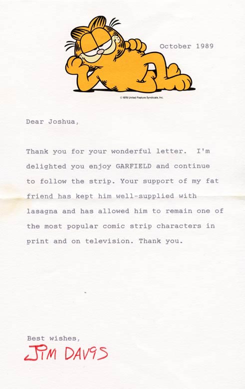
A personal letter from a childhood hero, cartoonist Jim Davis

I couldn’t believe my own eyes.

I was 10 years old, and an absolute Garfield fanatic. I adored that sarcastic orange cat because he made me laugh even though I didn’t have much to smile about. My father passed away 2 years earlier, and my mother became seriously ill to the point of repeated hospitalization shortly thereafter. The world seemed big and scary; I felt small and alone. Despite the chaos around me, I knew I could count on good ole Garfield to cheer me up in the newspaper or on Saturday morning cartoons. I started carrying a stuffed Garfield around with me to ease the parental separation anxiety.

My older brother sensed my vulnerability, as big brothers do. One day he decided to play a little mind game with me. He came into the living room where I sat reading a Garfield book on the couch.

“Katherine, ‘ he said, ‘I heard bad news. The Garfield strip is being discontinued because Jim Davis has writer’s block!”

I refused to believe him, although deep down I feared for the worst. Adept at research at an early age, I tracked down the phone number to Davis’ publishing company, who politely passed the frantic call on to his publicist. That very nice lady listened to my concerns, and assured me that my brother made the whole thing up. She asked for my address and said she wanted to send me a little something for being a loyal fan. About a week later, a package arrived from Random House (if memory serves me well) filled with stickers, a copy of Garfield’s new book, and a stuffed toy.

JACKPOT!!!!

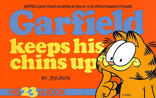
Garfield-keeps-his-chins-up-book-cover

I felt like the luckiest kid alive… until a week later when I received another package.

Only this time, the return address read from Paws Inc. Puzzled, I opened the package to find a letter from the man himself, Jim Davis! It went something like this:

Dear Katherine,
A little bird called me and told me you had some concerns about Garfield disappearing from the TV and comic pages. Not so! Never fear, Katherine. As long as Garfield has faithful fans like you, he’ll be around to keep you entertained. Enclosed is a copy of his 23rd book. Enjoy!
Thanks,
Jim Davis

While the rest of the letter was typed, his famous signature appeared at the bottom of the branded letterhead in red ink. The very same signature I saw on every Garfield strip I’d ever read. He also signed a copy of Garfield Keeps His Chins Up.

Gone, yet never forgotten

Sadly, I no longer have a copy of the letter or the book (they were lost when my mom moved a few years ago). I found this photo of a letter Davis sent to another happy kid. Mine was written in the same format on identical letterhead:

fan letter from Jim Davis
Source: http://www.joshshalek.com/wp-content/uploads/2013/08/garfield-letter.jpg

The point is that although I’m deeply saddened by the loss of these prized possessions, I will never forget Jim’s or his publicist’s kindness. Their actions made me feel as though I mattered, which meant the world to me. They had no idea what I was going through at the time, they were simply being nice to a random little girl halfway across the country.

I wonder how many other kids’ lives they touched with their sweet letters and surprise packages…

Share your favorite mail memories!

Did you receive a letter you’ll never forget? Share your mailing memories in the comments below!
Embossed Business Cards Are Awesome

Hello inkheads! The other day I noticed an irresistible business card sitting on our manager’s desk (his name is Alex, btw). I picked it up and carefully felt the surface to see if I’d be able to identify the printed effect.

Is this card embossed? I asked.

Yeah, he replied.

Oh well, I thought, must be someone else’s handy work.

So we didn’t print it here at PrintFirm?

Alex gave me a puzzled look.

No, we printed it, he insisted.

Since when do we do embossing?

Since forever, but only for custom jobs.

embossed-business-cards-offer-3d-effects

AHA! Therein lies the missing piece of the puzzle. If you visited the business card product page on our website, you won’t see anything about embossing. When you go to place an order, you won’t find this listed under the product options in our instant pricing calculator. But that doesn’t mean that embossing is out of the question. We fulfill a lot of custom orders, so don’t be afraid to ASK if you don’t see what you’re looking for on our site.

What is embossing?

That said, let’s get to the fun print geeky stuff! Well, the end result is fun…the process leading up to the finished product can be a bit complicated from a technical standpoint. No need to get ahead of ourselves, though. We’ll start off with the definition of embossing:

Emboss v.t. 1. To raise (designs) from a surface; represent in relief. (Free Dictionary)

How does embossing enhance my design?

Ok, embossing and other effects do cost extra—I don’t want to mislead you on pricing. These are not the most budget-friendly options available. If you want cheap cards, then standard options will suit you just fine.

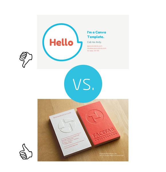
cheap-business-card-vs-embossed-business-card

But cheap i.e. inexpensive, commonplace design is by definition forgettable. Your goals with a business card campaign are to make a fantastic first impression and to ensure that prospects/contacts remember you. Embossing your logo or text sticks out in people’s memories because of the unique tactile experience and classy vibe. They will be able to see a difference between yours and the typical card before they get their hands on your cardstock as raised elements catch the eye from a distance. As soon as they feel the detailing on their fingers and the contrast between the flat part of the stock and the raised portion, they’ll stop to examine what they’re touching. They may even ask you about the technique, which gives you a chance to extend the conversation. Either way, the 3D effects on your card get people to focus their attention on your brand instead of slipping the card into their wallets without a second thought.

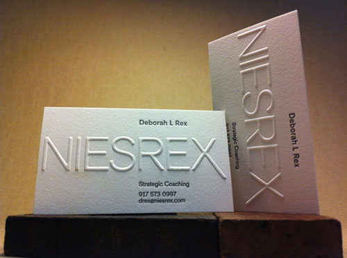
Embossed vs. Raised Ink business cards

Note: PrintFirm does not do raised ink or letterpress projects. Bummer, I know (letterpress rules!)

By now you might be wondering, what’s the difference between embossing and raised ink? What about letterpress? The answer is it’s all about the process. While these procedures appear similar to the naked eye, they’re quite different in terms of application.

In order to emboss your artwork, we have to create 2 metal dies (kinda like what we do for die cutting). Then we turn up the heat, and press the dies against your cardstock to make a 3 dimensional impression of the graphic.

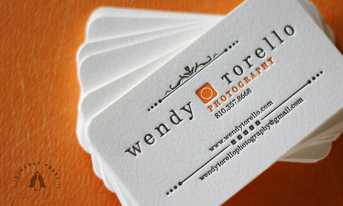
letterpress-business-card-example

Source: http://pixelcurse.com/wp-content/uploads/2011/02/TorelloLetterpressBusinessCards53.jpg

Raised ink, also known as Thermography, does not require dies. The cardstock gets heated, and the printer adds powder to the ink before putting it on paper. When the inky powder mixture dries, the ink puffs up with an elevated appearance. There’s no manipulation of the cardstock, and the printer will have a bit more control over the details. For this reason, raised ink or letterpress may be your best bet for intricate artwork.

Think of Letterpress as the opposite of embossing. You don’t need any heat. The printer creates a plate with your image on it and covers the surface with ink. Then the inked plate goes into a letterpress machine where the press operator applies manual pressure to the cardstock. The result will be an imprint or debossed design. Letterpress used to be the only game in town, but today this method would be considered a specialty practice. To get the proper effect, you need very high quality cardstock along with premium inks. Plus, the intimate nature of letterpress limits its mass production capabilities; letterpress is best left to the artisans and craftsmen. Consequently, letterpress projects often cost way more than embossing or raised ink. The results justify the price in my designer’s mind, though…

Can you emboss plastic business cards?

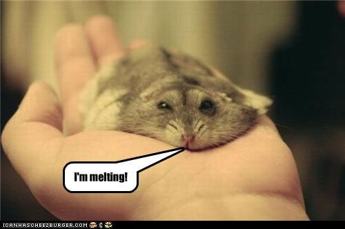
We sure can! Except they’ll melt.

melting

Seriously.

Alex got this exact question from a client last week. Unfortunately, the heating part of our embossing process I explained above means no plastic. We don’t want to hand you a glob o’ melted goop, so we don’t emboss on plastic business cards.

Beautiful embossed card design examples

All right, back to the fun print geek stuff I promised you earlier. Let’s have a looksee at embossing in action for your creative inspiration!

Blind emboss

Blind-embossed-business-card-design-example

Source: http://www.studioembossed.com/272/business-card-designs-using-blind-embossing/

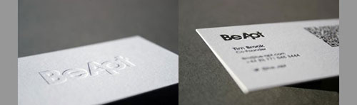
You probably noticed that the embossing in the above image doesn’t seem as dramatic as you anticipated. That’s because blind embossing is the most conservative method. Basically, we call the effect blind because we don’t use ink or foil on the embossed portion of the cardstock. You’ll be able to see and feel the impression, yet the effect won’t overpower the rest of your design elements.

Demboss

dembossed-business-card-sample

Source: http://www.studioembossed.com/272/business-card-designs-using-blind-embossing/

Often confused with letterpress, dembossing leaves a sunken in impression of the design in your cardstock. The dembossing process involves heat and not just pressure, which separates the two procedures on a technical level. The imprint will be visible at a glance, and your card will have a clean, tangible element that tempts the touch.

Combination foil stamped and embossed

foil-stamped-embossed-business-card-design

Source: http://www.underconsideration.com/fpo/project_images/fdg_00.jpg

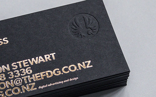
Any metallic gold or silver in your card design will be too shiny to ignore. Gold foil’s always been a favorite of luxury brands and high end firms who want to attract white collar clients. Foil stands out on its own, yet it doesn’t add a lot to the tactile sensations. The silky smooth feel of foil with a 3D embossed effect gives you an air of distinct credibility.

Embossing tutorials and design resources

Adobe Illustrator embossed tutorial

This easy tutorial explains how to separate your layers in their own PDFs to indicate the embossed portions of your design to the printer. The presenter makes a couple of key points I want to highlight as well. He states that whatever appears embossed on the front of the card appears dembossed on the back (reverse side). You can get around this a bit with super thick cardstock, but most of the time you’ll be dealing with the dembossed situation he describes. He also cautions to keep non-embossed text and graphics away from the embossed elements to avoid printing problems.

InDesign File prep and technique overview

An awesome explanation of lots of different print design effects just for business cards from Smashing Magazine. Embossing is covered, however, not in great detail.

Integrated Marketing Hangout Video

Hello inkheads and Happy Earth Day! Sadly, yours truly is a bit preoccupied with some SEO duties today so there will be no awesome eco-posts this year. Get your fill of Green Printing and Earth Day Marketing Ideas from these 2 classic blog posts:

https://www.printfirm.com/blog/green-printing-for-earth-day-2013-printfirm-com/

https://www.printfirm.com/blog/earth-day-event-marketing-ideas-for-small-biz-printfirm-com/

21/20 Marketing episode 4 Google Plus Hangout video

Speaking of recaps, here’s the latest 21/20 Marketing webcast from Thursday, April 17th:

Our topic “Where does print fit into integrated marketing?” generated great questions from the audience about the frequency of printed campaigns vs digital, local targeting, and new technologies for direct mail. As Richard said in the Hangout, print is the perfect complement to your digital channels because you’re able to make deeper personal connections with tangible marketing messages.

#2120 Marketing topic ideas?

Richard, Spencer, and I all felt as though the previous discussion about SEO for printing and mailing companies flowed better. Nevertheless, we got nothing but positive feedback, and we want to make sure we cover topics that will help YOU achieve your business goals. We have 3 suggestions for next time—which topic interests you the most?

From Megan Pritts on Google Plus: I would definitely watch one on guest blogging. It’s a hot topic in the industry right now, too, so I bet a lot of people would be interested in it.

From Kate Gansneder on Google Plus: Topic suggestion: KPIs (Key Performance Indicators) for printers, how to measure them, and make actionable plans to improve them.

From Richard Dannenberg (co-host): Email campaigns.

As always, we’ll take any questions, comments, or suggestions on Twitter with the hashtag #2120Marketing.

Or vote for your favorite topic/suggestion in the comments below!
New Print Isn’t Dead Magazine Contest!

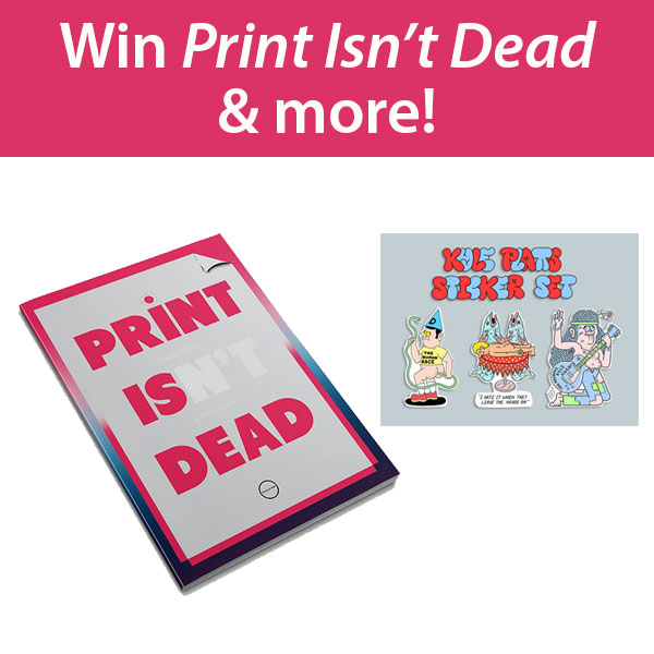
Happy Monday, inkheads! Today I’ve got a fun update to share via the Twitterverse. The fine folks at the People of Print are running an awesome contest perfect for the CMYK crowd. They’re giving away a copy of the brand new Print Isn’t Dead Magazine as well as stickers designed by famed illustrator Kyle Platts and a typographic t-shirt from Andy Cooke of the award winning Cargo Collective. Just fill out the easy social media tasks in the Raffle copter Widget of the contest page here:

Print-isn't-dead-contest-from-the-People-of-Print

http://www.peopleofprint.com/competition/competition-win-print-isnt-dead-magazine/

I believe the contest ends on May 6th, and you increase your odds of winning with daily tweets!

The Print Isn’t Dead Magazine story

I’m super excited about this contest for a couple of reasons. First off, I consider the People of Print site a must read printing blog. They’re more on the creative as opposed to the technical side of print, so their articles are right up my alley. You’ll find tons of inspiration for lots of print design projects, including posters, stickers, CD covers, and more. They also feature fine art, such as illustration, photography, printmaking, and news about notable exhibitions. Secondly, The People of Print appeared in our commercial printer’s guide to hashtags for the ever popular #PrintSpotters tag. Inkheads across the land should use this tag whenever you see an awesome printed piece. I love the concept of tying our offline artistic adventures to the social web, so I’m happy to promote this forward thinking organization.

people_print_logo_feat

Aside from my personal connection to the POP, there’s a fascinating story behind the Print Isn’t Dead magazine launch. The publication represents an unlikely kickstarter success; POP raised funds to get the first issue out and hopes to release supplemental copies quarterly. POP wanted to promote print properly with a hard copy of their popular blog posts, exclusive interviews with artists/designers, and studio tours. The design community rallied behind the cause of showing the best graphic work on paper, including the prestigious Design Week. And viola, we’re ready to celebrate by holding a copy in our hands this June/July!

In case you don’t win the contest, you can pre-order for 10 pounds (or $16.80 US dollars). The website says price includes postage and packaging to the UK, although there’s no mention for those of us across the pound. International shipping is pricey, so I’d expect US readers will have to pay a little extra for this collector’s item.

A return of the zine?

The POP story gives me hope for the magazine industry, which falls victim to the same negative stereotypes as the rest of printed communications. I’ve seen several articles recently that send a similar message, that magazines and catalogs are back with a vengeance. I believe these mediums never left; their popularity may have declined due to digital alternatives, but now everyone realizes the wisdom of the integrated approach. Readers and consumers enjoy the experience of browsing at their leisure without any online distractions.

In my research on Print Isn’t Dead, I discovered a fascinating perspective on the subject in the Guardian. Columnist John O’Reilly notes the evolution of magazines and identifies a growing trend of short run interest based community publications akin to the Indie Zine scene. These works obviously appeal to niche audiences, hence why they’re unlikely to attract big advertisers. Nevertheless, these narrowly-focused groups need a voice, and the marketers targeting them must find effective ways to reach them. A strategic magazine ad ensures the right eyeballs on brand content, which is more than I can say for many display ads online. O’Reilly mentions that independent magazines are similar to novels in that the format invites true story telling. Here’s hoping brands in search of personal connections with consumers will realize that emotional bonds transcend the web.

Canva Review: A Printing Company’s Perspective

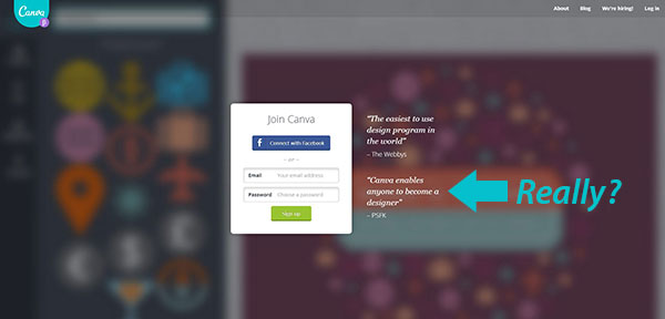
The design community is buzzing about yet another DIY online graphics tool known as Canva. While there’s really no difference between Canva and other similar sites, several prominent marketing figures rave about the latest wave in drag & drop “design.” The homepage goes so far as to proclaim, “Canva enables anyone to become a designer.”

Canva-homepage

Why “anyone” would want to become a designer, they tell us not.

Based on this statement, you’d think Canva targets amateurs exclusively i.e. stay at home mom bloggers, hobbyists, etc. But you’d be wrong because Canva thinks they’ll be able to woo the professionals looking for short cuts (nothing says pro creative like cutting corners!) and willing to sell their work for royalties.

Perhaps you’re able to sense my skepticism.

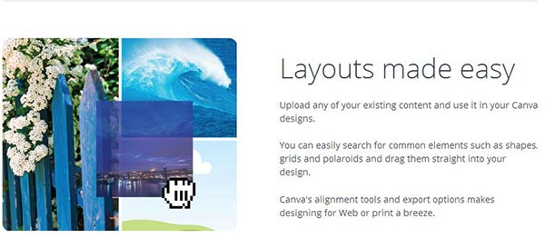
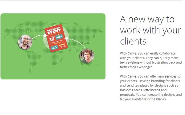
Despite my reservations, I didn’t want to pass judgment before testing the service myself. After all, there’s no real harm in having another freeware social media graphics generator. So I jumped on the Canva designers page, and discovered that they specifically mention “designing for Web or print” as well as “designs such as business cards, letterheads, and proposals.” Naturally I took a few screen shots as evidence:

Canva-claims-it-can-be-used-for-print-design

Print-products-mentioned-on-Canvas-site

Since they mentioned several print products, I figured I’d try one of their business card templates to find out whether or not you’d be able to use Canva for commercial printing purposes.

Canva fails the print design test

I sat through the starter exercises, which get users comfortable with the simple interface. I see the attraction here in terms of complexity or lack thereof. It’s taken me years to learn Photoshop/Illustrator, and I know how daunting these programs seem to beginners. I will say this: there’s no learning curve whatsoever with Canva; a brain dead lizard would likely catch on in a matter of minutes. Using Canva feels a bit like you’re navigating baby’s first design kit, complete with incorrect references to fonts instead of typefaces. (Pro tip: if you’re going to attract actual designers, use the proper terminology.)

From there I moved on to the real meat ‘n potatoes of image creation capabilities: the pre-made templates. Now Canva does give you the ability to set custom image dimensions manually, but the templates seemed like a better indicator of the site’s utility. It’s my understanding that templates serve as a basis for customizations, meaning they’re good to go as is unless you want to modify the elements. Luckily, Canva features a business card template right off the bat. When I moused over the business card icon, I noticed the template measured 8.5 cm x 2cm or 2″ x 3.5″.

I got my hopes up for a second.

“Hey, that’s the standard business card size.” I thought. “Maybe this won’t be so bad after all!”

I spoke too soon.

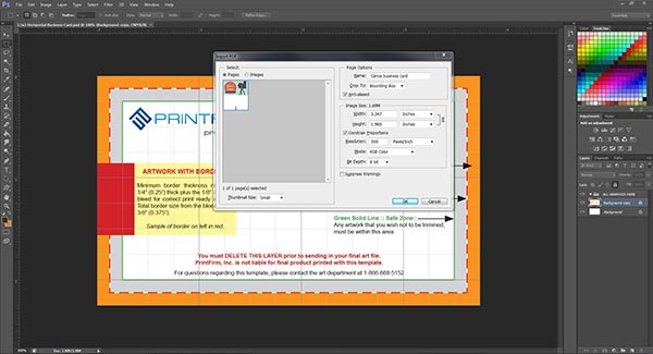
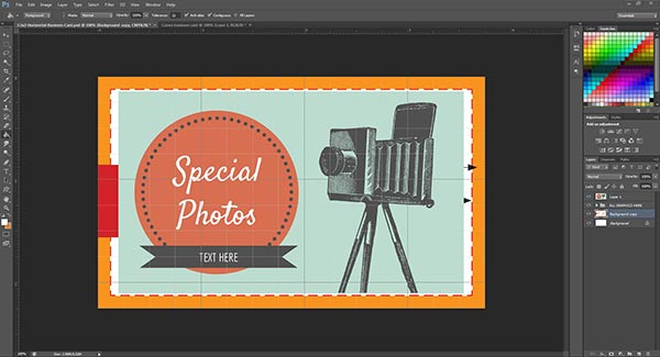
The export options include downloading a PNG file or a PDF for printing. I picked the PDF, and dropped it into Photoshop (not the best program for business card design, but I digress). Here’s a screenshot of the file specs in PS:

Canva-business-card-pdf-specs-in-Photoshop

As you can see, this artwork misses the mark big time. I’ll give them credit for the image resolution (300 dpi FTW!). Everything else renders Canva unsuitable for professional print design.

A lesson in basic business card file prep

Let’s break down the reasons why you should never rely solely on Canva for print design projects.

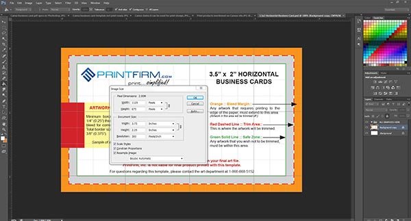
Business Card Size: Although the template supposedly measures 2″ x 3.5″, Photoshop says it comes up short at 1.965″ x 3.347″. No biggie, it’s only off by a couple of centimeters, right?

WRONG.

In print every single millimeter matters. The fact that the Canva business card template is off by a hair means that the artwork doesn’t cover the trim area! Watch what happens when I paste the design on our standard sized horizontal template:

Canva-business-card-template-not-print-ready

If we sent the file to our press exactly as is, you’d end up with an uneven amount of space on the top/bottom vs. the sides. And that’s without the inevitable shifting. Ouch. Even if you wanted a border around your artwork, you’d need total 3/8ths (.375″) all the way around as per our guide.

Bleed: Speaking of size, there’s a related issue going on here. Notice our 2″ x 3.5″ business card template file actually measures 2.25″ x 3.75″. The extra space accounts for what we call the bleed; if you want your artwork to cover the whole card, then you need to include a bleed. Otherwise there might be some unsightly, uneven white cardstock left on your card after trimming. Should you attempt to print the Canva image in its original size, you’re not going to have a good time.

PrintFirm-business-card-printing-template-with-bleed

Color Mode: The Photoshop screenshot shows the Canva picture is in RGB color mode. That’s a no-no. Artwork for 4 color process printing needs to be in CMYK color mode, and I didn’t see anywhere to switch within the UI. Colors don’t always look different when you change modes, but sometimes they’re totally unrecognizable. Experiment with a couple of neon colors and you’ll see what I mean. What looks intensely bright in RGB becomes dull by comparison in CMYK. You should at least be able to see the colors in CMYK ahead of time to avoid an unpleasant surprise. But let’s say you upload artwork straight from Canva to a web to print site without ordering a prepress proof. You may find yourself paying for a reprint out of pocket to appease an irate client! This issue is especially dangerous for the amateur crowd who probably don’t even realize that color modes exist. I hope a self-respecting creative would at least have the sense to check the file specs on Canva artwork before moving forward with a print project.

In sum, never, ever use Canva alone for commercial printing

Ok, you might be able to get away with printing images from your home or office equipment, but steer clear of Canva for your business marketing campaigns. Unfortunately, Canva fails to make this critical distinction on the site. By using the word “printing” without further explanation, I fear Canva sets unreasonable expectations for its users. In fact, I’d go so far as to call this a deliberate misrepresentation of the service. I strongly suggest they rethink the language on their site before any print projects get ruined.

Have you tried Canva? How would you rate this online graphics tool? Tell us in the comments below!