Preparing your business for a trade show can be just as important as the time you actually get promoting your company to new potential clients. It’s likely that you have already started making a trade show checklist in preparation for the event, and it’s likely to include “print products.” We know that many businesses leave their trade show printing needs until the last minute – when everything else is already crossed off the trade show checklist. When you’re in a hurry, you need a one stop shop for your trade show printing needs.
Just because you’re in a rush doesn’t mean you shouldn’t get top notch business products for your trade show. Before you order trade show print products, it’s important to think about exactly what you want to accomplish with each piece. The most successful businesses know how to use a combination of products to attract people to their trade show booth – and leave them with a takeaway item that will standout long after the event is over.
Grabbing the attention of potential customers at a trade show is much easier for companies that use roll up banners. Showing a large print image of your product or brand name in full color can make you stand out amongst the sea of booths at a trade show – pulling in the right type of attendee. The next step is to leave a lasting impression.
Handouts and Giveaways that Last
Standing out on the trade show floor will only get you so far. You need to make sure that your business continues to standout long after the show is over. Giving away handouts at trade shows with your brand logo, contact information is the best way to stay in the mind of these potential customers. Different types of businesses may want to use different types of print products, but there are some that work for any business.
Of course you will need business cards for the trade show – but printing notepads with your business logo and contact information is one of the best ways for you to leave a long lasting impression. These notepads are likely to be used throughout the day, and end up back on the desk of your potential client for months after the actual event.
You Know Your Customer Best
Certain trade show products will work better for your customers than others. Sell cookware? Try magnetic business cards to stay in front of your amateur chef customers. Are your clients also bookworms? Order custom bookmarks before the trade show to stay in front of them for chapters to come. Our one stop shop for trade show printing needs has all the products you need for a successful event that will keep your business growing long after the weekend is over.
A new business year brings new business card trends. As the economy continues to improve, more people are in need of new business cards for 2017, and there are quite a few new options that professionals will have to choose from. Your business card should reflect the industry you’re in – professional businesses such as real estate may want to stick with a classic style business card, while people in more creative positions often seek something more unique. With more custom choices than ever before, PrintFirm can help you keep up with the top business card trends for 2017, no matter what industry you’re in.
Most professionals in the market for new business cards are interested in the thickness, and the size of the card, but there are so many other options that you can choose from in 2017. For example, have you thought about clear or frosted plastic business cards to stand out amongst your competition? These new types of business card styles are becoming more popular in 2017 for people seeking a unique, personalized feel.
Most memorable business cards have something very unique about them. One way that you can make sure that your business will stand out is is to use custom shape business cards. Not only will you get to select color and content, but you can create a shaped business card that is unique to your service or product.
You don’t want your contact info to get lost in your client’s top drawer or among a pile in their wallet – which is unlikely to happen if you choose to order magnetic business cards online. Magnetic business cards are perfect for both B2C and B2B companies looking to keep in front of potential clients and customers. This format is perfect for the business card trends in 2017, but will be stuck on fridges for years to come.
Ordering Custom Business Cards Online
Every business owner knows that they need company cards, but it can be a tough decision where to order online. PrintFirm makes the process of creating your own business card online easy – just upload your own design or work with our team to create premium business cards today.
Welcome back inkheads—hope you enjoyed the loooong weekend over the 4th of July holiday!
A week ago today, yours truly participated in a Social Media Day 2014 Facebook Q & A on the Social Solutions Collective page. We didn’t have a huge turnout.
Nevertheless, one small biz owner posed a question that always seems to come up in print marketing discussions: Do *insert various printed products here i.e. flyers, postcards, rack cards, etc.)* still work?
The specific circumstances don’t matter because we’ve all heard this one before. A small biz owner or marketing professional hears horror stories about expensive campaigns that failed miserably. You know the drill. A friend mailed 15,000 beautifully designed postcards and got no responses. Since there were no issues with the artwork or printing quality, these folks blame the entire medium instead of digging deeper to find the true culprit.
Surface scratching of this nature would be yet another example of mental shortcuts aka heuristics and anti-print prejudice. Beyond that, it’s nearly impossible to determine whether or not a printed component would benefit an integrated campaign without defining the goals first. So the next time someone asks you if print ‘works,’ ask this person to explain what they’re trying to accomplish!
Then you can attempt to explain what might’ve gone wrong in a tale of anecdotal evidence…
6 Reasons Why Your Friend’s Print Marketing Campaign Failed
Marketers mainly aim to increase sales, which is what most of them are really asking about with these vague, ‘does print work’ questions. They want to hone in on ROI, especially since online marketing solutions are promoted as free advertising options. We all know nothing’s free in this world, but remember, we’re dealing with surface scratchers here.
Print requires some sort of budget, which means you can’t afford to waste money on lackluster communications. The following list contains 6 common characteristics of failed direct mail promotions:
#1) Poor List Quality- Direct mail success depends heavily on your mailing list. For instance, did you collect the list yourself using your customer database or purchase addresses from a third party? Here at PrintFirm, we provide lists for clients who don’t have databases, and we work with trusted sources to obtain this info for you. That said, beware of bad lists! Shady lists may consist of deceased consumers and other such nonsense. If at all possible, perform a manual inspection before you make a purchase!
#2) Ignored Loyal Customers- You use direct mail to generate new business, right? Well, yes and no. New business doesn’t necessarily mean that you attract brand new clients from postcards, even with EDDM (Every Door Direct Mail). Choose a neighborhood where you know several of your current customers live for better returns on your next EDDM blast. Why? Research shows that sending those postcards to your current customers instead of fresh prospects yields higher response rates. This makes sense when you consider your own behavior. You probably feel comfortable dealing with familiar brands because they’ve earned your trust. Your clients likely feel the same way!
#3) No Call to Action- This one’s a doozy as it appears to elude many a small biz owner. Let’s say you print flyers announcing a summer sale, and you pass them out to shoppers inside your store. Your design’s got celebratory confetti, pro product photos with super low prices written in a bold typeface. Yet your copy doesn’t speak directly to the reader—you don’t invite the flyer recipients to come by and check it out. You just assume they’ll decipher the message through your not so subtle hints. Only no one has time to figure out what you’re trying to tell them. A call to action tells your customers exactly what you want them to do to follow up, hence why your CTA may be the most important part of your design.
#4) Irrelevant or Unprofessional Design- I’m sure you realize that you’ll get out of your direct mailers what you put into them. Amateur artwork harms your reputation in the sense that it tells customers you don’t value your business presence. Beyond the obvious pitfalls of cheap or DIY tools, even aesthetically pleasing artwork might give you trouble. Allow me to explain via example. Let’s pretend you own a sporting goods store. Little league baseball season is wrapping up, and you want to let parents know about your used equipment exchange program. Your target market would be adults, but your beautifully designed graphics include cartoonish illustrations and a juvenile typeface that caters to kids. It doesn’t really matter how great you think the design looks because the intended audience won’t connect with the tone or imagery.
#5) Too much clutter- This one’s kind of the opposite of having no call to action. Are you overloading your recipient with too much information? Multiple calls to action? Cut the clutter, keep it simple, and stick to a single CTA per piece (unless said piece is a full product catalog).
#6) No incentive/offer- Not be confused with a CTA, although incentives and offers often appear within calls to action. You see, a call to action might instruct the customer to call your office or arrive at your store for an in person event. An offer would be a coupon you provide that can be redeemed at said event or a promo discount code to include in an online order. The difference is that offers entice consumers to follow up on your CTA. Show’em you’ll make it worth their while, and they’ll respond.
I’m sure you’re stoked on the long holiday weekend ahead.
While you’re relaxing with friends and family, I ask you to spend at least a little bit of your downtime thinking about your business blog.
Why would I want you to think about work on July the 4th?
Simple—because I believe that blogging will lead your business on a path to independence and growth. Since blogs are owned media (that’s content you produce and completely control), they have the most potential as far as brand development as well as establishing yourself as an authority in your industry.
But no one becomes an authority overnight. You have to earn your reputation, mainly by posting original ideas. When I say that you need original ideas, I mean you that you must have a unique voice and perspective on important issues or trends. In fact, a true authority would be the trendsetter—the individual or brand who takes the lead while others follow suit.
Not everyone can be a leader, which brings us back to my weekend challenge. I want you to dig deep and do a gut check. Be completely honest with yourself: Do you really have what it takes to manage a successful blog?
Your blog as a labor of love
I’ve been blogging professionally for over 4 years. Believe me when I say that blogging is worthwhile, but keeping your site fresh will be one of the toughest journeys you’ll face in your career.
Let me be very clear: I’m not suggesting that you should throw in your blogging towel today.
Nope, my goal for this post is to give you a realistic picture of the time commitment and labor that goes into managing a top notch printing company blog. That way you’ll be able to honestly assess your brand’s capabilities and formulate your strategy accordingly.
Here’s the thing about blogs: you won’t see much return on your investment at first. Brace yourself for an extended lesson in delayed gratification because you might have to spend a whole year writing until you get your first direct conversion (sale). For this reason, many a printer simply gives up before their blog gains ground. I think the Wizard of Moz Rand Fishkin said it best in his hilarious Slideshare presentation entitled Why Content Marketing Fails:
As you can see from Rand’s traffic graph, your blog will likely hit several progressive plateaus before you gain a loyal readership. The temporary spikes might get your hopes up, only to come crashing down as your traffic levels off shortly thereafter.
Make no mistake: the elusive ROI will frustrate the hell out of you.
You’ll be tempted to give up on a weekly basis. Maybe you’re already considering calling it quits. After all, how many articles can you write about business card design inspiration or brochure typography? If you’re already feeling burnt out, how will you possibly post on a consistent basis? And what’s the point of pressing on with no tangible benefits?
The hidden ROI of business blogging
Of course we all want to increase profits; this here blog and social media upped our sales by 46% in one year! Yet hopefully you realize that your return on investment may take on other forms besides money. Here are 2 other awesome non-monetary benefits of blogging to motivate you:
Community
In the old days your website probably seemed similar to a brochure, a kind of static representation of your core mission. This model doesn’t help customers get to know you very well, or give them a reason to come back unless they want to place an order. Plus, there’s nowhere on your web-to-print site for customers to ask you questions without sending an email or picking up the phone. Your blog fills each of these needs by adding a sense of community to your site where customers can engage with you directly.
Separates you from competitors
Take a moment to browse your top competitor’s sites and you’ll notice a pattern or two. Many printing companies not only offer the same products and services, they tend to use identical selling points, too! With so many similarities, it’s no wonder buyers can’t remember who printed their last project. Your blog gives you space to highlight your differences, such as areas of focus i.e. wide format and express your brand’s personality.
How to generate content ideas
If you’ve tried to write on the regular, you’ve likely encountered the dreaded writer’s block. Every blogger struggles to keep the creative juices flowing, but don’t just wait around hoping for a random burst of inspiration. Generating post topics takes practice, and these tips will help you get into the groove of being a blogging machine!
Be super ultra specific
A lot of beginning bloggers try to be everything to everyone. In an effort to cast the widest possible net, they post about very broad topics in a general sorta way. This syndrome is akin to the client who tells a graphic designer that, ‘Everyone is my target market!’ Get that thought out of your head because you’re writing for your inkhead tribe, not adults ages 18-85. Instead of collecting standard 2″ x 3.5″ business card designs to showcase, show your readers examples of the far out stuff, such as your specialty substrates or unusual creative concepts (monochrome business cards or spot UV with blind embossing). Technical info is fine fodder for these types of posts, just be sure to keep the material useful and relevant. For instance, post tips about getting a proper custom printing quote and save the chatter about presses/mechanical processes for the break room.
Develop reader profiles and personas
Basically, put yourself in your readers’ shoes to better understand their needs and pain points. Let’s say you want to write about the need to promptly approve PDF proofs. Who are you writing this article for, a male small business owner in his 50s or a 30 something female designer? Once you identify your reader, you’ll be able to figure out the right tone, language, etc.
Maintain an editorial calendar
I learned this one the hard way. I used to brainstorm blogging ideas on my morning bike ride. By the time I got to the office, I’d have half the post written in my mind. But some days I’d get sidetracked or maybe spot a high potential keyword phrase and change my mind. Naturally I quickly discovered that creating content on the fly makes for a disconnected strategy. Now I try to plan out my blog posts at least 1 week in advance. If something comes up and I decide to go a different direction, I can always adjust the schedule. You’ll be amazed at how much more together you feel simply by writing out your list of topics every Friday for the following week. That way you’ll feel prepared to start writing immediately on Monday morning.
Where to get blogging assistance
If you think you’re not up for the challenge of daily or even weekly copywriting, you don’t have to go it alone. You can hire help. An in-house writer with an inbound marketing background would be a huge asset to your business.
Can’t afford to hire another full time employee? Hire a freelancer with experience writing about subjects of interest, including marketing, print design, and prepress procedures. Who knows, you might find a pro content marketer along the lines of Matthew Parker or Margie Dana, 2 prominent independent consultants from the CMYK world with strong social media ties.
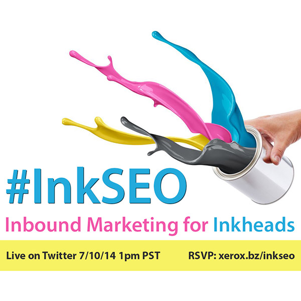
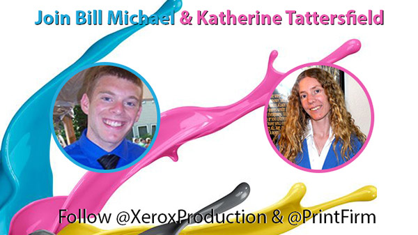
You might even meet some of these expert writers during #inkSEO! In case you haven’t heard, I’ll be sharing tons o’ inbound marketing info with fellow inkhead Bill Michael during the #inkSEO Twitter chat on Thursday, July 10th at 4pm EST/1pm PST.
You’ve been slaving for hours to get that project design completed, and you’re just about ready to send it off to your printer. Just what is it that your print provider is looking for when they open up your files and prepare them for proofing and press?
Sizing
First and foremost, we’re checking out whether the specs you provided for quoting match that of the actual piece.
Flat Size versus Final (folded/converted) Size
Page Count:
If you change your page count, your price is destined to change (& possibly not in the way you hope). For example, if you have a perfect bound book you quoted at 100 pages, but reduce your page count by two – you’re going to be paying more because at a minimum you’re adding the need for an additional signature. Remember we work most efficiently when page counts are divisible by four.
Fonts/Typefaces
I can’t stress this one enough. A lot of printers “turn-off” or clear out their fonts folders at the beginning of every job. Why? Because we don’t want to risk the chance of having a different version of your fonts used. This can cause text reflow, meaning all that time you spent making sure your document didn’t have any widowers is pointless if we try to fix it ourselves.
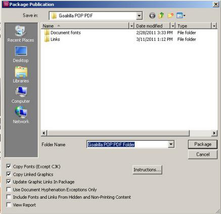
Packaging your fonts is relatively easy, too. Select “File” > “Package” in InDesign and follow the additional prompts to package all of your projects files (including images) together in one single folder.
Using the Creative Cloud fonts included in the Adobe Type Kit? Make sure you let your print provider know when submitting your files so they can turn their Type Kit on and eliminate any back and forth that might delay the processing of your print project.
Bleed
Bleed is incredibly important if you wish to have color going off the edge of your page. Improperly setting up for bleed can cause a small white border to be created when the project is cut down to final size.
Avoid risking this white margin, by making sure your bleed settings are set up to print 1/8″ and ensure all imagery/color boxes are extended to this bleed line.
Color Setup
We check to make sure that the project has been setup like the specs. If we quoted four color, but your file includes spot colors – most companies will double check with you to make sure you aren’t hoping to have that spot color printed instead of the four color process build (adding time to your project).
If you’re hoping to have specific PMS colors printed, make sure you spell this out at the time of quote and have your colors set up properly in your file.
Every print provider is different, but I also suggest setting up your special processes (dielines, embosses, foils, etc) as spot colors instead of layers. By setting it up as a spot color this allows us to simply turn the color off in our RIP without having any knock-out, and saves time by not requiring us to export multiple layers to create your special process files.
Images
In addition to checking to make sure that all linked images are actually provided, we check to make sure they are in the CMYK color mode. Just recently I had a client who did not convert images and was surprised when she saw the CMYK rendering on the proof.
Some print providers have a soft proof setting you can add to Photoshop so you can visibly see what the proof output will look like on screen. Check with your service provider to see if they can provide you with this setting. It will ultimately help you eliminate revision costs down the line when trying to hit that very specific hue of blue.
PC versus Mac Files
It is important for us to know what type of computer your project was created on because PC fonts don’t flow the same when (if they even can be) installed on a Mac. Most print shops I have been in have at least 4 Macs for every PC in their prepress department so they’re going to open your project on a Mac unless you specify otherwise. Help cut down their time and streamline your project by letting them know ahead of time.
Run-Across/Gutter Jump/Crossover
Run-across, gutter jump, crossover is the art of having a design element that prints on one pages and crosses over the gutter onto the facing page of the publication. Depending on the means of finishing, special steps need to be taken by the prepress department when laying out the imposition to ensure nothing gets lost in binding.
About the Author
Christine Alexander is the Chief Ink Geek for Dreaming in CMYK. Her experience comes from her time spent in the Metropolitan Printing Leadership Development Program where responsibilities have included prepress management, Web2Print and cross-channel campaign development, and her current role as a marketing consultant. Christine is passionate about what makes people tick and thrives on finding creative solutions that bring a brand’s story to life. Connect with Christine online on Twitter and LinkedIn.
Good afternoon inkheads and a very happy Friday to you!
Let’s cut to the chase.
You’re here for one reason, and that’s to find out if you’re taking home 250 custom 4″ x 6″ rectangular sticker prints!
I won’t keep you in suspense any longer….
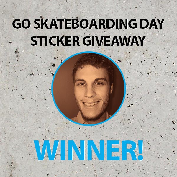
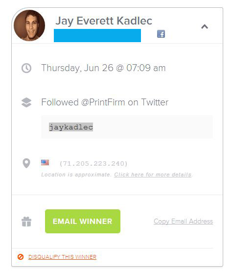
The winner of the 2014 Go Skateboarding Day Sticker Contest is….Jay Kadlec!
Congratulations Jay from the PrintFirm team! We can’t wait to print your design, and we hope you’ll show off your prize so we can post the picture on social media.
Mark your calendars: PrintFirm Community Events
Didn’t win? That’s ok because you’ll have plenty more chances to win awesome printed prizes this summer. We’ve got lots of surprises in store for you, but if I announce them here, it’ll ruin the fun. You’ll just have to wait and see what killer contests are coming in the near future.
In the meantime, those of you in the marketing world will definitely want to add these 2 exciting events to your calendar:
Social Media Day 2014- Monday, June 30th 9am to 8pm EST
Sponsored by our friends at the Social Solutions Collective, this all day online shindig takes place on your favorite social sites- Facebook, Google Plus, Twitter, and Instagram. There will be Twitter chats about social media marketing and customer service, a fun photo scavenger hunt (with the hashtag #SSCscavenge), and a blog comment exchange. Plus you’ll get a chance to pick our brains during the hour long Facebook Q & A session. Be sure to head to the Social Solutions Collective Facebook page at 5pm EST/2pm PST where yours truly will answer ANY questions you have about print marketing in a session entitled, The Power of Print Propels You: Exorcising the Idea That Print is Dead!
Big thanks to organizers Mallie Hart and Mandy Edwards for inviting the PrintFirm community and representing PRINT MEDIA at an otherwise digital marketing geek out!
#inkSEO Twitter Chat- Thursday, July 10th 4pm EST/1pm PST
I’m going to make sure you don’t forget to attend the upcoming Twitter chat with Bill Michael of the Xerox Digital Printing hotspot all about inbound marketing best practices for print providers! Well, maybe I should rephrase that because we’ll have some inkheads from outside the printing industry in attendance as well. If you’re wondering how to leverage search engines, blogging, and social media to your business benefit, then join us for an hour long interactive and informative discussion.
Good afternoon, inkheads and happy Throwback Thursday!
Surely you’re in awe of the fine craftsmanship known as letterpress printing.
Before the days of digital printing and even offset, letterpress ruled the ink scene.
The letterpress technique adds a unique tactile element to your design similar to that of dembossing. Yet the intricate process makes mass production nearly impossible.
You see each letterpress piece must be made individually with care by a skilled press operator, which means that bulk i.e. large quantity projects are either out of the question or quite costly.
For this reason, 21st century technology nearly destroyed the art of letterpress…
But us print and design geeks won’t let that happen.
And we’ve got an amazing ally in Neenah Paper.
You can save letterpress history for only $5
The fine folks at Neenah Paper are rallying the print community to save the Hamilton Wood Type and Printing Museum in Two Rivers, Wisconsin. The Hamilton museum contains all kinds of awesome stuff, such as over 1.5 million pieces of wooden type, antique equipment, and classic advertisements from as far back as the 1930s. Of course, the museum also offers guided tours, educational workshops, school field trips, internships, and artist residencies.
Hamilton needed to move back in November of 2012; the lengthy process involved raising almost $250,000 to relocate those delicate historical pieces, and there’s still more work to be done.
The good news is that you can help. Your donations are tax deductible, and Neenah’s even created an irresistible incentive to tug on your heart strings—exclusive letterpress prints!
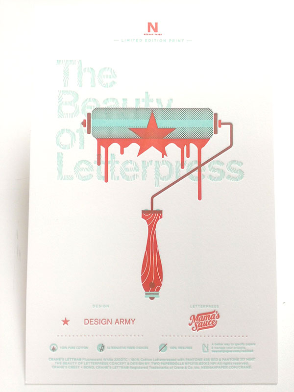
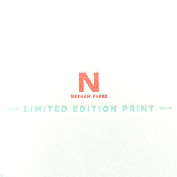
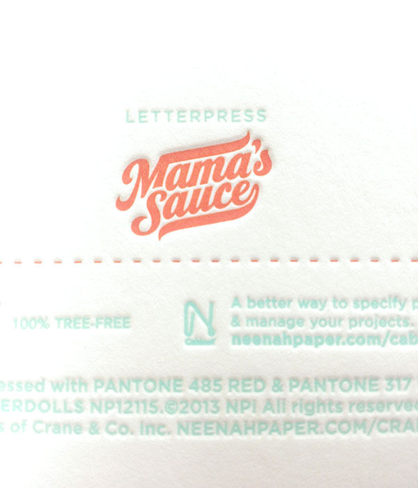
It was a tough decision, but I finally chose this $5 Issue Six Print designed by the award winning creative studio Design Army. The gorgeous graphic appears on 100% cotton aka tree free paper printed with Pantone colors (PMS 485 Red & PMS 317 Mint). I think you’ll agree that it was worth every penny:
Best of all, Neenah will donate another $15,000 towards the cause if you in the community order prints, too. They’ve already raised $30,000, and every penny goes to support Hamilton.
I’ve got an extra special announcement for you inkheads.
You may have noticed that this blog hasn’t been updated since last Friday. That’s because yours truly has been a very busy print geek.
What’s been occupying all of my time?
The upcoming #InkSEO Twitter Chat with Bill Michael of the Xerox Digital Printing Hot Spot!
What is #InkSEO?
Strangely enough, the #InkSEO concept came from a #printchat session.
Guest host/moderator Sandy Hubbard asked my fellow printchatters for future discussion topic suggestions, and several folks asked for inbound marketing.
Since the community seemed so enthusiastic about talking search engine optimization, social media, and content marketing, I enlisted the help of my good friend Bill Michael.
Bill and I share a passion for both print and digital, so we organized this fun event to educate about best practices to grow your online presence.
While we will be offering exclusive tips, advice, and resources for participants, this won’t be a boring webinar style lecture (nothing against webinars, mind you). Because where’s the fun in that?
No, this will be an interactive chat where you’ll be able to ask us hosts questions, play marketing trivia games, help your peers with your own internet marketing knowledge, and network with industry colleagues.
How do I participate?
Baby, you’ve got options.
Of course you’re welcome to jump on Twitter on July 10th at 1pm PST/4pm EST and search the hashtag #inkSEO. You’ll find the entire conversation on native Twitter, although some folks find it tough to keep up on the site directly. These chats tend to move very quickly; personally, I dig the fast pace and I’ve never had a hard time following along. Yet it’s easy to miss questions and there is a noticeable delay in terms of real-time tweets.
If native Twitter isn’t your thing, you can use other popular platforms such as TweetChat, Nurph, TweetDeck, or HootSuite. Feel free to ask others about their chat preferences! Some of our Print Pals are very adept at Twitter chats, and will be happy to offer their input.
I’m not in the printing industry. Can I still come to #InkSEO?
AB-SO-FREAKIN-LUTELY!
YOU are welcome at #InkSEO whether you work in the printing industry or not. In fact, I’m hoping more of my friends in the inbound marketing space will get involved. I already know that SEO and social media specialist Megan Pritts of JP Enterprises will be in attendance. Google Penalty expert Marie Haynes of HisWeb Marketing (who generously offered a quote for the event press release) plans to pop in as well. These marketers make a living building brands online, so you’ll surely benefit from their wisdom.
RSVP to #InkSEO
Don’t forget to join the party on July 10th! For your convenience, we created an easy way for you to add the event to your busy calendar:
We’ve still got 2 weeks to prep, so start thinking about your burning SEO questions or gaps in your content strategy. Speaking of content, your customers are facing many of the same marketing challenges as your team. Why not drop your knowledge in a blog post? If you mention #InkSEO on your business blog, please drop your link in the comments below for social sharing!
I know you’re all gearing up for Go Skateboarding Day tomorrow—-don’t forget to enter yourself in the free sticker printing giveaway!
Since we’re on the subject of skating, I want to spread the stoke and share some of the best sticker designs in the industry.
Skateboarding brands invest a lot in sticker advertising because those semi-permanent printed pieces give fans a way to express loyalty as well as identify with the larger action sports community.
Let’s have a look at the sickest typographic designs!
Why typography is an essential sticker element
Before I show you the cream ‘o the CMYK crop, I think it’s important to address the greater purpose behind this post. While I want you to feel inspired by the design examples below, I’m hoping the artwork will convince you to spend more time carefully crafting your type.
Reason being, stickers tend be quite small. They’re often viewed from far away or in passing as someone walks by on the street.
You need to take these factors into consideration when you’re sketching out your design ideas (you will want to start your creative process on paper). I’m not one of those minimalist design freaks, but believe me when I say to let the KISS design principle guide your workflow. You must adapt your message to suit the medium and context, which means that people should be able to comprehend your concept within seconds. Unnecessary elements, illegible text, and complex layouts are your worst enemy.
9 gnarly skateboarding sticker designs
Feast your eyes on the most excellent examples of sticker typography in the skateboarding industry!
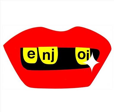
Always on the cutting edge of skater style, Enjoi kills with this creative and oh so flat sticker. The Enjoi brand identity doesn’t use a moniker or symbol, so they can get away with a type driven design. Most of the time, I’d say to avoid splitting up text this way, especially for the brand name. Still, there are exceptions to every rule. Since the company name is short, this unique layout grabs your attention.
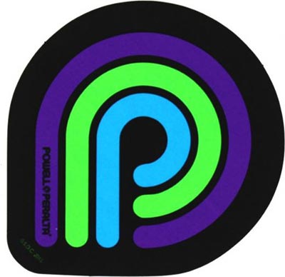
The Powel Peralta brand blew our minds with their crazy cool custom skateboard shaped wooden business cards. This sticker’s not quite as insane, yet the artwork proves there’s strength in simplicity. The trademark letter P appears in bright complementary colors that create just enough contrast to keep your eyes entertained.
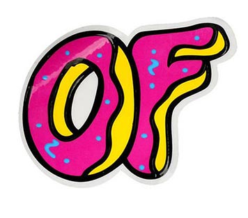
It doesn’t get much sweeter than donut typefaces. This shiny sticker features the OF brand initials with distinctive, fun lettering. Gloss compliments the graphic well because fresh baked donuts often emit glare, at least from behind display counters. Not to mention the whole glaze thing. The custom die cut shape acts as icing on this funky tactile cake, or should I say frosting?
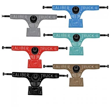
Caliber makes trucks aka axles, hence the interesting custom shaped die cut. The thin type may be tough to read towards the bottom, especially on the teal, gray, and light blue colored prints. Nevertheless, I’m willing to overlook these slight design faux pas because the rest of the execution saves the project.
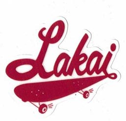
You might not be familiar with Lakai unless you’re really into skateboarding. The footwear brand makes technical shoes that are flying under the mainstream radar. This sticker shows a clear connection between the brand name and the sport by connecting the type to the skateboard graphic. The perspective conveys a sense of motion and excitement, which leave a favorable impression about a lesser known manufacturer.
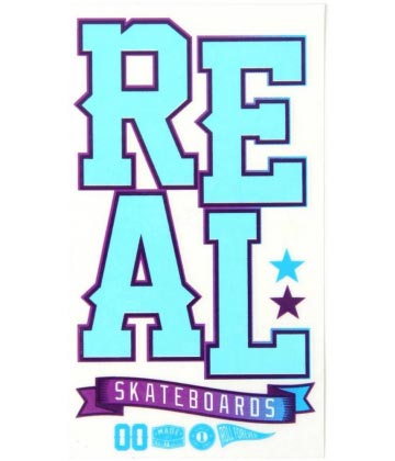
Props to the Real Skateboards team for this super clean decal with a clear background. The big bright letters will stand out on just about any surface. This print comes in 2 other color palettes that all give off the same summer vibe.
Creature appeals to the dark punk side of skateboard culture. Their brand imagery usually looks like something you’d see on a Misfits CD cover. Much like Misfits fans, Creature skaters are heavily drawn to gothic themes. In other words, Creature’s kind of a subculture within a subculture. Fans identify strongly with the brand’s values of rejecting commercialism, which is why devotees are called FIENDS. This sticker uses bold type inspired by classic horror films to enhance the sense of brand tribalism.
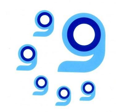
This one’s from the longboarding brand Orangatang, who concentrates on wheels mostly for downhill/racing. This sticker actually consists of 6 smaller logo decals arranged on a single piece of clear backing. Although I question the white/orange and white/blue color combinations given the material, the creative concept alone warrants a mention. A distinctive flat style gives a single letter the power to stand as an isolated symbol without being boring.
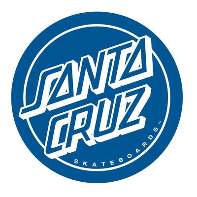
This legendary NorCal surf/skate brand set the standard for unique branding. Most of the Santa Cruz merchandise looks loud with surreal illustrations. This toned down circle shaped decal lets the 3D type do the talking.
I can almost hear your brain lighting up with awesome design ideas. In case you’re reading this after the Go Skateboarding Day 2104 giveaway ends, you can still get stickers printed just not for free.
We know that as much as you dig print design and typography, the actual process of putting your artwork on paper can be quite painful.
Maybe you’re fresh out of art school, and your courses didn’t cover technical printing knowledge.
Perhaps you’re a veteran rushing to meet a deadline, and in your hasty file prep, you forgot to adjust your CMYK values to rich black.
Whatever your circumstances, we can all use a helping hand now and then. And it’s comforting to know that if you do make a mistake, someone’s there to catch it.
That’s why proofs are so valuable— they provide 1 last opportunity to spot errors. We always recommend getting a proof for this reason and to physically print out the artwork with your home or office printer to check for common file issues, such as poor color contrast.
Trouble is that proofs add another $10 to your order, which makes a big difference when you’re on a tight budget.
At least they used to cost $10…until today!
We want you to be able to print with confidence, so we’re pleased to announce FREE PROOFS FOR EVERYONE!
What is a design proof?
PDF proofs give you a chance to review your artwork again before it goes into print process. Here are the 3 main things you want to watch out for:
Spelling, grammar, and punctuation: No one knows your copy better than you. Go over all text in your design to check for typos, etc.
Text size: Is your type too small to read? Print out your PDF at actual size (if possible) to make sure your letters are large enough to be legible.
Color contrast: Is your background color too similar to the text? Do you have a hard time reading because the text is too dark? Give your copy and design elements the final once over.
If you spot any problems at this stage in the order process, don’t worry—you’ve still got time to make corrections and upload new artwork. Simply decline the proof, and follow the resubmission procedure outlined below.
What does the PrintFirm prepress department do to my artwork/file?
Great question! We have an automated pre-flight software system that scans your file for the basics, such as CMYK color mode, bleed, and image resolution. Our technicians use this info to perform a manual inspection of your artwork. The humans also consider the finer points that elude machines, including font size, color management, contrast, etc. You’ll find more information about changes or potential problems in the comments section of your PDF.
Is there anything your prepress technicians don’t touch?
I’m so glad you asked because this question often creates confusion.
Our prepress techs will do their best to make technical adjustments to your artwork. For example, we will convert from RGB to CMYK color mode, add bleed (so long as it’s possible to do so without interfering with your design), and adjust color values on design elements to suit our procedures.
As you can see, we do our best to fix common errors; however, there are certain elements we won’t lay a finger on and for good reason. Prepress will not do any of the following edits:
Copy/text: We have no way of knowing how to spell your name properly or what you want your copy to say. We’ve also seen intentional misspellings and grammatical errors for creative purposes. We don’t want to ruin your mojo, so we leave the copy up to your team.
Low res images: There’s not a whole lot we can do about image resolution. A poor quality image isn’t going to magically turn into a masterpiece after a few adjustments in Photoshop. Your best bet would be to replace the low res visuals with high resolution photos.
Note- this is by no means a complete list of stuff our prepress team won’t do to your artwork without consulting you first. Basically, we don’t make major technical or aesthetic changes.
How to order your free PDF proof from PrintFirm.com
We already provide complementary proofs for custom design jobs as well as artwork you create with our online design tool. The new service applies to those of you who plan to utilize our printing services alone and upload your own artwork.
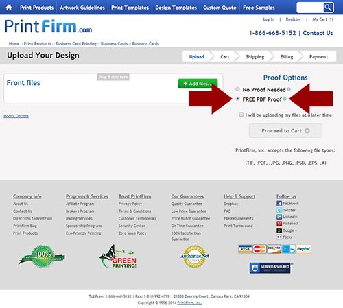
After you select a product, get your instant pricing quote, and hit the big green ‘Upload Your Files and Order Now’ button, you’ll land on the ‘Upload your design page’ seen below:
In the highlighted area to the right of the ‘add files’ button, you’ll find the ‘Proof Options’. Select ‘FREE PDF Proof’ and you’re good to go!
How will I receive my complementary PDF file?
You will receive your proof via email. Be sure to add prepress@printfirm to your contacts list or else your proof could end up in your spam box!
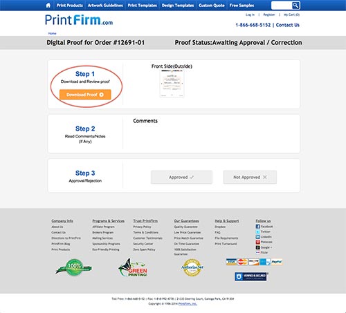
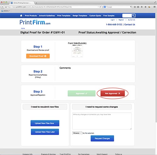
The email will contain a link. Click on it to visit your digital proof page, which shows you 3 easy steps to follow. Click the orange button under Step 1 that says, ‘download proof’.
You’ll probably receive a pop up prompt on your computer asking whether to save or open the file now. Choose your preference and thoroughly inspect your artwork.
As I said earlier, you’ll want to print out your design to perform your inspection. It will be much easier to find errors with a physical copy in front of you!
After you’ve triple checked every aspect of your artwork, go back to the download page to accept or reject your proof.
How do I approve or reject the PDF proof?
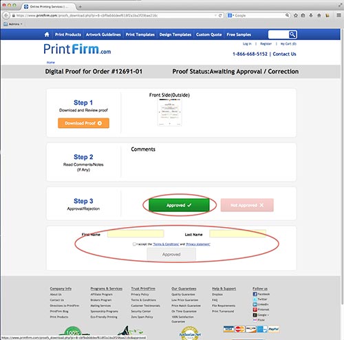
On the download proof page, select either the green ‘approved’ button or the red ‘not approved’ button. Make sure you agree to the terms and conditions by typing your name and checking the acceptance box below the approval button.
What happens if I don’t approve the file?
Did you spot a mistake? Phew, at least you have a chance to fix it. After you hit the ‘Not approved’ button, you’ll have 2 options: ‘upload new file’ or ‘request changes’. Just ignore the ‘request changes’ part unless you want one of our creative team to make the changes for you. Otherwise, select either ‘upload new file now’ or ‘upload new file later’.
If you can’t make the necessary changes right away, you’ll receive another email with a special link where you’ll go to upload your updated artwork. The upload page will look quite familiar by now, so simply follow the instructions to receive your new proof via email.
Do I have to get a prepress proof with my order?
No way, Jose! While we strongly urge you to take advantage of this free service, you’re certainly not obligated to do so. We understand that every minute counts when you’re in a rush, so we give you the option of not getting a proof with your project.
Will a printing proof change my turnaround time?
It might…
There’s no one size fits all answer to this question because a variety of factors come into play.
Let’s say you upload your artwork during business hours and you choose standard turnaround time; you’ll receive a proof via email within 8-12 hours. Proofs go out much faster for rush or same day orders, but let’s stick to this scenario for now.
As long as you approve the proof asap, your turnaround time will remain on schedule.
Now let’s backtrack a bit and say we sent you the proof via email, but you don’t check your inbox for a couple of days. Your login to your email, and quickly approve the proof. Unfortunately, you’ve just lost 2 days on your project turnaround! That’s why it’s super important to keep an eye out for that email. And if for some reason you don’t receive the message within 8 to 12 hours, call us so we can get that proof over ASAP.
Now let’s backtrack again and say that you didn’t check your email for 2 days and you need to decline the proof. Your designer isn’t around, so you have to wait 3 days to submit a new file for another proof.
You’ve just restarted the clock on your turnaround time!
Yes, that’s the way print production works. Every time you submit a file, we have to start the whole prepress process over again.
Don’t let this discourage you, though. You’ll only run into trouble if you neglect that email. Stay on top of your inbox, and your turnaround time will stick to schedule.
I hope this eases some of your commercial printing pains. Do you have any suggestions to improve other aspects of our order process? Leave your feedback in the comments below!

 Just because you’re in a rush doesn’t mean you shouldn’t get top notch business products for your trade show. Before you order trade show print products, it’s important to think about exactly what you want to accomplish with each piece. The most successful businesses know how to use a combination of products to attract people to their trade show booth – and leave them with a takeaway item that will standout long after the event is over.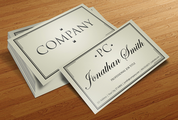
 business card, while people in more creative positions often seek something more unique. With more custom choices than ever before, PrintFirm can help you keep up with the top business card trends for 2017, no matter what industry you’re in.