Fellow inkheads, I’ve noticed that the general public, especially folks who work in online marketing, cast a very narrow view of print.
They seem to view our dynamic industry through biased blinders that cause them to reach false conclusions about print’s future.
Surely some of these folks deliberately downplay print’s value, yet I believe we’re also dealing with a fundamental flaw in human reasoning.
Printing and cognitive psychology
The flaw I’m describing likely doesn’t fit the way you view yourself and your decision making process. You see we all tend to think of ourselves as rational beings partly due to the lingering effects of Enlightenment principles. Capitalism and the U.S. Constitution are byproducts of Enlightenment theories in that both systems are built on the premise that humans make carefully calculated decisions based on rational self-interest.
Anyone who works in marketing knows that’s not an accurate description of human behavior.
More often than not, irrational emotional triggers guide our actions while subconscious mental short cuts derail our thoughts.
Now I’m not here to pass judgment; I’m as guilty as the rest of you. In fact, there’s not a lot we can do to prevent our leaps of logic, although we have the ability to control our reaction to them. These short cuts known as heuristics serve an evolutionary purpose, so they’re not all bad. They help us process a large amount of stimuli quickly and break it down into simple parts we can understand.
We only run into trouble when our brains use heuristics to oversimplify a complex topic, such as the state of print media. For example, most of us naturally associate the word ‘print’ with paper products used for mass communications i.e. publishing (books, newspapers, and magazines). Trouble is that printed books and magazines represent a small fraction of total print production.
We encounter print in many forms on a daily basis, we just don’t connect our experiences with the term print media.
14 examples of print you encounter every day
Try a little experiment to test my theory: ask your friends or better yet a complete stranger about print’s role in their lives. They’ll probably respond with a negative observation about how print’s declining or even dying out. Part of this undoubtedly stems from people parroting so-called tech experts. But I’d wager the true culprit would be the availability heuristic.
In a nutshell, we look for consistency in our environments. The things we see as widely available to us, we assume there’s a high probability that they’ll be there tomorrow. The opposite also occurs wherein we presume that an observed instance of scarcity signifies that something is disappearing completely.
This effects the perception of print in 2 ways. First off, people already see print in a limited context. They hear the word print, and they immediately think of books and magazines. Then they assume that since there are less printed publications in front of their faces, the entire medium must be on its way out.
I bet when you pose the question, the average person will proceed to explain that print’s on its way out despite the fact that they’re literally surrounded by print pieces. I love hate to burst your bubble, but print’s got a lot more to offer than newspapers (no offense to newspapers or other forms of publishing mind you).
Don’t believe me? Here’s a list of 14 types of print media that you deal with on the daily:
#10) All types of mail (postcards, letters, direct mail campaigns)
#11) Posters
#12) Catalogs
#13) Restaurant menus
#14) Promotional flyers
Now go forth, you ink freaks, and help me expand the colloquial definition of print media until it encompasses our robust capabilities. Use this list as a reference to cut through the cogitative biases of the CMYK ignorant, and be sure to tell me how your conversation goes in the comments below!
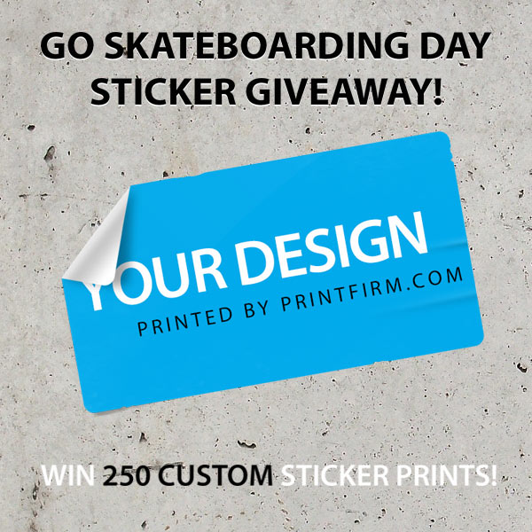
Today I’m super stoked to announce another awesome PrintFirm.com Go Skateboarding Day giveaway!
Last year we celebrated the glorious combination of summer, skating, and print with a free poster promotion as well as creating a custom CMYK penny skateboard.
This year we’re giving you design freaks a chance to win 250 custom printed rectangle stickers because skateboarding and promotional stickers go together like ink & paper.
Ok, before I go listing all the important legal details, I want to make sure everyone understands what you’re entering. This contest is a little different than your typical skating stuff because we’re a commercial printing company. That means we don’t have a bunch of stickers from your favorite skateboarding brands to send you. Nope, we’re giving you a chance to make your own stickers and get your design professionally printed! In other words, you supply the artwork, and we’ll put it on paper.
Those of you regulars might be wondering why I’d mention this—to be honest, we’ve had some trouble with these contests because past winners never sent us anything to print. We do have other options for you if you don’t have a design, but please be aware that you need a print ready file to claim your prize!
Go Skateboarding Day Custom Sticker Giveaway Rules
Now that we’re clear on the purpose of this contest, let’s talk official rules.
Giveaway begins on Friday 6/13/2014 at 4pm PST and ends on Friday 6/27/14 at 4pm PST.
1 Winner will be chosen via Random.org; winner will be announced no later than Tuesday 7/1/14. Winner will be announced on PrintFirm social media communities; winner will also receive email notification. He/she MUST reply to email notification within 48 hours or we’ll pick another contestant.
Welcome to another Demand 14 recap just for you inkheads!
Last time we shared insights from Chris Brogan and renewed our commitment to the printing freaks among you.
Today we’re digging into a very hot topic that’s near and dear to my heart—content marketing.
Several presenters discussed content marketing extensively, so I want to pass along their pearls of wisdom to help your own advertising strategy.
The Why and How of Building B2B Brands Online Presentation
I didn’t get a chance to attend this talk because I was preoccupied with getting my freak on. I’m posting the slides because most of you probably work in the B2B space either as a printing company or creative professional. Now I know a lot of smart people are calling for an end to the B2B vs B2C divide.
Point taken, we’re all dealing with people.
Still as someone with experience on both sides of the marketing aisle, I’m confident in saying the 2 spheres are indeed distinct. For example, successful B2B content tends to be more informative than entertainment oriented. There’s a certain degree of professional etiquette expected; contrast the tone of LinkedIn (the leading B2B social platform) with that of Facebook (the #1 B2C networking site). While lighthearted material exists on LinkedIn, users generally expect to see funny photos on Facebook as opposed to LinkedIn where photos can’t even be shared in groups.
The perception problem
You may run into trouble as a marketer, though, if you put on a pair of B2B blinders. Many assume that a professional tone must be dry, cold, and distant. Trouble is that this approach alienates your customers! People respond to brands that make emotional connections, which means you should focus on engaging customers directly with personal copywriting.
I believe Ann Handley instructed Demand 14 attendees to count how times the word us vs you appears on your website, print marketing materials, and other forms of marketing communications. If you find that your brand comes off sounding a bit egocentric, it’s time to refresh your copy.
The somewhat sad state of marketing and PR report
Speaking of refresh, I’m amazed to learn than less than half of respondents in the Vocus State of Marketing Survey view their business blogs as successful. In this case, success means generating leads, creating community, and increasing website traffic/social media buzz.
I hate to say this, but if your blog isn’t working for you, you’re doing it wrong.
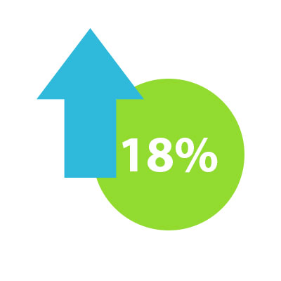
This blog pushed our site’s traffic from 183,723 visits in 2012-2013 to 216,302 in 2013-2014 and we’re just getting started!
Those numbers may not sound very impressive, but that’s almost an 18% spike in targeted visitors. I know you’re interested in what we do because why else would you find this blog in a search for embossed business card design inspiration?
The Demand 14 panel mentioned that the folks who find blogging ineffective feel the same way about SEO. I suppose this shouldn’t surprise me as blogging is an integral part of SEO. And blogging without a rock solid SEO strategy won’t produce results.
You see a lot of B2B brands fall into the trap of producing content for its own sake. They don’t bother to do keyword research or identify growth opportunities. They just write whatever blog ideas come to mind, do a little social sharing, and call it a wrap.
No wonder their blogs don’t further their goals!
At the same time, I think the SEO disconnect is a symptom of deeper brand identity issues. It’s tough to manage an owned media platform without a coherent mission because the purpose guides the content strategy. So if you consider your blog a wasted effort, I suggest you go back to square one. Here’s another Demand 14 slide deck by Laura Ries that will help guide you on your brand journey:
For more content marketing gems, please visit the Demand 14 recaps on the Vocus blog:
Before I share some insights from my personal marketing hero Chris Brogan, I want to express my sincerest thanks to the entire Vocus team for all their hard work and hospitality. Extra special thanks to Senior Social Media Community Manager Stacey Miller aka Social Media Stacey. Stacey’s simply captivating in person, and I watched her go the extra mile every day to keep the conference running smoothly. How’s about a CMYK salute to Stacey?
Stacey’s efforts at Vocus serve as the perfect segue into New York Times Best Selling Author Chris Brogan’s presentation entitled, Get Your Freak On for Success. Now I’m not saying Stacey’s a freak, although I hear her NASCAR obsession is quite intense. Stacey demonstrates the importance of community daily as she always engages the Vocus social followers. And by engages, I mean that she actually interacts with people and treats them like human beings. In fact, several of the folks I met at the VIP events also connected to the brand through Stacey. We can’t all be marketing thought leaders like her, but we can certainly learn a lot from her example and Chris’ sage advice.
The business of belonging
Luckily, I’m able to embed Chris’ Demand 14 presentation here directly for your viewing pleasure:
Chris explains the concept of Monchu, which is an Okinawan terms that means your family of choice as opposed to your family of birth. Not all of your customers or social community members will fall into this category because these people are your brand’s true tribe. At the same time, these hardcore consumers are really the people you need to please, not the new prospects you’re trying to attract.
I hope this point resonates with the printing community because most of the dialogue I see revolves around convincing people to give print a chance and revive the medium from its deathbed. I have one question for all the printing companies beating the print’s not dead drum:
Who cares what the paper haters say? Why are you dignifying the print haters with a response?
Let me be very clear as to my meaning: I’m not suggesting that we ignore the false environmental claims about paper production or wave a white flag at the digital diehards.
Far from it.
I do believe that we as an industry need to stop letting ourselves get trapped in a defensive position. Instead of justifying our existence to the nay-sayers, we should be forging alliances with CMYK sympathizers. Most of my designer friends hold print dear to their hearts. They love creating in the physical world and making intimate connections through typography. These are the folks we should be courting because there’s already a bond between us.
Kill the marketing campaign mentality
Another theme Chris explores lies in the utility of pursuing a traditional campaign style marketing strategy. The old school advertising model focuses on distinct single serving promotions as opposed to cooking up a never ending feast. Chris suggests that this mentality creates a disconnect between brands and consistent messaging.
I’m inclined to agree as campaigns are by nature short term, meaning they’re not designed for the long haul. I’ll give you an example of what I mean from my experience here at PrintFirm. When I started here we ran lots of giveaways to increase brand awareness. These campaigns lasted about 2 weeks, and at first I used them as a way to entice new people on social media.
WRONG.
Yep, I can hardly believe I sat there wasting time trying to court contest junkies who could care less about print, design, and everything else that’s important to our brand. And as soon as the current contest ended, I’d watch those fair weather fans abandon ship.
Of course the abandonment issues shouldn’t come as a surprise seeing as how I sought these people out! I actively recruited lukewarm users on free contest listing sites and social feeds/pages. And why not? It’s a lot easier to win someone over with 250 brand spankin new business cards than to build a trusting relationship through several touches (small interactions).
What’s more I realized that these flakey people’s presence actually decreased the chances of a real fan winning the printed prizes! A couple of contest winners ended up being the hit it & quit it types, which really made me question my logic. So for our last contest back in February, I purposefully promoted to our fans alone, and didn’t bother trying to stimulate activity on 3rd party sites or blogs. As a result, a long time PrintFirm community member from Google Plus won the canvas.
I’m still going to run contests to reward you guys for being your awesome selves, but I changed my perspective to where I no longer see these events as stand alone campaigns. They’re simply part of keeping the tribe happy, and that’s my #1 priority as community manager.
Renewed commitment to the printing FREAKS
Speaking of priorities, I’ve realigned mine to put you inkheads first. That means no more posts filled with fun small business marketing ideas. I love local business, yet this blog doesn’t truly serve the small biz crowd. There are plenty of other business blogs much better than this one for those folks to read. From now on I’m sticking with sexy print design examples, case studies from our creative clients, and technical design tutorials to inspire and hopefully educate you.
Hello inkheads! Let me start off by wishing you a very happy June!
Summer is my favorite time of year and luckily, PrintFirm’s celebrating the season with lots of exciting sales and promotions. I’m also planning a few more of those free print product giveaways you guys like so much. I don’t want to spoil the surprise, but there will be another gnarly Go Skateboarding Day contest this year…
If you’re on our email list or you received one of our postcards in the mail, you’ve probably noticed that most of the deals and discounts require print ready artwork. Our customer service department’s gotten a lot of questions about what the heck qualifies as a print ready file, which brings me to the point of today’s post. Have no fear, new printing friend—I’ll give you the full breakdown for your future projects!
What is a print ready file?
Ok, I think I understand where the confusion comes from with this phrase. After all, the words ‘print ready’ are fairly ambiguous. At first glance, the term sounds as though you’re simply prepared to place your order. It’s a little more complicated than that, though.
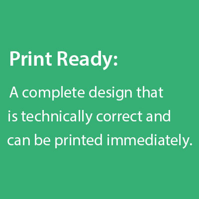
We define the phrase ‘print ready’ the following way:
A complete design that’s technically correct and can be printed immediately after uploading.
Phew! That was more than a mouthful.
Now let’s break this bad boy down into parts to figure out what you need to send us to get your project onto the press.
If you read the definition carefully, you’ll see that there are really 2 parts to the equation that both lead up to the exciting culmination of your printed marketing campaigns. And said parts are inseparable because without each component intact, it would be impossible for us to produce the paper collateral.
Let’s use a real life example to explain what each part means. Pretend you have a postcard you made 5 years ago. You lost the native InDesign file, but you’ve got an old copy of the postcard and want the exact same design the second time around.
Does your artwork pass the print ready test?
Answer: NO!
Why not?
Because we can’t print your old postcard as is, at least not without scanning the physical item first.
Even though you want an identical design on your postcards, your artwork would be filed under incomplete. Don’t get me wrong—we would absolutely be able to accommodate you in this situation, just not through the discounted offers reserved for ready to print orders.
The technical side comes into play when you send us a file that’s not properly formatted in some way or another. Let’s say you ordered a standard 4″ x 6″ postcard, yet you sent us artwork for a 5″ x 7″ piece. We would have to put the order on hold until you correct the problem and submit updated artwork. As soon as you make the corrections, we’re good to go!
If you’d rather we make the corrections for you, we’d be happy to do so for an additional cost. You see as soon as someone from our team starts working on your file, you’re no longer in the print ready category. Makes sense, right? We’re able to offer you super low prices because we’re literally just putting your file to print. Anything beyond that eats into our overhead, which means you wouldn’t get low prices for very long because we’d go out of business.
5 Common circumstances without proper artwork
Hopefully we’re clear on what’s acceptable—now let’s go over the common situations that don’t quite make the CMYK cut. Here’s a list of the types of files that don’t qualify as print ready along with the reason why. I assure you, there’s a method to our ink madness!
#1) Hard copies of printed pieces- The fictional postcard example above would fall into this group. In that scenario, you had an old copy of a postcard that you wanted printed again. The physical copy can’t be printed again on its own—I’ll tell you what we can do with physical copies of artwork momentarily.
#2) Photos of prior print jobs- Pictures of the last postcard you sent out presents similar problems as hard copies do. Don’t worry, we can still help you if all you have is a picture of a campaign you’d like to run again, just not through the same process as someone with a file that’s ready for primetime.
#3) Isolated/Incomplete design elements- We run into this instance a lot with small business owners. You have your logo, contact info, maybe even a background image or pattern to use in your business card design. The only problem is that none of these elements are put together in a single file. In other words, your card design still needs to be designed. Design includes arranging elements on your layout, too, not just creating graphics from scratch. After all, you don’t want us to literally print just your logo on a 2″ x 3.5″ card, right? I didn’t think so.
#4) Web elements- Along the same lines as hard copies and disconnected design elements, screen shots of your website or your logo on your website won’t work for this purpose. Besides, you don’t really want us to print out low res graphics from the web. You wouldn’t be very happy with your marketing materials if we did!
#5) Files you want edited- This case comes up when clients want to reprint a previous design with a few, usually minor, modifications on the artwork. For example, you want us to replace your old logo with your new brand identity, or fix your company address. While these are indeed small changes, they’re changes nonetheless. Since our creative department would have to work on your files…you guessed it— they’re not print ready.
Alternative printing options
You don’t have to abandon your dreams of launching that big campaign in the near future if you don’t have a file that’s ready to upload. We have plenty of other ways to get your job done such as:
High resolution scan
A high res scan would be your cheapest option in situation #1 where you have a hard copy of a postcard you used before. The price of a scan depends on the size and type of the item; please note that this cheapest method won’t be as sharp as the original. Only use this option if quality isn’t your priority.
Pre-designed templates
There are plenty of places online where you can download professional design templates. This might not be a good idea unless you’re able to customize said templates with Photoshop, Illustrator, etc. No access to pro software? Try our free online design tool. We’ve got template galleries for many popular products, including hundreds of business card designs. Best of all, you don’t have to worry about formatting your file because the tool will do the work for you!
Custom design
Our creative team will take the lead and build your campaign from scratch, recreate a design you used in the past from a photo, or create a layout with elements you provide. No job’s too big or too small—we have different packages to suit your needs.
I hope this post clears things up for you. Did I miss your question? Ask me anything about our procedures in the comments below!
Good afternoon, inkheads! It’s time for another fun-filled episode of the 21/20 Marketing broadcast on Google Plus with my esteemed colleagues Richard Dannenberg and Spencer Powell. We’ll be on the plus side tomorrow, Thursday, May 29th at 4pm EST/1pm PST. Be sure to RSVP on the official event page on Google Plus:
Tomorrow’s topic suggestion comes to us from the lovely Kate Gansneder, the marketing mastermind behind Washington Graphics. Kate wanted to discuss KPIs (Key Performance Indicators), to help you figure out what to measure and how to create an actionable plan to improve your metrics. Kate’s very well versed in this subject, and she should probably be taking my place in tomorrow’s Hangout. Fortunately, our resident Southern Gentleman Richard happens to be very familiar with KPIs, so I’ll let him do most of the talking. We will cover this stuff and more:
Why do I need to measure anything?
Are business measures and marketing measurements the same? Why or why not?
What tools do I need to measure marketing KPIs?
Google Analytics and Goal setting for meaningful marketing data
While I’m a bit out of my comfort zone as far as KPIs are concerned, I’m confident that I at least know more about Google Analytics than Richard. For my part in tomorrow’s Hangout, I’ll show you how to work Analytics like a pro. This would be especially important for printers with a Web to Print solution in place because goal setting works best for ecommerce sites. If you aren’t equipped to take orders online, don’t worry; Analytics will still provide valuable data to improve your results.
Goals in Analytics are important because they let you know how often users take specific actions on your website, such as place an order or fill out a request form for free printing samples. You’ll learn how to set up goals to track campaigns and use funnels to pinpoint where users get stuck on your website.
I’ll go into more details as far as goals during the #2120Marketing Hangout, but for now let’s talk about your priorities in Google Analytics. The amount of data available feels overwhelming at first, and it’s tough to figure out where to start. The fact that the Analytics interface changes frequently doesn’t help matters. Here’s what you need to zero in on while you get comfortable with the program.
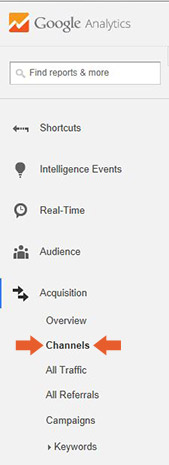
Acquisition > Channels
The acquisition section shows you how people found your website i.e. through search engines, direct or type-in traffic, referrals from other sites, or referrals from your social media communities. You’ll find the segmented traffic breakdowns listed under channels along with other useful info, such as the average bounce rate from a particular medium.
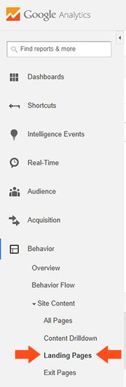
Behavior > Site Content > Landing Pages
In this case, the term landing page doesn’t fit the usual definition. These aren’t special pages you’ve built for a PPC campaign or to track leads from a printed catalog. Landing pages in this sense refers to the exact URLs where users land on your website. This data shows you which pages are getting the most visits and identifies possible problem areas. You’ll be able to see where there’s room for improvement based on the bounce rates. In general, when you see higher bounces (50% or over) that usually means there’s an issue with the content on a page or with its load speed.
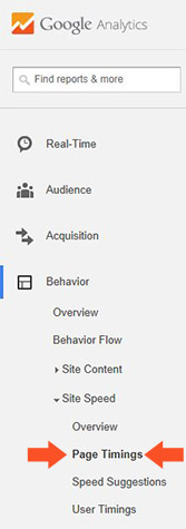
Behavior> Site Speed > Page Timings
Speaking of load speeds, users HATE slow websites. In fact, making your site faster will improve conversions (sales) almost automatically. Plus search engines favor fast sites, so you’ll get a boost in your organic traffic, too. If your pages are taking more than 3 seconds to load, read the speed suggestions in the same section for ways to improve.
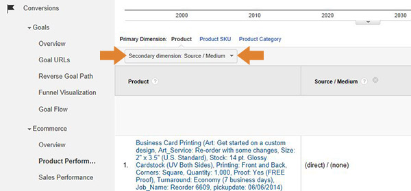
You’ve probably already figured out that you need to monitor transactions/purchases on your site. That’s kind of a no-brainer, yet newbies often fail to properly attribute the source of the sales on an item by item basis. There are other ways to find this data in Analytics, but I find this method to be the least confusing. Sorting out the sources of your conversions allows you to see exactly what products are popular with new customers (usually the people who visit through search engines) and which appeal to the loyal clients (the users who visit your site directly).
Recommended KPI reading from Richard Dannenberg
Enough about Analytics for now—let’s get back to KPIs for your printing business. Prepare for tomorrow’s live Google Plus broadcast by catching up on Richard’s excellent and entertaining article series on his blog:
Happy Tuesday inkheads! I hope you all enjoyed a relaxing weekend. Now that Memorial Day is behind us, it’s time to focus on your mid-year marketing campaigns. Great weather means all kinds of exciting events from backyard BBQs to music festivals. Of course, no business sale or community event would be complete without promotional flyers to spread the word. Custom flyers last a lot longer than a tweet, although you can integrate a hashtag in your design to stimulate social media buzz online.
6 Free Photoshop flyer design templates
Ok, the templates below are all print ready in that they’re in CMYK color mode, high resolution (300 DPI), and contain proper bleed. Try as I might, I couldn’t find any vector based files for you; apparently the interwebs is stuck on Photoshop as the default design software of choice. That’s a shame because none of the Photoshop templates below are scalable, meaning you can’t enlarge the graphics without distortion. I really wanted to find some Illustrator artwork in case you need to print fliers in alternate sizes…and because AI would produce sharper text. C’est la!
Click on any of the images below to download the template.
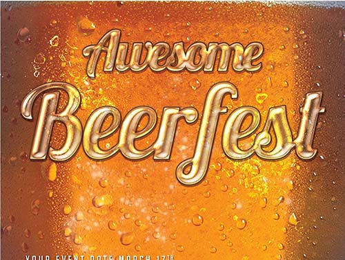
#1) Beerfest Flyer PSD (Size 4″ x 6″)
Doesn’t this design make you thirsty? The extreme close up of a tall cold one would be perfect for just about any celebration that caters to adults, especially a bar, pub, microbrewery, or bowling alley. Planning a company picnic with beers? This flyer design will get employees excited instantly!
(Note: You must “like” a Facebook page to obtain free template)
#2) Summer Indie Rock Festival Flyer (Size 8 ½” x 11″)
Summer concerts rock the season. Everyone loves enjoying the sounds outside on a warm evening. The usual suspects, such as night clubs and coffee shops, often host outdoor music performances throughout the year. Yet summer inspires other businesses and organizations to get their groove on, including churches, non-profits, youth sports teams, and more. This simple design featuring bold typography works for lots of different niches, and gives you space to provide your own event photo. The well-organized layers allow for easy color customizations.
IMPORTANT: The template above should be 8.5 x 11, but you’ll have to increase the canvas size as the file dimensions only measure 8.4″ x 11.89″ with full bleed!
#3) Retro Beach Party (Size 4″ x 6″)
This generic artwork seems suitable for most adult-oriented summer parties, although you could easily change up the background to get a kid-friendly design. The background looks a bit busy in my opinion, so I’d probably delete that layer and go with a solid contrasting color instead.
#4) Minimalist Futuristic Event Flyer (Size 8.5″ x 11″)
This would be my top pick out of this flyer collection. The clean layout contains plenty o’ white space, which gives your message room to breathe. The beautiful blue sky with an ethereal cloud in the background complements the circles in the center. I also appreciate the trendy thin typeface, which isn’t skinny enough to cause print production problems.
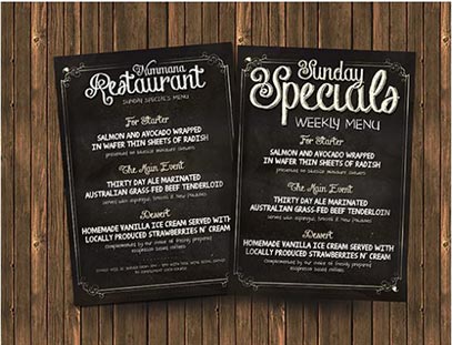
#5)Chalkboard Restaurant Menu (Size 6″ x 8.5″)
There’s nothing quite like savoring a meal under the stars. Inspire customers to try your restaurant’s summer specials with a fun menu flyer. The chalkboard theme wouldn’t suit a luxury dining establishment, but the homey feel would be perfect for a café, coffeeshop, or family diner.
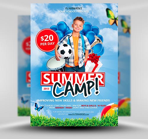
#6) Summer Camp/Summer School (Size 8.5″ x 11″)
Getting ready for your school or church’s summer program? This bright, colorful flyer will get the kids pumped to join in the fun while reassuring parents that their kids will be left in a safe learning environment. The graphics are geared towards elementary school age children, although you could substitute the elements for a preschool or kindergarden crowd. The central photo of the boy does not come with the file, so you’ll have to use your own hi res picture.
Happy hump day, inkheads! Today’s regularly scheduled blog post about sexy summer flyers is going on the backburner by request of our operations manager, Alex. As much as I’d love to inspire your creative designs, Alex asked me to explain a very common printing issue that came up with a customer yesterday. The seasoned ink veterans among you may not need to hear this piece of advice, but the newbies should gather ’round the campfire for a little lesson/technical printing tutorial.
The color conversion nightmare
Our story begins with a frantic phone call from a customer. Alex spoke with a local designer working with a small business about a color issue on her business cards. It seemed her printed cards did not match the colors in her artwork…at all.
She submitted a layered Photoshop file, which we don’t recommend for several reasons I won’t get into right now because layers aren’t relevant to the main point. Anyway, Alex did some digging and discovered the root of her ink problems—-the file started out in RGB color mode, and that’s how the file appeared in our system. That means our prepress department converted to CMYK after the fact!
What’s wrong with this printed picture?
Our file requirements page explains that we’re not responsible for color shifts as a result of RGB to CMYK conversion, so it’s super important to set up your files correctly. Just so you know, we don’t cover color because most matching issues stem from client files, not our production process.
Now that may sound a little scary. I’ll be the first to admit that prepress prep can be crazy confusing. Still, don’t let the possibilities of printing errors get the best of your marketing campaigns. Remember, our customer service department is here to help. If you have any questions about file prep from setting up bleeds in Illustrator to using our free online design tool, feel free to get in touch. We want you to have a successful project in your hands as much as you do, and we’ll do everything in our power to make the order process painless.
That said, let’s get back to the ink issue in our customer’s story. The color shift came as a surprise because the customer never saw her business cards in CMYK before they went to print. A prepress proof may have saved the day, yet she didn’t request the pdf proof option with her order. Besides, there’s no guarantee should would have caught the difference. Surely she’s a busy lady, which means she probably wouldn’t have set aside time to give the business card proof a proper inspection. So what can she (or you for that matter) do next time to solve the problem before it occurs?
3 CMYK conversion solutions
Enough about the problem—let’s find a solution that works for you, and hopefully, you’ll never find yourself in this customer’s shoes. I’m going to offer our best suggestions below.
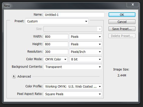
Always design in CMYK color mode from the start
Forgive me for sounding like Captain Obvious here, but doesn’t it make sense to start your print design in CMYK color mode since our press uses 4 color process? I mean, you don’t design a website in CMYK first, and then convert to RGB, right? Of course, you can always download one of our free printing templates. That way you won’t have to worry about file formatting period.
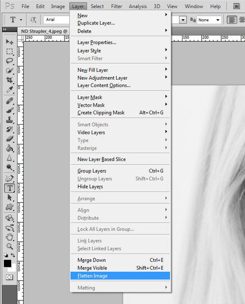
Flatten your file before you convert
All right, I realize that you’re not always in control of files from start to finish. While you’d never design a print product in RGB color mode, you may inherit an incorrect file from another designer or a client. Before you report this print design crime to the CMYK police, make sure to flatten your file. Converting a layered file to CMYK might not produce the consistent results you want. Flattening the file ensures consistent changes to the entire image color profile as opposed to that of the individual layers.
Avoid image effects and transparencies
Here’s one thing you need to know about the flattening trick I mentioned above—it won’t always work due to image effects. What kind of effects will get you in trouble? Basically anything that modifies a layer’s color profile, such as changing the blend mode, applying filters, or using transparencies. You can flatten transparencies in Illustrator separately, but that won’t prevent the problem I’m referring to because you’ve still altered colors within the layer. Your best bet would be to leave the layer styles n stuff out of your print designs altogether.
How to convert files in CMYK color mode
If you’ve never designed for print before, you might not even be aware that CMYK exists in the first place. I’m pretty sure most folks who send us RGB files simply don’t realize there are technical differences between print vs web design. I blame the lack of printing education in art schools and college graphic design programs. At any rate, here’s how to convert your work from RGB to CMYK in the popular Adobe Creative Suite programs.
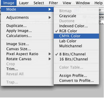
Photoshop
From the main menu, go to Image> Mode> CMYK Color
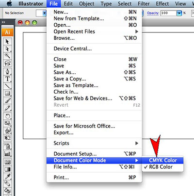
Illustrator
From the main menu, go to File> Document Color Mode> CMYK Color
InDesign
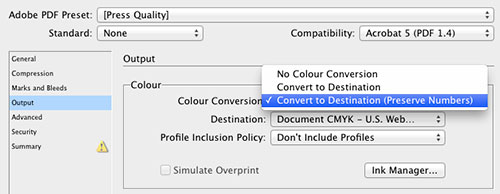
Since InDesign is primarily a print design tool, you’d think the default settings would be in CMYK. Alas, even this well known layout program can cause color-induced headaches. Most of the time, you’ll be importing RGB images into InDesign, and many designers convert photos in PS or vectors in AI before placing them in ID. Here’s an alternative InDesign workflow method wherein the final conversion occurs during PDF setup with press quality settings. Be sure to read the comments on that article as I think the first one in particular makes good points about problems with rich black and blues.
Photoshop Elements, GIMP, Word, Publisher, Canva, etc.
Let’s say you don’t have access to the professional tools listed above. I wish I had an easy answer for folks in this sticky situation, however, I don’t. These programs outside of the Adobe Creative Suite don’t have CMYK capabilities, so please be aware that any non-professional design software may cause color management problems, not solve them.
Hello inkheads! The fine folks at Mohawk are running an awesome article series about inbound marketing on the famous Makeready blog. I must say it does my heart good to see the growing interest in digital marketing from the print and paper community. *Shameless plug* My pulpy pals at Mohawk invited yours truly to contribute a quote to their must read article Ready, Set, BLOG! I’ll pause for a moment so you can finish reading their brief, actionable guide.
Needless to say, their enthusiasm inspired me to dust off my own posts about blogging for commercial printing companies. I’ve already written a basic overview as well as a post that shows you how to write killer headlines to increase your content’s visibility.
Pro headlines aka post titles will get you higher traffic, but words alone are only part of the picture. Visuals are a huge part of social media and content marketing, so you absolutely MUST incorporate visuals into your blogging strategy.
Right now some of you might be thinking, That’s easy for you to say Miss Designer Writer Person…and you’re right that this topic speaks to my passion for visual communication. While I firmly believe that design should be left to trained professionals, you don’t have to be a designer to add images to blog posts. Sure, a designer would be better suited to the task than a non-designer, especially with respect to custom graphics. To be clear, I don’t think it’s wise to mix your newly discovered creative side with your business. After all, your blog reflects your brand’s reputation—-you don’t want to give people the impression that you’re cheap or unprofessional. Don’t worry, I’ll show you how to choose the right images and share best practices for publishing pictures with your blog posts so no one looks down on your content.
Are you ready to supercharge your storytelling? Let’s dig in!
Why does my blog need images?
For the same reason it needs words.
No, I’m not being sarcastic. I consider images as vital to blog posts as copy.
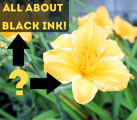
You have something to say and you want to present your thoughts, tips, and info in a way that engages readers, right? Then you have to cater to all the different types of potential readers on the interwebs. Some of them might be visual learners, so they will have a hard time understanding your lengthy textual explanation of rich black vs plain black without a couple of pictures to demonstrate the point. Others are too busy to read your entire article; they want to quickly scan the text and get the main idea from your headings or images alone.
The above examples illustrate specific instances where visuals cater to the audience. In reality, we don’t have to get into esoteric reader psychology because literally everyone responds to images. Why do we love images so much? Here are 3 big reasons in no particular order.
#2) Storytelling- We tend to remember stories or personal anecdotes as opposed to dry textbooks or instructional videos. For this reason, marketers like me recommend writing in a way that reveals your human side. An intimate tone will do wonders for your blog, yet plain text stories fail to capture the mood you’re setting. Images also serve a purpose in your layout. Pictures break up your paragraphs and create breathing room for people to digest your words. Let’s put it this way: reading a blog without pictures would be like listening to a politician deliver a long winded speech. Even the most loyal of supporters in the crowd would tune out after a while. Pictures grab reader’s attention immediately and help maintain their interest for longer periods of time.
#3) Emotional connections- Pair your powerful words with expressive images and you’re guaranteed to make a lasting impact on your readers. Photos cut right to the core of our psyches. Leave them out and you miss your opportunity to create branded content that truly resonates with your customers.
If you’re not convinced that visuals will rock your content strategy, please stop reading here because I’m operating on the premise that we’re on the same page from now on. Speaking of which, let’s move on from the why to the actionable how to of blog images.
What kind of visuals should I share?
I’m glad you asked this question because it takes us down a slippery slope and into a trap I see inexperienced bloggers fall into frequently. I already explained that images help you tell stories; this means that the pictures you add to your blog posts should be directly related to your message. Irrelevant images distract readers, which diminishes your capacity to clearly convey your message. How’s that for a tongue twister!
I’m raising this issue because I don’t want you to be like the thousands of bloggers blathering on Google Plus posting pretty and sometimes downright ugly graphics that have absolutely nothing to do with the content they’re sharing. These misguided folks are trying to increase their visibility by capitalizing on popular social media graphic trends, such as sunset photos or LOLCats.
Before you succumb to the temptation to drive shares with unrelated images, ask yourself what you want your readers to remember about your brand in general as well as the particular post. Do you want them to think of your brand as a printing industry expert, a marketing partner, an awesome print design resource, or that page that posts the beautiful landscape photography?
I’m sure you would prefer the former, so keep your visual strategy in synch with this aspect of your brand messaging.
Do I have to design my own images?
Not necessarily.
Don’t get me wrong—-original images go a long way as far as branding is concerned. You want people to recognize your blog posts wherever they’re shared, regardless of who shares them. The easiest way to get that kind of recognition going on is through custom graphics.
If you don’t have the resources to put your designers to work on your daily or weekly blog posts, let them create simple templates for you along with a brand style guide. That way you’ll at least have a consistent look across platforms.
Don’t have any creatives on staff? I highly recommend seeking professional assistance with the aforementioned visual style guide before you integrate branded designs. Otherwise, you can get by sharing images from stock photo sites, creative commons, etc. Be aware that you must always abide by applicable copyright laws and please, give credit in the form of a link to the image source.
Where can I get photos for my blog?
Since you’re a printer, I’m going to assume that you’re already aware of the various stock photography websites for royalty-free photos. For a very large list of free images, check out this sweet post from the Buffer blog.
Will images help me with social media and content marketing?
As I’ve said before on this blog, AB-SO-FREAKIN-LUTELY! Including related images with your links will get your blog post more views on basically every network…except for Facebook. Despite the fact that photos consistently get the highest engagement on Facebook, the book of faces will completely bury your update if you post a photo and include a link to your blog in the status/description.
The Facebook situation is a big bummer, but don’t throw in the towel just yet. Visuals are invaluable to your content marketing game plan because you’ll be able to share some of the best ones from your blog by themselves on social media!
As my friend expert designer Paul Bieddermann says, visuals allow you to break your blog posts down into snack sized servings. To explain what I mean, let’s revisit the earlier example about complex black ink issues. You’ll surely want to demonstrate the difference between plain and rich black in print with a graphic. Otherwise, it will be tough for people to grasp the impact CMYK values have on their finished artwork. After you publish your epic ink post, you can share this graphic again a few weeks later on your social media accounts with a bit of text reminding people about proper prepress prep! You can even include the blog post URL in said graphic to try generate direct traffic to your blog. (Note: direct traffic aka type in traffic is SEO speak for people who physically type your web address into a browser as opposed to clicking on a link from another source i.e. Google or your Facebook page).
Do images impact SEO?
Ooooh, you betcha.
Images contribute to search engine optimization directly and indirectly. The direct part comes in when users perform image searches through Google, primarily. Let’s say you write a blog post about die cut business card design inspiration or pro plastic business card design tips. With proper image optimization in place, which we’ll discuss momentarily, they might find one of your business card example images and click on the link to your blog for more.
The indirect SEO influence stems from social media. Posts with images get more clicks, comments, and shares from the people in your social communities. This activity sends low watt signals to search engines about your brand’s popularity as well as niche authority. Right now, Google Plus is the only network that manipulates personalizes search results based on your activities and those of your contacts. At the same time, social shares build the type of buzz that attracts links naturally. In fact, great designs may attract links on their own in the form of image source attribution.
How do I optimize images on my printing blog?
All right, here’s where we’ll delve into a bit of technical SEO. There are really 6 steps to optimizing your blog pictures, although you might struggle with a few of these unless you have an SEO-friendly content management system in place i.e. WordPress. Check for SEO plugins or extensions on your platform provider’s website if you don’t see a way to add the metadata below. (Note: metadata is a fancy way of saying data you input for structural and user experience purposes).
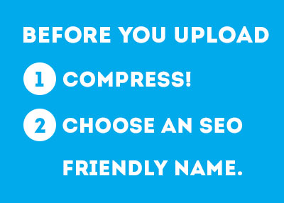
Before you upload, do the following:
Step 1) Compression- Large files look amazing…and take forever to load. Users typically abandon slow sites within 3 seconds; compress your images so they have no reason to abandon ship without absorbing anything. Use the save for the web feature in Photoshop, Illustrator, or try a web based compression tool, such as Kraken.io. In general, you want to keep your images as small as possible while preserving their quality. Shoot for small files under 50 kbs.
Step 2) Naming- This one’s the most important as far as bringing you organic search traffic. In the business card blog post example, I mentioned a user finding your blog by searching for photos of sexy die cuts or something of that nature. This type of discovery is largely keyword driven in that Google matches photos to user queries mainly by the image names. So a photo named oval shaped die cut business card will appear in search results for a related query. An image that isn’t properly named (ex. Image1232ddfdf.jpg) can’t be identified semantically, which means it won’t show up in any queries. Just don’t go overboard trying to shove every relevant keyword into your image name because that screams Spammy McSpammerson!
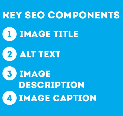
After you upload, add these fields of metadata:
Step 1) Image title- This can be the same as your image name. And that’s the only time you’ll ever see me recommend repeating stuff on your website.
Step 2) Alt text- Alternate text is a feature that most users don’t realize exists because it doesn’t come into play unless you’re visually impaired. Search engines are visually impaired in the sense that they can’t interpret images without alt text. In a way, alt text functions as an image title for search engines. Alt text also works with screen reading software programs i.e. ZoomText that allow visually impaired users to navigate the web. The software literally reads alt text out loud to them when it encounters an image in your blog article. For this reason, you want to be extra careful not to abuse alt text with yucky keyword stuffing. Instead, choose 2 or 3 words that summarize the image.
Step 3) Image description- Much like meta descriptions entice users to click on your links in search results, image descriptions appear alongside your photos within image searches. When a user clicks on your photo in a Google image search, the description shows up along with a link to your website. Limit the text to a short sentence that tempts them to read more.
Step 4) Add a caption- This may sound hypocritical seeing as how I don’t include image captions on this blog. Confession time—I wish I could write captions for our images; however, the theme we have installed right now can’t handle captions without messing up my formatting. Anyway, I lament the lack of captions because users read them. A lot. Keep your captions brief, and lighthearted. Complement the image with additional info or a witty aside.
Continue the SEO education
And this concludes our discussion on blog images! If you made it this far, pat yourself on the back because you’re well on your way to blogging mastery. As a reward for reading this lengthy post, I’m going to let you in on an exciting new project I’m working on with my buddy Bill Michael from the Xerox Digital Printing Blog (@XeroxProduction). Bill and I will be hosting a special Twitter chat about SEO for the printing and mailing community called #InkSEO on July 10th at 1pm PST/4pm EST. I’ll be very sad if I don’t see you there, so mark your calendar.
Do you have any questions about visual content marketing for your printing company? Ask me in the comments below! Or tweet your questions and suggestions for the Twitter chat with the hashtag #InkSEO.
P.S. If you write a printing industry blog, feel free to drop me a link in the comments section for a little CMYK blog networking. I’ll leave your link and pay you a visit so long as I deem your site worthy.
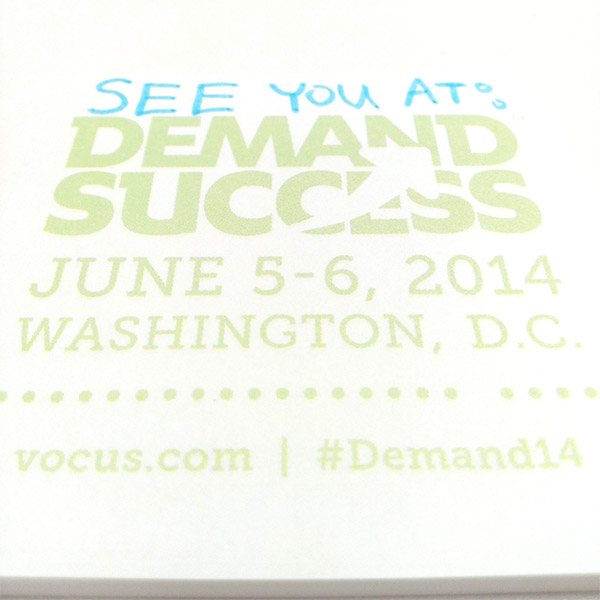
Hello Inkheads! I’ve got very exciting news to share with the printing community today. For the last couple of weeks I’ve been raving about the Vocus Demand Success conference in Washington D.C. on June 5th and 6th. I even posted an exclusive $300 discount on tickets for you awesome readers (an offer that ends on May 16th, don’t miss out!)
As a reward for my obsessing brand advocacy, the good people at Vocus gifted yours truly with a FREE TICKET TO #DEMAND14! Needless to say, this print geek is beyond stoked. I’ve already made plans for a lunch meeting with the Vocus hostess with the mostess, Stacey Miller. I figured lunch would be the least I can do to thank her for the help and support.
I’m not exactly sure how the conference arrangement works, but I’ll be live tweeting as much as possible and utilizing this blog as well as my personal LinkedIn blog to record the journey. I’ll do my best to post the valuable insights and actionable tips I hear on social media, content marketing, community management, and public relations so you guys can learn along with me. I haven’t settled on the itinerary yet, although I’m leaning towards the social track agenda.
Where does print fit in at Demand Success?
Ok, I realize that it may sound odd to hear the marketing director at a printing company gushing over an event that focuses on digital channels. As I’ve said before, I believe it’s vital for the CMYK set to get schooled on internet marketing. There’s no better way to increase public awareness of print media than to spread the message through an integrated promotional strategy.
At the same time, I realize that you might not find everything that goes on at the conference relevant to you. That’s why I’ve decided to bring you the inky side of #Demand14! I’ll keep you inkheads entertained by taking photos of awesome printed pieces I spy at the conference and in the Nation’s Capital. I’ll have my camera along with my smartphone at my side at all times so you’ll get a bird’s eye view of action. Of course, I plan to share plenty of tweets in the #Demand14 stream with other attendees, but I’ll also be sharing the print love with the new community hashtag #DreamIn4C.
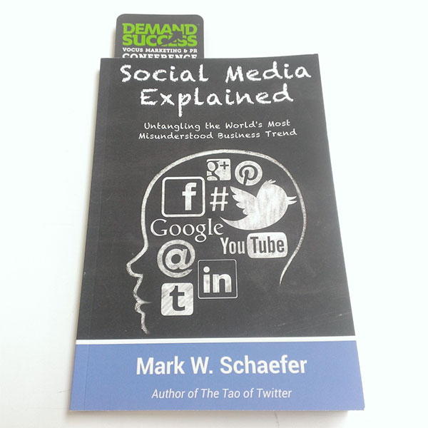
I’ve already got a great example in this paperback edition of marketing thought leader Mark Schaefer’s new book Social Media Explained. I’m a long time Schaefer fan, so I jumped at the chance to hear him speak in the latest Vocus Webinar How to Block Content Shock. Just for tweeting Mark’s wisdom during the webinar, I received a complimentary copy of the book. How awesome is that? I started reading it at home last night, and I will be writing a full review here soon. I’m only on Chapter 3, but loving Mark’s usual no nonsense approach peppered with hilarious personal anecdotes.
Pre-conference networking
Will you be attending #Demand14? Are there any presentations at the conference you want me to attend on your behalf? Let’s network in the comments below!