Parents, teachers, youth group leaders, and other community groups are always on the lookout for fun craft ideas, especially over the holidays. Adults may be interested for their own reasons as celebrations for grownups need decorations and party favors, too. Businesses also run lots of marketing campaigns in the 4th quarter to end the year on a profitable note. While there are ways to use trading cards in just about every industry, I ran across an interesting press release from the American Dental Association that got my mind going. Last year, the ADA printed 5 million free trading cards as part of a large scale campaign called “Stop Zombie Mouth,” promoting healthy eating habits and oral health. The National Oral Health Campaign included coupons for a free game download, and encouraged adults to offer “tooth friendly alternatives” to candy for trick-or-treaters.
Halloween Trading Card Ideas for Dentists
There’s no reason why your local dental practice can’t run a campaign with the same theme for our national sugarfest. Here are some fun ways you can use branded cards as teaching tools for your pediatric patients.
Create a Trivia Game – Help kids learn about the 4 food groups, the different types of teeth, daily mouth care, and other important stuff with colorful cards.
Show Off Your Staff – Introduce new patients to your staff members in the Halloween spirit! Have your receptionists, hygienists, and everyone else dress up in costumes and then make cards with the photos. Just be sure to avoid masks or heavy face makeup.
Nutrition Suggestions Front and Back Design – A variation of the trivia game concept would be to have familiar Halloween characters on the front in a spooky setting holding an unhealthy item labeled “trick” which an alternative nutritious “treat” on the back. The same character would appear on the back enjoying the substitute treat, such as a shiny red apple instead of a caramel dipped apple.
Tooth Care Tips – Kids are more likely to pay attention to flossing if a witch or a zombie asks them to. Another way to present the information would be to develop illustrations of dental monsters i.e. tooth decay, cavities, and plaque.
Dental Community Feedback
Did your practice participate in last year’s Stop Zombie Mouth campaign? Are you planning to pass out cards to kids at Halloween or Christmas? Tell us in the comments below!
Google made several significant changes in the last couple of weeks that will have a big impact on your small business. SEO as we know it is over; the days of static sites and keyword driven optimization efforts are long gone. Here are the 2 most important updates from the online advertising world:
Limited Data –Google removed organic search data from its free web analytics tool.
Major Algorithm Update –You’ve heard of Panda and Penguin—make way for Hummingbird. The new algorithm uses information collected through the knowledge graph to deliver results based on authenticity, trust, brand reputation, and user intent.
By now you’re probably wondering how these things will affect your bottomline. While the lack of data makes it harder to find out what your users want to see on your site, Hummingbird may end up helping you get the recognition you deserve for your hard work.
Old SEO and Link Dependency
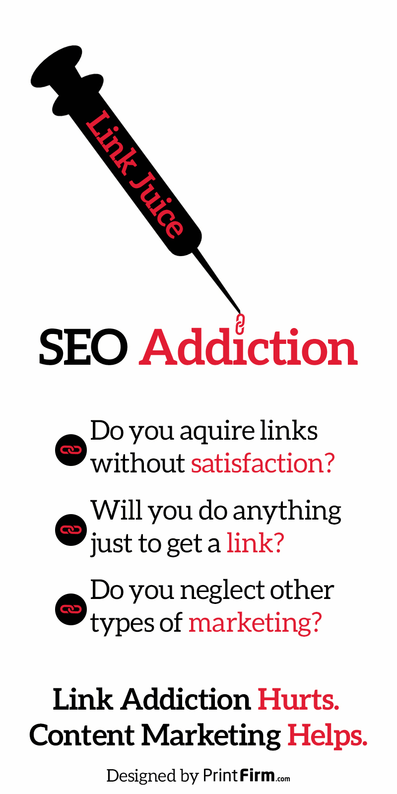
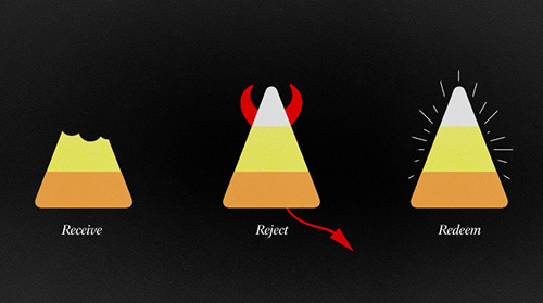
In the old days of the internet (circa 1998), search engines emerged as a way of organizing online content. They crawled pages and used simple signals, such as key phrases and meta data, to find the right material. As the web progressed, flaws emerged in this system as a result of increasing complexity. This created an entire industry of internet marketing professionals like me who focus on helping consumers find your website when they need your products and services. You hire us to bring traffic to your website by any means necessary. Basically, our lives revolve around link building, or as I like to call it, chasing the link dragon. This infographic parody offers a peak into the life of a certified link addict:
Content Marketing as the Path to Recovery
The graphic lists common symptoms of link addiction, and suggests content marketing as a kind of treatment for this illness. You may be asking youself, “wait, isn’t content marketing already part of SEO?” The answer is yes, but only if you’ve been paying attention. Most business owners are still stuck in the mindset of obtaining as many links as possible regardless of quality. Why? Because they see their websites as mere sales tools, not a true digital extension of their brand. Online marketing success will come to those who adapt, and create an excellent user experience through content. Believe me, you will get far more natural links and better responses to your link requests by perfecting the art of storytelling.
Be Transparent, Be Yourself
This may sound like more marketing nonsense, but hear me out. When I tell you to be yourself on the web, I mean that you need to give your business a distinct identity. Reveal your personality, show your human side, and give users the opportunity to meet your team. Transparency in this sense means listening to your customers, responding to them in a meaningful way, and using their feedback to guide your decision-making process.
How to Take Action Towards Transparency
You don’t become a premium publisher overnight. You’ll need a lot of patience to reach your goals, but the results will pay off in the end. Here are 4 steps you can take today to position yourself for the future of the web:
Invest in Content and Design –This means you need to stop buying ghost written content from someone overseas or buying bottom of the barrel graphics on Fiver. If you can’t afford to hire a writer, find a good freelancer with reasonable rates. Ditto designer.
Establish Authorship –If you’re already blogging, great! Now it’s time to officially own your content on the web with authorship. All you need is a Google Plus account and probably a plugin to get started. For more information, read this authorship tutorial.
Get Serious About Social Media –Small business owners have a love/hate relationship with social media. That’s usually the result of a misguided approach to engagement. Your social accounts are places to start conversations, not solicit nonstop sales. Fortunately, a solid content marketing plan will automatically keep your social sharing in check.
Advertise Offline –You’ve heard the phrase don’t put all your eggs in one basket. That’s exactly what you’re doing by being strictly digital. Small businesses often develop the strongest connections in person; print marketing materials gives your advertising the personal touch that keeps customers coming back. Even if you don’t have a physical location, you can create printed pieces to boost your online traffic, such as catalog campaigns for an ecommerce site.
Small Business Community Sound Off
Do you have questions about SEO, content marketing, or social media? What are you doing to make your business stand out on the web?
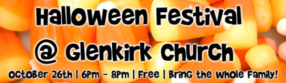
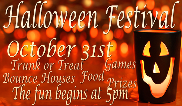
Halloween may or may not be a big advertising opportunity for your small business. If you’re in the retail sector, you’ll probably have a sale along with special seasonal items in your store. Other businesses and organizations may throw holiday parties or host spooky themed events with custom tickets. Whatever you’re promoting, you’ll probably want to fit full color flyers into your marketing budget. If you don’t have a designer on hand or you’re the one creating the artwork, these Halloween flyer templates will really speed up your workflow.
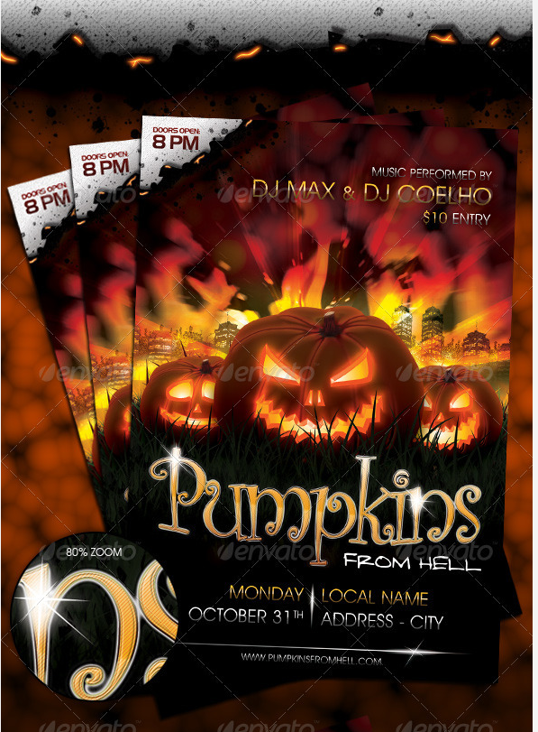
This fully layered PSD template comes print ready in CMYK color mode at 300 dpi. The versatile design would be suitable for a wide variety of gatherings for bars, restaurants, night clubs, and local businesses.
Halloween may be a kid’s favorite holiday for one reason: free candy! If children will be attending your event, then your graphics should tell their parents that your event will be safe for little ones. The flyer pictured above features a cartoonish cover that’s obviously geared towards small children. The design does not have anything scary on it, which is probably best unless you’re organizing an event for teens.
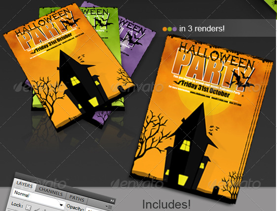
This club advertisement pack comes with an 8.3″ x 11.7″ poster version and a standard 4″ x 6″ postcard template. The artwork is the same in both sizes, which is important for consistent branding. They even clearly labeled a good place to put your logo.
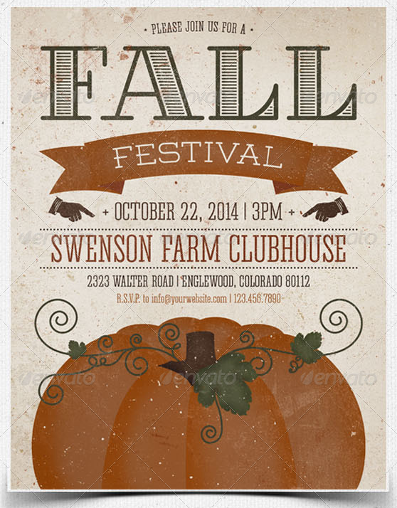
Maybe you’re not celebrating Halloween per say, but you’re having an annual carnival or harvest party. This flyer and postcard combo invites guests with a clean, modern design that’s more on the minimalist side. This typographic print would work for a religious group as well because of the simple artwork.
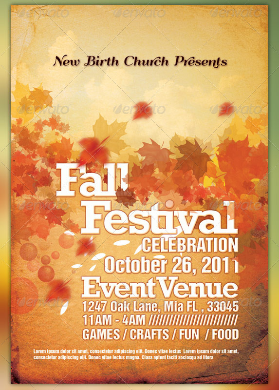
This 4″ x 6″ fall celebration flyer was made specifically for Christian churches. The beautiful leaves come in 2 different color choices and are free of any potentially offensive imagery.
Community Plans for October 2013
What kind of marketing campaigns are you planning for October? Do you want help finding a template that’s right for your industry? Tell us what you want to see in the comments below!
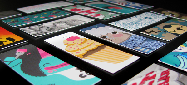
Mini business cards are the must have print marketing item of the moment for graphic designers, photographers, marketing agencies, and art studios. There are a few different styles getting a lot of buzz, such as slim or skinny cards and square cards with rounded corners. We do offer these products, and they’re one of my personal favorites. I toyed with the idea of printing mini cards to show off my photography when I designed my personal cards, but I ended up going with the oval die cut shape this time around. Still, I plan to revisit the mini concept for my next campaign, and I wanted to share why I think nano cards are so hot right now.
The Metaphor Behind the Small Size
I noticed that most of the people going mini work in creative fields where there’s stiff competition. With literally thousands if not millions of people trying to attract clients, finding ways to develop a distinct brand identity gets really tricky. Mini cards are a solution to this problem because they’re visibly different from standard 2″ x 3.5″ cards. But I believe the connection goes deeper; I see the size as a kind of visual metaphor for an individual or agency’s capabilities. Most people are putting portfolio samples on the card designs, and printing several pieces of artwork at a time. To me, this represents the scope of work, and shows a kind of consistency in terms of production quality. This creates a perception of competence, which is very important for art and design marketing. Sure, anybody can get lucky and take a great picture. But a photographer or designer needs to come up with beautiful images for every project. What better way to show the depth of work than with a nice portfolio sample in print?
Mini Cards Start Big Conversations
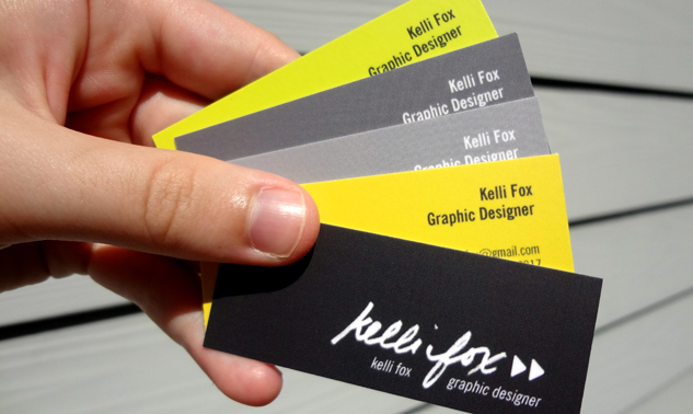
Sometimes business owners question whether or not they need to print business cards when LinkedIn is just a click away. In my opinion, everyone needs cards for a variety of reasons, but creative professionals should be more concerned with making a good offline impression than other brands. Freelancers of all stripes depend on word of mouth, which means their physical presence should be a top advertising priority. Unique shapes and sizes catch the eye immediately, but being able to hand each of your prospects a separate compact card design personalizes their experience.
Imagine yourself at a networking event, such as a gallery showing. You’re chatting with a small group of people, and they ask about your own work. You reach into your pocket and pull out a set of 5 mini cards, each with its own bold design. You fan them out, and let everyone pick a card from your hand. Now everyone wants to know about the artwork and where you got your nano cards. Success!
Community Soundoff
Our friend Kayti Welsh, a designer/illustrator, hoped on the mini card trend. Will you go nano or stay traditional? Tell us in the comments below!
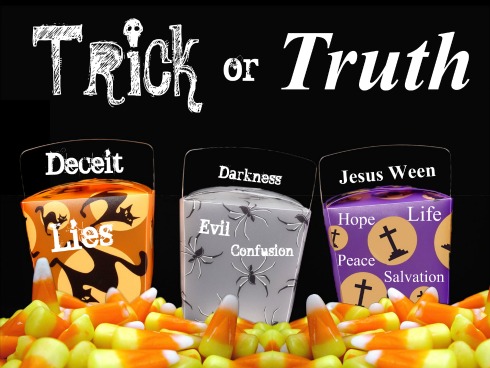
Our latest press release focuses on the growing trend of churches hosting alternative Halloween events. The article mentions several print products that help Christian churches promote their message on this traditionally pagan holiday, but we get the most questions about vinyl and roll up banners. Since religious organizations are usually working with tight budgets, cheap banners are their favorite advertising tools. Most of the time, vinyl banners are used outdoors, such as on the front lawn or on the side of a building, whereas pull up banners are part of indoor worship services. For this reason, big vinyl banners will be more useful as part of a Halloween outreach strategy.
Creative Church Banners for Fall Festivals
The great thing about banners is the fact that they’re reusable; however, it’s important to remember that including specific event details i.e. dates/times in the artwork means that you won’t be able to put the same banner up next year. A better solution would be to create at least 2 banners—1 for your upcoming event specifically and another generic design with a seasonal theme for repeat promotions.
All purpose banner solution: Choose a name for the event, such as Trunk or Treat Celebration or Fall Harvest Festival, that you plan to stick with for a few years.
The creative design part may be difficult unless there’s a graphic designer in the congregation willing to volunteer his or her time. If you don’t have anyone with the necessary skills, here are some fun ideas to help get your project started.
This piece will surely get kids’ attention with the large pieces of tempting candy corn in the background. The black text uses a white outer glow to create more contrast, which makes it easier to read.
Here the familiar images of candy corn serve as symbols to convey a universal Christian message of love and forgiveness. This banner would be perfect for repeat use. Note: the captions should be enlarged so they can be understood by passersby.
This banner sends the strongest Christian message about life as a believer. Children might not understand the point without an explanation, but it will speak loudly to their parents every year.
Faith Community Sound Off
Is your church planning a Halloween alternative event? How are you using print marketing materials for local outreach? Tell us in the comments below!
Business cards are one of the least expensive promotional items you can purchase for your small business. But don’t let the low price tag fool you; cards have a big impact on your brand, especially if you run an online business. Cards put a piece of your company in someone’s hands, which instantly increases your credibility in their eyes.
That said, cards are one of our most popular products. Consequently, we get a lot of questions from clients about printing their own cards, especially from small biz owners and startups. Our staff is always here to discuss your project specifically, but I thought it would be helpful to address frequently asked questions here on our blog for folks contemplating a new print marketing campaign.
How Many Business Cards Do I Need?
The answer depends on your marketing goals and practical needs. Startups tend to place orders in small quantities, such as 50 or 100 cards, and that strategy allows them to test the waters so to speak. Still, ordering a series of small print jobs may end up costing you more in the long run. If you already have your logo, typefaces, etc. finalized, you can save money by buying 1,000 or 2,000 cards at once. Of course you will need to purchase business cards in bulk for trade shows, conventions, networking events, and employees who travel frequently, such as sales people.
What are the best fonts for business cards?
Any designer will tell you that typography matters more than you realize. As a business owner, you want to present yourself or your employees as well as the company in a professional manner. The right font also expresses your brand’s personality and helps sends a clear message about your image. That said, popular fonts and styles vary considerably by industry. For example, doctor fonts tend to be traditional whereas advertising agencies often adopt modern or custom typefaces. There are literally thousands of fonts to choose from; some are free and others are premium i.e. available to download for a free (usually between $45-$200). If you’ve having trouble figuring out where to start, don’t feel overwhelmed. The perfect font will find you when it thinks you’re ready. You can speed up the process by browsing through this helpful guide.
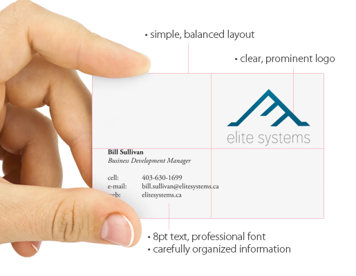
What size font should I use for business cards?
We get this question all the time in some form or another, although it tends to come from irate people over the phone. The main concern with business card font sizes is the text being too small. It doesn’t matter how big the design looks on your giant Mac monitor; your text should be 8pt. at a minimum in order to be readable. Remember this when you are viewing the design at 100% in Photoshop, Illustrator, etc. The font may be legible on screen, but in reality you are seeing a much bigger version than the actual printed piece. In general, 8-12 pt. font works well for your important contact information. The best way to preview your font size is to print out a copy of your business card in its actual size with your home or office printer. In addition to size, you should also consider the thickness of your chosen typeface. Thin may be in for the fashion industry, but skinny letters are a no-no in CMYK world.
What are text weights?
In this case, the word weight refers to the thickness or width of the letters. Typefaces, especially premium fonts, may come in several different weights from light to bold. If you’re already working with thick letters, you may be able to get away with the light version. Otherwise, stick with regular or bold weights to ensure legibility.
Should I hire a designer or make my own business cards?
We offer in house creative services, so we’re big believers in professional artwork. When you pay for pro work, you see a big difference in terms of ROI. This is especially true if you’re rebranding your business or have a cool concept but aren’t sure how to put the plan into action. Another reason to hire a designer with print experience is simply peace of mind. Put your project in skilled hands and you will feel more comfortable with the whole printing process. That way you know your marketing campaign won’t fall victim to rookie mistakes, such as border issues, artwork getting cut off due to improper arrangement, etc. Please keep in mind that prior print design experience makes a huge difference. No offense to our friends in the web design community, but print requires a degree of technical knowledge along with creativity. For instance, web projects rarely demand individual color output adjustments. Pro print designers already know about CMYK percentages and uber specific ink stuff.
That said, we realize design doesn’t fit into every small business marketing budget. That’s why we have tons of templates categorized by industry available for you to customize with our online design tool. You can add your own logo, background, images, and text within a few minutes.
“It’s just ink on paper” is a common phrase in the print industry. And truthfully, it is. But more than that, printing is a craft, requiring great skill and knowledge on the part of press operators to achieve the results that the client seeks on the final press sheet. In this blog we’ll cover the basics, to give you as the client an understanding of how the process works.
Granted, it’s drastically changed in the last few decades, but the science and art are the same.
First off, we print in the CMYK world, which means our presses print in cyan, magenta, yellow and black. This really hasn’t changed, and I doubt it ever will. Often you print in what are called PMS colors, which means Pantone® Matching System, the international standard for colors that you can print with. Most print shops will have at least a 4-color press, many have a 5-color press (which can allow printing in a 5th or “spot” color). Many presses have capabilities for running 6-colors, which can allow for PMS colors, or inline varnishes. Each “unit” of the press (the tower that holds the ink, the printing plate, the impression blanket and impression cylinder, and all the rollers) is dedicated to specific colors. So, you might have the 1st unit running black, the 2nd unit running magenta, the 3rd unit running cyan, and the 4th unit running yellow. There might be a 5th unit running a client’s corporate color. And some shops run their color in different sequences, since they may have different ink manufacturers or different presses.
The science behind the process is this: oil and water don’t mix. Now, most inks today are not oil based, but soy based, and the chemistry in the presses is different too, allowing for the same principle of oil vs. water to work in a synthetic environment. The ink is loaded into ink fountains (they look like trays) at the top of each tower and distributed by several rollers to the printing plate. The printing plate, which is a photosensitive sheet of aluminum, has been laser etched and processed through a solution that removes all the non-imaged area. Those image areas are receptive to the ink. In addition, there is a solution that lightly coats the plate so that the ink stays ONLY on the imaged areas. The ink is transferred to what is called a blanket, which is a flat sheet of rubber that is placed onto the blanket cylinder. The blanket often has behind it sheets of paper of varying thicknesses to ensure the plate and the blanket press against each other to transfer the image onto the blanket. This is called packing. The blanket transfers the ink to the press sheet, and as it passes under each tower, each color is applied to the sheet until it has printed all four colors. The art of all this is knowing how much packing to put in, how much ink to use, the pressure of the various cylinders, the balance of the solutions you have to use – and determine that for EACH printing unit!
To further emphasize how much this is an art, the press operator’s skill comes into play when he or she sees the color on the sheet, and determines how much to add, or how much to take away from one or more colors. The subtle balance of adding 5 points of magenta, or removing 3 points of cyan, and doing it in specific areas on the sheet, truly is a skill. Press operators use a device called a densitometer, which reads small boxes of each color on the sheet, and tells them the density of the ink that is being applied to the sheet. The press operator can then reduce or increase the ink to a specific area of the sheet to affect the color in a specific area. When you take all this into account, and then add the press operator’s knowledge of the paper that the job is running on, or how to adjust the packing and ink balance for that specific paper, and you can easily appreciate the craft.
About the Author
John Prothero, Business Development Coordinator, Westamerica Graphics, Foothill Ranch, CA
John Prothero is a 30-year employee of Westamerica Graphics, a commercial printer based in Orange County, California. In his 30 years at Westamerica, John has done delivery, bindery, proofing, plating, traditional prepress (stripping), scheduling, job planning, job management, account management, and digital job production. Currently he is the Business Development Coordinator, working with the marketing team in creating blogs, social media posts, and tools for the company’s sales team to enhance and grow the company’s sales.
Connect with John and the Westamerica Team on Facebook, Twitter, and LinkedIn.
Source (Note: This was the most shared image on Facebook in 2012. Food for thought for the Facebook quality team.)
Do you use memes to increase engagement on your Facebook fan page? Have you ever asked fans to like or comment on a post? If so, you might want to rethink your social content strategy. Facebook recently issued a controversial, and characteristically vague, announcement that every small business owner should be aware of. In a nutshell, they stated that they’re tweaking the EdgeRank algorithm yet again in an effort to improve the quality of content on the site. Click here to read the official statement on Facebook for Business.
Facebook vs. Memes
So what’s all the fuss about? This seemingly benign update enraged many marketers for 2 reasons. The statement specifically mentions “low quality post[s] or meme[s]” along with the previously mentioned calls to action. I don’t know about you, but I’ve been using memes on my fan pages for years with considerable success. People connect with memes for lots of reasons, and they’re a great way to show a brand’s personality or sense of humor. As an end user, my newsfeed is literally filled with memes because my friends obviously enjoy posting and sharing them. In fact, there are thousands of community pages who post memes all day long; said pages happen to be some of the most popular on the site (see the George Takei fan page, which currently has over 4.5 million fans and 2.6 million talking about it”). Based on my personal and professional experience, Facebook’s decision does not reflect actual user preference in the slightest.
Since this update contradicts user behavior, marketers are naturally skeptical as to Facebook’s motives. I won’t get into the rumors because I have no idea what motivates Zuck and company besides money. I do know that spammers often “trick” users into spreading affiliate links by asking them to share posts to express support for cancer victims and things of that nature. I wholeheartedly agree that such practices should be banned from the site and humanity in general. I mean, how anyone can exploit leukemia victims is just beyond me. But I’ve seen less of these posts lately, and I presumed Facebook was finally cracking down on this disgusting crap. Some people are indeed defending Facebook and claiming that these pages will be targeted instead of your small biz.
How to Adjust Your Small Biz Social Marketing Strategy
Will this content policy only affect the real offenders or will your brick and mortar business get punished in the process? Only time will tell, but here are 3 things you can do right away to stay within the guidelines:
#1) Stop Using Calls to Action – I know almost everything you’ve read on the big social marketing sites said to ask fans to like posts, comment on them, etc. From now on, consider that concept totally outdated. Don’t use Facebook action words in your posts until it’s absolutely clear how they’ll be enforcing the quality guidelines.
#2) Use Photos Without Text – Let me be clear: I seriously doubt that Facebook intends to ban images with words in them. Surely an image about your upcoming Halloween sale should include copy with the important details. But if you’re simply adding a photo to go along with your latest blog post, it might be a good idea to use a high resolution picture without any words for the time being.
#3) Post More Text Only Status Updates- Facebook already changed its algorithm to give higher weight to text only status updates. I know from my own experience that text posts get more visibility aka reach than pictures, links, and videos. Just be sure to avoid the direct CTAs (see tip #1). For example, ask your fans a trivia question that relates to your brand or industry, but don’t instruct them to answer in the comments below.
Community Sound Off
Do you agree or disagree with Facebook’s content policy? What tips can you add to our list? Tell us in the comments below!
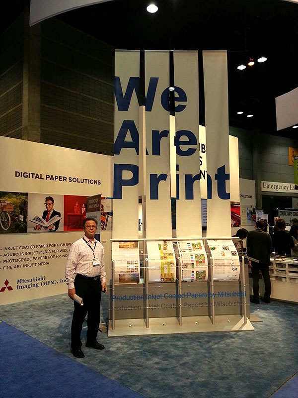
Now that all the ink’s dry, we thought we’d share our favorite moments from Print 13. I wasn’t lucky enough to attend the event, but our CEO Nick and company manager Alex sent me lots of fun photos from the floor. I spent most of my time watching the Print Media Centr live stream broadcast and participating virtually through Twitter. Nick and Alex stopped by the giant Xerox booth to check out the awesome equipment and meet our favorite Digital Printing Baller, Bill Michael. The Xerox team promoted Print 13 using the hash tag #PrintWins; here’s Alex explaining why Print Wins for all of us at PrintFirm.com in a Vine:
This picture of Nick says it all—We. Are. Print.
There were lots of excellent speakers who shared their wisdom at the Printerverse booth, including Trish Witkowski of the Fold Factory (home of the Super Cool Fold of the Week YouTube series), Mike Blanco from GPA Substrates, Phil Riebel from Two Sides US, and of course, Deborah Corn, the ruler of the ink galaxy. Still, my favorite speaker was definitely Mary Beth Smith of Girls Who Print fame. Her inspiring speech about empowering women in the printing industry really hit home with all the girls in our office. The girls and I dig the concept so much, we’re already planning our celebration for next year.
Mary Beth raised an interesting point about the need for strong female mentors to help young women with their careers. I’m fortunate to have an awesome mentor in Deborah, but I never thought about becoming one myself. Right now there aren’t any junior staff members in need of guidance in our company, but I am certainly available to help any interested students through the web (feel free to hit me up on LinkedIn). I’d be happy to teach you everything I know about print, marketing, SEO, social media, design, writing, and life in general. And who knows, maybe our next hire will be a girl looking for some professional advice and direction.
If you missed Print 13, you won’t have to wait very long to get the next best thing—the Print Media Centr live stream awaits on YouTube! You can see Mary Beth’s moving speech and get helpful tips about marketing your printing company. The fine folks at Xerox are also adding their own Print 13 virtual recap that will go live on September 19th. Be sure to pre-register here.
Did you go to Print 13? What were your favorite takeaways? Share your CMYK memories with the community in the comments below!
Welcome back to our educational series on commercial printing! Last month, we introduced this article collection with an informative post on image resolution. If you’ve ever wondered why a photo came out blurry in print, you’ll probably find your answer there.
Today we’re going to cover another common round of associated questions we get from clients about colors. We love colors as much as you do, and we get why you want everything in your printed piece to be pixel perfect. But before you start screaming about something that’s slightly off, there are a few things you should know about our professional printing methods.
Why Can’t You Guarantee Color Matching?
Short Answer: Because we’re not liars.
Long Answer: The first answer is meant to be funny, but there’s a lot of truth behind the joke. We could pretend to have complete control over our press machine, but that would be dishonest. Here at PrintFirm we consider quality and value as equally important. Our goal is to give you the best possible quality for the lowest price. To keep our prices competitive and your wallet happy, we use a process known as gang printing. We’ll explain more about this later. For now, just know that we can’t guarantee colors without raising our prices substantially. Besides the overhead costs involved in perfecting intricate color details, there are lots of external factors that influence the results of your print project. For example, the weather and the amount of moisture in the air have an effect on our digital press. We haven’t figured out how to control the weather yet, so we don’t plan on changing our color policy any time soon.
What is Gang Printing?
Short Answer: It’s the reason why your business cards were so cheap.
Long Answer: Gang printing or gang runs allows us to print your orders quickly and efficiently for the lowest price. The word “gang” in this sense means group. We could print every single order individually, but that would make tons of extra work for us, and it would majorly increase our turnaround times. By grouping multiple orders together on the same sheet of paper and printing them simultaneously, we’re able to maintain a high level of productivity while wasting less paper. Still, gang printing does have some drawbacks, such as less control over colors. Since there may be several projects on a single sheet placed side by side, it’s impossible to get precise ink distribution.
Can I Get a Reprint or Refund Because of Color Variations?
Short Answer: Yes. Have you heard about our going out of business sale?
Long Answer: Sorry, we don’t offer reprints or refunds for minor color variations. If we ever make a serious mistake, our claims department will take care of your case. Please note that by serious, we do mean major, as in “OMG WHY!” NOT “I’m an extremely picky person who considers everything serious” serious. Otherwise, please refer to our terms and conditions page before you place your order. Pretty much all the parts about color appear in red lettering, so you won’t have a hard time finding what you’re looking for. The cliff notes version says that you’re prepared to handle slight inconsistences in your artwork. If you’re not, well, perhaps another company will be able to meet your needs.
What is Pantone Color Matching?
Short Answer: Something only design geeks obsess over.
Long Answer: Ah, Pantone Color Matching (PMS)…the stuff designers’ dream about in their tasteful typographic PJs. Pantone colors are usually left to graphics and printing industry professionals. Pantone or spot colors each have a name or number to ensure uniform appearance for printing. When you indicate a Pantone number, you know you’ll get the right color regardless of how the file looks on your computer screen.
We do not offer PMS matching for our full color products. We do give you this option for our business stationary products, including 1 or 2 color envelopes, 1 or 2 color letterhead, and 1 or 2 color custom notepads. You are free to order any of these items and pick the exact color(s) from the choices provided.
Can I Pay For Custom Colors?
Short Answer: We’ll do anything if the price is right.
Long Answer: There are other common PMS colors available for the products mentioned above. We will probably be able to accommodate your custom color requests for a small fee. Feel free to discuss your project specs with our customer service staff.
How Do I Know What My Printed Piece Will Look Like?
Short Answer: Invent a time machine.
Long Answer: By now you’re probably questioning the viability of your print projects. Don’t lose sight of the fact that the vast majority of the jobs we print come out looking every bit as awesome as they’re intended to be. That said, there are a few things you can do to avoid confusion and increase the chances of successful completion.
#1) Calibrate Your Monitor Have you ever noticed that websites look a little different on your phone than they do on your desktop? Or that when you look at your design on your boss’ computer the colors don’t seem quite right? That’s because computer screens aren’t always accurate as far as colors are concerned. The best way to get around this hurdle is through calibration, which means making adjustments to your screen’s color balance. For instructions, please see the tutorials below:
#2) Review Your Digital Proof Carefully You may or may not receive a digital proof with your order. We highly recommend electronic proofs because they give you a chance to review your artwork before it goes to print. This might not sound like a big advantage, but you’d be amazed at how many errors you can overlook by ignoring your proof. Be sure to check your proof for everything from spelling mistakes to color issues. If you see something that looks off or not the way you expected, speak up! Ask our staff for assistance via email or phone. We’d much rather answer your questions than have you unhappy with your order.
#3) Request a hard proof Let me be very clear: WE DON’T CURRENTLY OFFER THIS SERVICE. I brought up hard proofs anyway because this article isn’t really about our company specifically; it’s about helping you get a better understanding of commercial printing in general. We know of other companies who still send hard proofs for a price. These are very time consuming, and they still don’t mean that your marketing materials will come out exactly the same as the sample. Why not? Because small print jobs, such as a single poster print, are created through digital imaging. Digital colors have a reputation for being less accurate than offset for the most part. Nevertheless, a hard proof will let you see potential problems with your file, especially if you’ve never done a print design before. CMYK colors are definitely not the same as the RGB graphics you’re used to seeing on the web, and nothing makes this clearer than holding a physical example in your hands.
The CMYK Round Up
I hope this clears up any misconceptions about printing and color matching. Do you have additional questions about colors or our policies? Do you have another topic you’d like us to discuss? Let us know in the comments below!